Mobile Screen Navigation Adjustment
-
Hello!
I would like to adjust the navigation on the mobile version of my site.
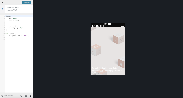
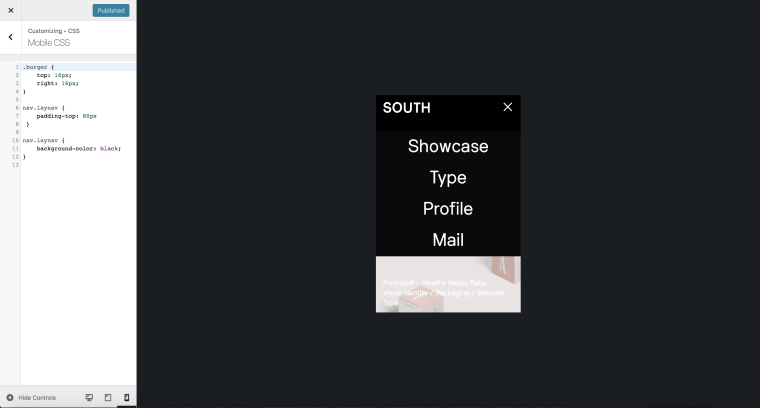
I added a little CSS and was able to push the Navigation links down using the padding, although now when the navigation is hidden you can still see it cut off at the top of the screen (see below). I would also like to make the whole screen black with the links in the center.
Thanks for your time!
Best,
A


-
-
Dear @amc
in the CUSTOMIZER you can change the fontsize etc of the mobile navigation.
I recommend to use this instead of the Custom CSS:
Best!
Marius
-
Dear @mariusjopen & @edgrbnz Thanks for your messages.
When I hide the 'menu bar' this messes up the padding at the top of the navigation. As I don't want a black bar behind the site title and burger.I cannot see where I can make this complete colour overlay either sadly.
Thanks in advance!
A -
Dear @amc
-
Your black navbar is not a read navbar.
The black is from the background colour which you can see because the LayTheme content gets pushed down with the padding. See here:

-
When you edit the active navigation CSS like this you can make changes:
.laynav.mobile-nav.transition.active {
    background: red !important;
    height: 100vh;
}
Or for the list elements:
.laynav.mobile-nav.transition.active li {
    padding-top: 20px;
}
Best you play around with this a bit :-)
Hope I could help!
Marius
-
-
Thanks @mariusjopen!
I made it work!Cheers
A
I also code custom websites or custom Lay features.
💿 Email me here: 💿
info@laytheme.com
Before you post:
- When using a WordPress Cache plugin, disable it or clear your cache.
- Update Lay Theme and all Lay Theme Addons
- Disable all Plugins
- Go to Lay Options → Custom CSS & HTML, click "Turn Off All Custom Code", click "Save Changes"
This often solves issues you might run into
When you post:
- Post a link to where the problem is
- Does the problem happen on Chrome, Firefox, Safari or iPhone or Android?
- If the problem is difficult to explain, post screenshots / link to a video to explain it