Mobile menu (use desktop style)
-
Hi,
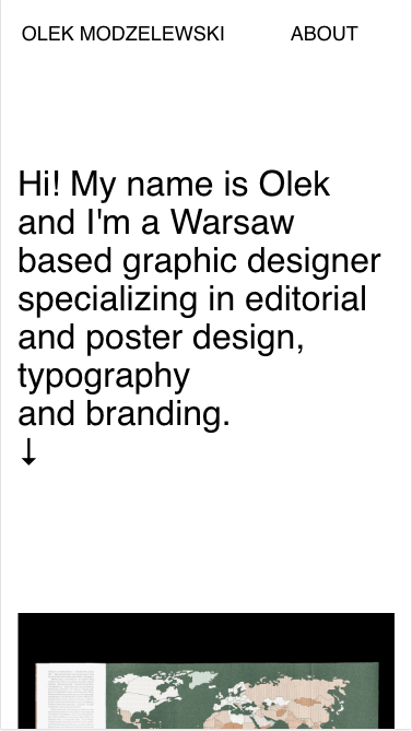
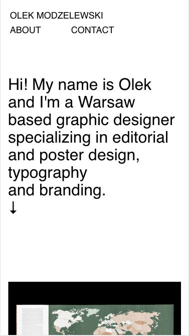
I have problem with mobile menu using desktop style. When I set my site mobile menu just to shrink into two lines and now it's not. In first row there was "Olek Modzelewski", and in second "About" and "Contact" buttons, so "Contact" button disappear.
Can you help me with that problem?
Here is link do my site www.modzelew.skiBest
Olek -
-
I'm sorry. Maybe I misspoke. Menu on mobile is not shrinking into two lines. A make screen shot and Ps simulation how it should look.
This is how it loos now

And this is how I would like menu to look like:

Maybe now you will understand my problem correctly.
Best
Olek -
Dear @Olek
ah, ok. I see.
You need to use CUSTOM CSS to edit the mobile menu. That is possible.You know the basics of CSS?
Best!
MArius
-
I also code custom websites or custom Lay features.
💿 Email me here: 💿
info@laytheme.com
Before you post:
- When using a WordPress Cache plugin, disable it or clear your cache.
- Update Lay Theme and all Lay Theme Addons
- Disable all Plugins
- Go to Lay Options → Custom CSS & HTML, click "Turn Off All Custom Code", click "Save Changes"
This often solves issues you might run into
When you post:
- Post a link to where the problem is
- Does the problem happen on Chrome, Firefox, Safari or iPhone or Android?
- If the problem is difficult to explain, post screenshots / link to a video to explain it