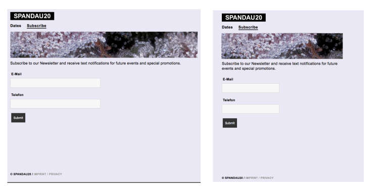
Image with fixed height and responsive width
-
Hi Marius,
Thanks for your reply! I tried the object-fit: cover property but it is apparently an „Unknown property“.Also, the class doesn‘t seem to be applied to the image. Looking at the source code, there is a div around the image which receives the properties of the class „banner“. The image is placed into a stack element but I made sure to select the image for the custom class. Use „s20“ to access the pages.
Julius
-
Dear @jw
the message unknown property can be ignored. It still works.
Don't forget to use!importantto overwrite the settings from Lay:
https://css-tricks.com/when-using-important-is-the-right-choice/If you have still trouble, the best is to post a link to your website that I can have a look.
Best!
Marius
-
Hi Marius,
Unfortunately I am still struggling with this. Could you please give spandau20.com/subscribe a look?
The image banner should have a height of 150px and cover the full width (-20% left and right).On the Dates page you can see the image I want to crop to the final size. The table underneath is positioned as if the banner was 150px high, but the banner image isn't cropped at all :(
Best
Julius -
Dear @jw
The image is trapped in the container:

But you can drag images out of the gridder, into the pink area.
Best!
Marius
-
-
Hi Marius,
I tried dragging the image to the left which worked but didn't yield the effect I was aiming for. (See www.spandau20.com/dates)
Maybe my aims were a bit unclear: The banner on the subscribe page looks great with only one problem: I want the height to remain at the same px value across all screen sizes. The width is correct.
I made a quick sketch in Ps of how I want this to look across two screen sizes:

Best
Julius -
Dear @jw
ok. I understand. you can use CUSTOM CSS to change the height.Also look into:
- !important
- object-fit
Best!
Marius
-
Dear @jw
try this:
.banner img {
    height: 100%;
    object-fit: cover;
}
.banner div {
    height: 100%;
}
Hope that works!
Best!
Marius
-
Hi Marius,
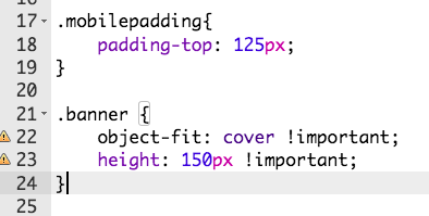
That didn't work either but I managed to work it out using a HTML object:
<img src="wp-content/uploads/2019/02/banner_03.jpg" alt="Banner" class="banner">
The CSS class:
.banner{
position: relative;
padding-top: 125px;
height: 125px !important;
object-fit: cover !important;
}Thanks for your help!
Julius -
I also code custom websites or custom Lay features.
💿 Email me here: 💿
info@laytheme.com
Before you post:
- When using a WordPress Cache plugin, disable it or clear your cache.
- Update Lay Theme and all Lay Theme Addons
- Disable all Plugins
- Go to Lay Options → Custom CSS & HTML, click "Turn Off All Custom Code", click "Save Changes"
This often solves issues you might run into
When you post:
- Post a link to where the problem is
- Does the problem happen on Chrome, Firefox, Safari or iPhone or Android?
- If the problem is difficult to explain, post screenshots / link to a video to explain it

