Mobile Background not working
-
Hi @jjk
-
try to upload your image in a lower filesize.
It takes way too long until it is loaded.
Photoshop -> save for web… -
You need to add the code also in the Custom CSS for Mobile Version.
Let me know if that worked for you.
Best!
Marius
-
-
Hi @jjk
-
try to upload your image in a lower filesize.
It takes way too long until it is loaded.
Photoshop -> save for web… -
You need to add the code also in the Custom CSS for Mobile Version.
Let me know if that worked for you.
Best!
Marius
thanks for the reply!
-
the picture is only 322 KB, that cant be too much, can it?
-
i got it only in my custom css for mobile version.
did you see how it displayed, it quickly pops up crisp and then blurs and has this grey line on top, + it also scrolls, not fixed...
x Julian
-
-
Hi @jjk
Ok, I see . but the loading is pretty slow in the desktop version.
I think the images gets blurred on mobile (not on the mobile-desktop version, actually only on the phone) because somehow it gets stretched I suppose.
I cannot really understand yet why and would need to look more into it.
I can do that but before please tell me why do you not use the regular way of adding a background image via the Gridder?
Best!
Marius
Yeah I also think it's stretching, don't know...
The gridder Backroundimage only apply to columns, so it will repeat with gaps where "row gutters" are and would also not be fixed...
I also tried to embed some html directly in the site, without success.
I would be very happy if you could look deeper into it, I'm already so much overdue with this timewise and kinda lost.
X Julian
-
Hey m8!
Why not just use "Customizer" -> "Mobile (Smartphone)" -> "Mobile Background Image"
-
Hey m8!
Why not just use "Customizer" -> "Mobile (Smartphone)" -> "Mobile Background Image"
hey armin,
this is embarassing, hadn't updated and didn't have that option in my old version. works perfectly now.
Thank you!
-
Cool :) Aha
-
Hey m8!
Why not just use "Customizer" -> "Mobile (Smartphone)" -> "Mobile Background Image"
@arminunruh
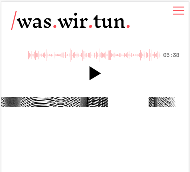
I tried to put a background-image with your custumizer-option. But it displays very strange. Its only a small part of the original pic and shown as a bar...
Have you seen this problem before?
Thx
-
-
dear @mariusjopen
Here is the link https://podcastlab.marcel-gross.ch/szene/
I placed the background now with code/* Hintergrundbild allgemein */ body { background-image: url("/wp-content/uploads/2019/01/scan-67_hellblau.jpg"); background-repeat: no-repeat; background-attachment: fixed; background-position: center center; background-size: 100% 100%; } @media only screen and (max-height: 900px) { body { background-repeat: repeat; background-position: center top; background-size: 110% 710px; } }This works as a not too beautiful solution, because I would like to have the picture stretched the same way as on the desktop-version... But it doesn't work with background-size 100%
-
I also code custom websites or custom Lay features.
💿 Email me here: 💿
info@laytheme.com
Before you post:
- When using a WordPress Cache plugin, disable it or clear your cache.
- Update Lay Theme and all Lay Theme Addons
- Disable all Plugins
- Go to Lay Options → Custom CSS & HTML, click "Turn Off All Custom Code", click "Save Changes"
This often solves issues you might run into
When you post:
- Post a link to where the problem is
- Does the problem happen on Chrome, Firefox, Safari or iPhone or Android?
- If the problem is difficult to explain, post screenshots / link to a video to explain it