Sub Menu Background
-
Dear @rbnbm
for me it did. It extended the background of the navigation to the right border of the screen.Best!
Marius
-
Hi @mariusjopen ,
Sorry, you are right! I failed to explain – there is white space on the right side, but I would like to have some space on the LEFT side of the items (letters) in the submenu. Possible?
-
Dear @rbnbm
have a look here:.sub-menu { padding-left: 15px !important; }And here. You can use the :hover in the Chrome Inspector:
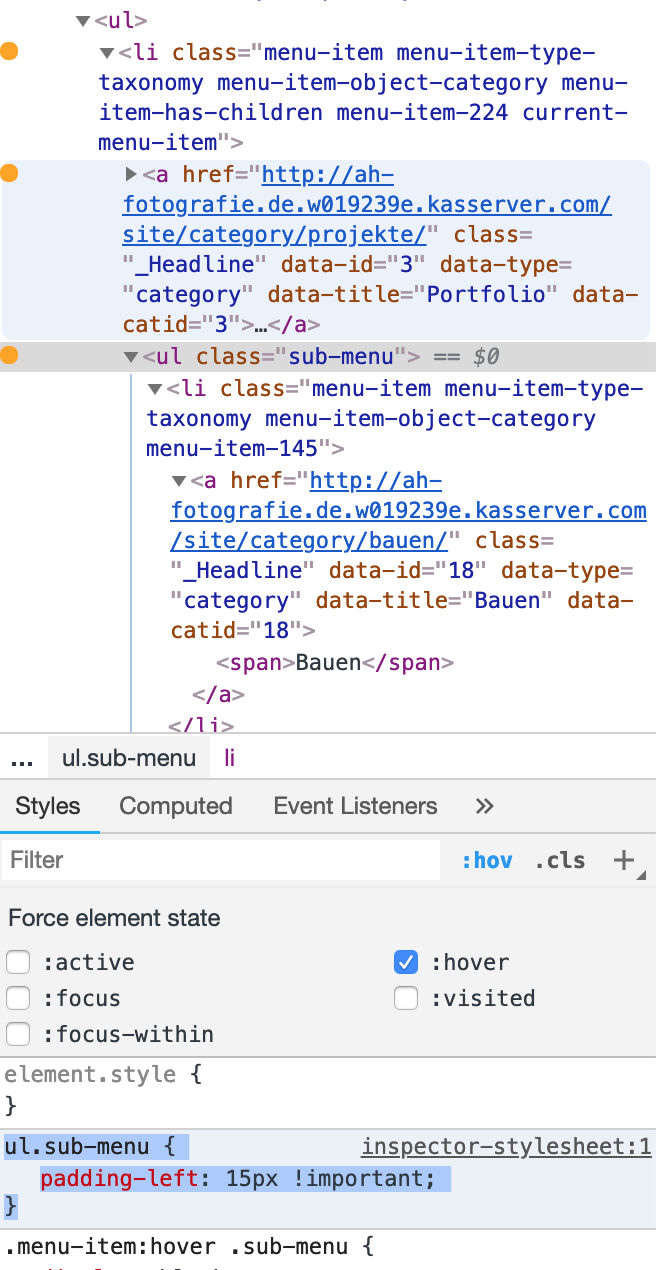
Best!
Marius
-
Dear @mariusjopen ,
Thanks, but I already got that to work, I am looking for a code so that it looks like this:
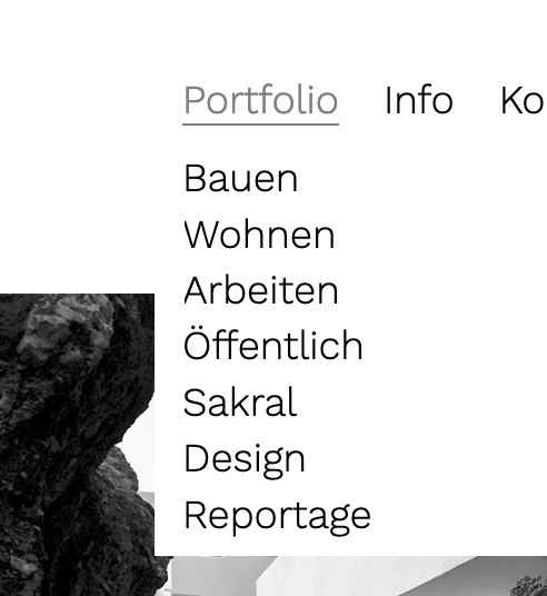
Possible? Thanks again!
-
Dear @rbnbm
but that was the solution I provided, no?
You can also play around with the code I gave you.Best!
Marius
-
Dear @mariusjopen ,
Sorry, but your code delivers the following:
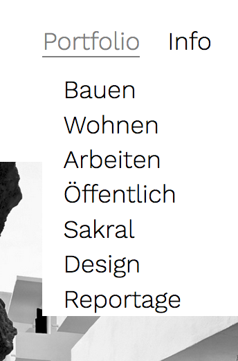
The text is indented, not aligned with the item of the menu. Minor, I know, but still... I already tried different things but couldn't make it work. If it's not possble - okay. (I send you the login data via chat regarding the other matter, if you want to take a look....)
Thanks again, your help is much appreciated!!!
-
Dear @rbnbm
try this one:.primary .sub-menu { display: none; position: absolute; background-color: white; border: 0px solid grey; padding-top: 10px; padding-left: 20px; margin-left: -20px !important; padding-bottom: 20px; }Best!
Marius
-
Hi @mariusjopen ,
Sorry, does not work, now all Sub Items are in line:
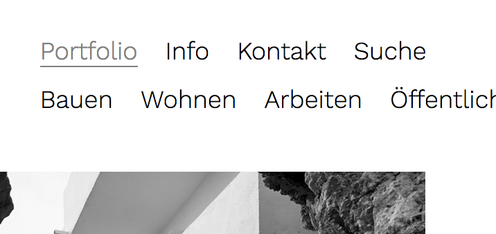
Nevermind, let's leave it at that. I'll file this under "not possible".
Any news on why the search does not work (my chat message)? Did you get my login data?
Thanks
rbnbm -
Dear @rbnbm
try this then. I think this is what you want:.primary .sub-menu { display: none; position: absolute; background-color: white; border: 0px solid grey; padding: 10px 0px 10px 10px; width: 100vw; }I wrote Armin about the search and he will reply soon I assume.
Best!
Marius
-
dear @mariusjopen ,
Thanks, but it does not work ; -)
Text is indented again.
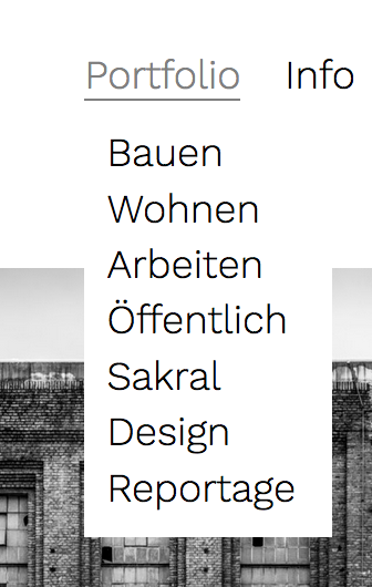
As I see it, the padding indents the text to the right. A negative value puts it back in place, but then there is no white space to the left.
As I said, not perfect, but also not a big deal. I'm just wondering whether it is possible at all (I also tried different negative values, to no effect).
Just to make sure, here is all of the code I am using right now for the menu:
.primary .sub-menu {
display: none;
position: absolute;
background-color: white;
border: 0px solid grey;
padding: 10px 0px 10px 10px;
}
.primary .sub-menu li {
display: block;
}
.menu-item:hover .sub-menu{
display: block;
}Looking forward to the search thing...
Best,
RBNBM
I also code custom websites or custom Lay features.
💿 Email me here: 💿
info@laytheme.com
Before you post:
- When using a WordPress Cache plugin, disable it or clear your cache.
- Update Lay Theme and all Lay Theme Addons
- Disable all Plugins
- Go to Lay Options → Custom CSS & HTML, click "Turn Off All Custom Code", click "Save Changes"
This often solves issues you might run into
When you post:
- Post a link to where the problem is
- Does the problem happen on Chrome, Firefox, Safari or iPhone or Android?
- If the problem is difficult to explain, post screenshots / link to a video to explain it