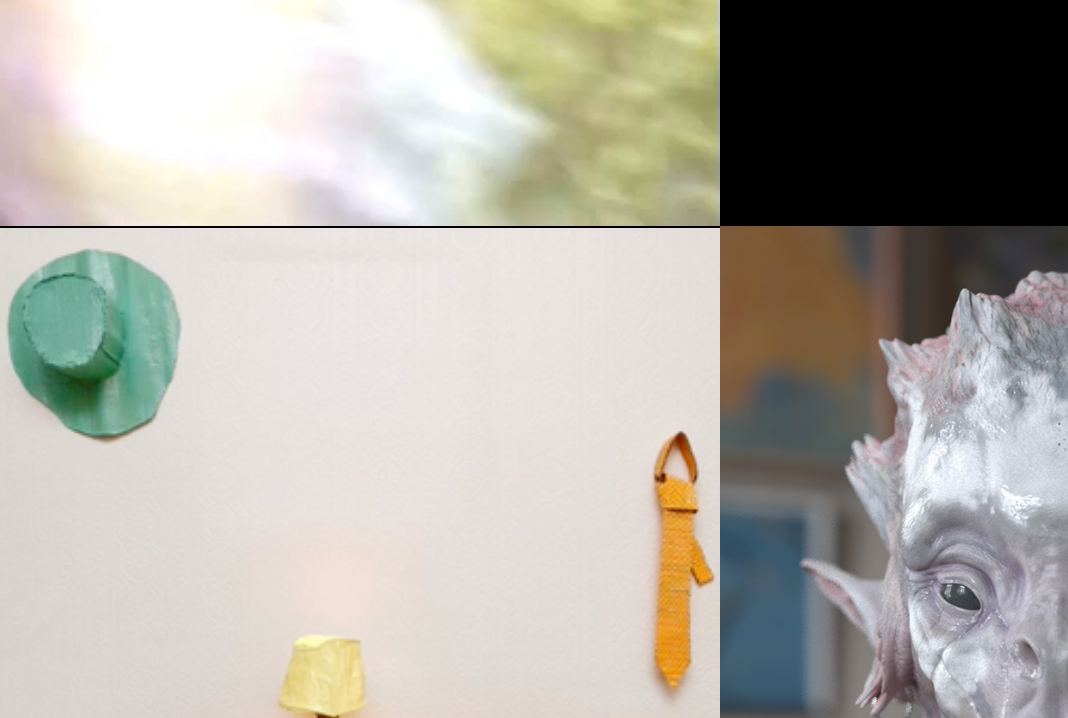
Project thumbnail mouseovers have strange borders & blurry fonts
-
hey NR! This can happen because of how browsers render percentage based positions. You'll maybe see that if you resize your browser at one point that border disappears? Anyway, if u want I can take a closer look at your site if u can send me a link.
-
hey MAN, since version 1.8.0 of lay theme you can use brightness instead of background color for the hover. This way you won't get these borders. But yea your image will just change its brightness on mouseover and not its color. I hope that works for you.
Copied from http://laytheme.com/version-history.html
Customizer: "Project Thumbnails" → "Project Thumbnail Mouseover" → new settings for brightness on mouseover. Brightness works better than the "show Background Color" setting if all you need is a darker or brighter thumbnail on mouseover. With brightness you will not experience glitchy 1 pixel lines in Safari on mouseover.
-
Hey @arminunruh I'm experiencing a similar issue on this website: https://templemagazine.co/ on the project thumbnails with videos. I tried using the opacity instead of background-color but it didn't solve anything
-
Dear @jsphbngrnd
Hi :)
On what background videos are you experiencing the problem?Having trouble seeing, also what browser are you using?
Talk soon & have a wonderful day
Richard
-
@Richard-K
It's happening here for example:

I'm using chrome at the moment.
Thanks for your response :)
I also code custom websites or custom Lay features.
💿 Email me here: 💿
info@laytheme.com
Before you post:
- When using a WordPress Cache plugin, disable it or clear your cache.
- Update Lay Theme and all Lay Theme Addons
- Disable all Plugins
- Go to Lay Options → Custom CSS & HTML, click "Turn Off All Custom Code", click "Save Changes"
This often solves issues you might run into
When you post:
- Post a link to where the problem is
- Does the problem happen on Chrome, Firefox, Safari or iPhone or Android?
- If the problem is difficult to explain, post screenshots / link to a video to explain it
