Mobile settings don't adopt
-
Hey Everyone,
I'm working on my first Lay Theme Project and have a problem I can't fix.
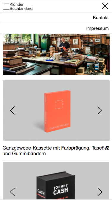
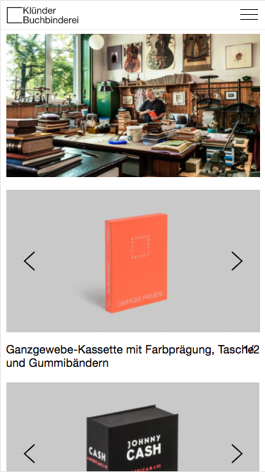
In the first two screenshots, you see the Mobile preview of my browser (looks the same in Chrome and Safari) and this is (almost) how it is supposed to look like.
First thing you'll notice is that the image caption runs into the numbers on the right site.
My main problem tho is that if I review the site on my iPhone on chrome and on safari, the gridder settings, as well as the alternative logo, don‘t adopt.
Also, I get an extra "x" for closing the menu which is weird
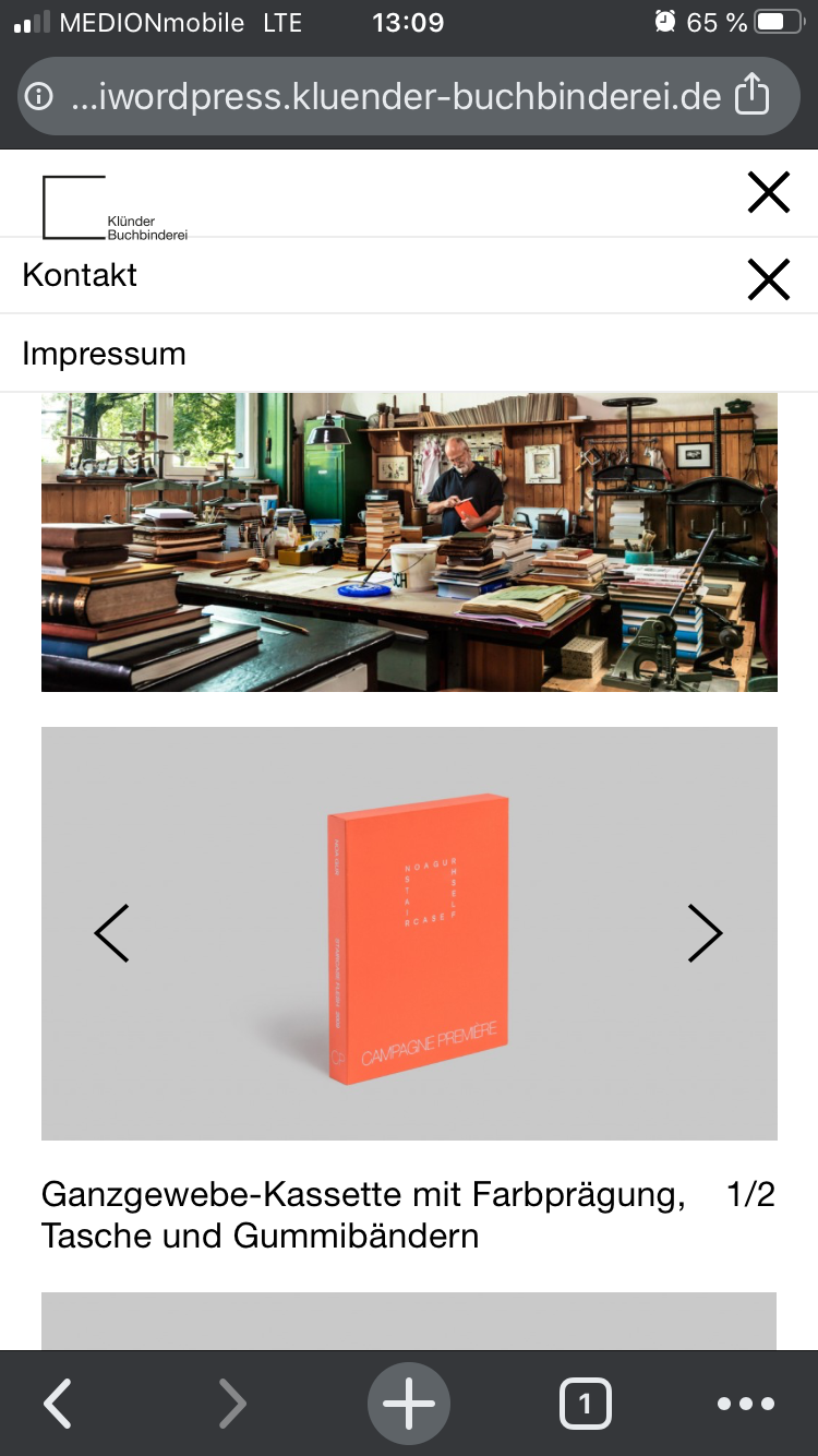
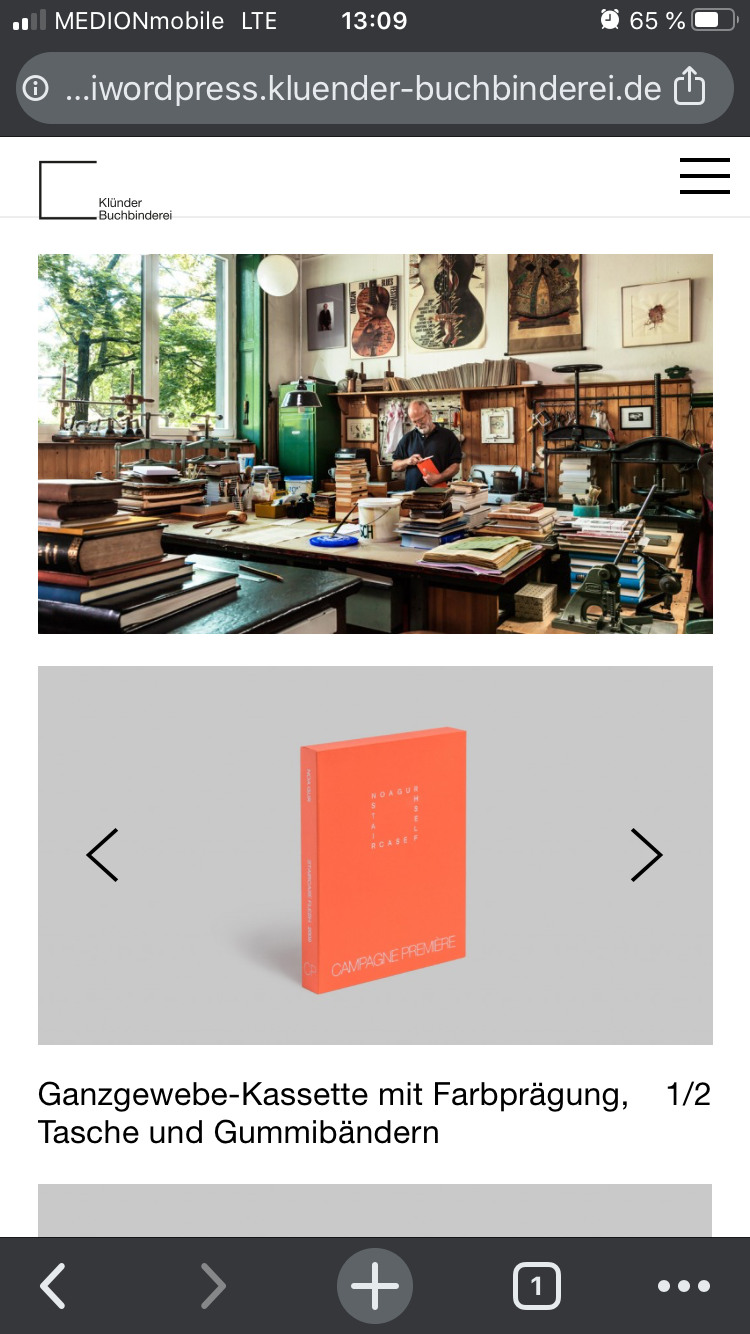
Does anyone have a clue why it looks like this?
I'm grateful for your help.All the best,
Henning -
… And now my Burger Icon disappeared.
I tried to change the Gridder defaults in the customizer and tried to change them in the project menu when i switched to phone layout. Nothing changes either way. I'm confused.
It always looks great on my laytheme preview mode tho.
Thanks for helping!
Henning -
Dear @Henning
Do you have any third-party plugins installed or CUSTOM JS code? Is it possible to deactivate it for a moment to see if the problem remains?
Do you have everything up-to-date?
Wordpress, Plugins, Laytheme?
Many wishes!
Marius -
Dear @mariusjopen
I loged in to WP on safari and then nit worked.
Dont know what happened but thanks! -
Dear @Henning
Nice!
Thank you for letting us know!
Best and have a wonderful day!
Marius
I also code custom websites or custom Lay features.
💿 Email me here: 💿
info@laytheme.com
Before you post:
- When using a WordPress Cache plugin, disable it or clear your cache.
- Update Lay Theme and all Lay Theme Addons
- Disable all Plugins
- Go to Lay Options → Custom CSS & HTML, click "Turn Off All Custom Code", click "Save Changes"
This often solves issues you might run into
When you post:
- Post a link to where the problem is
- Does the problem happen on Chrome, Firefox, Safari or iPhone or Android?
- If the problem is difficult to explain, post screenshots / link to a video to explain it