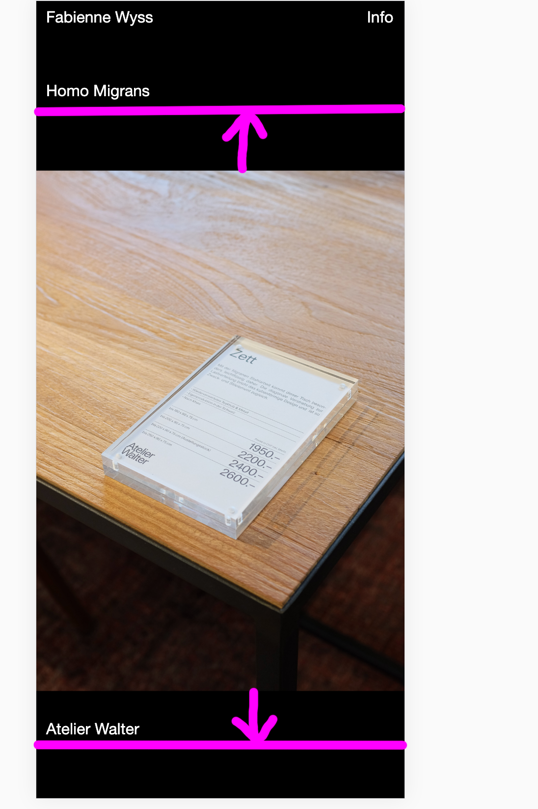
Mobile Layout: Portrait Images
-
Dear Armin and Marius
First of all: Thanks for Laytheme, its great!
For my website I use the carousel addon in a fullscreen slider.
In the desktop version I activated "100vh" and "multiple slides showed" in my carousels.
Here my website: www.fabiennewyss.comFor the mobile version I do not want to use the fullscreen slider nor the multiple slides. Here I activated in my carousel: "80vh" and slides width "100%". Works good so far, but I want the portrait images to be shown 100% in height (within the 80vh carousel) and the landscape images 100% in width. Is there any possibility to do so?
As I do know just some html basics, I do really appreciate your help!
Thanks!
Best, Fabienne -
Dear @fabiennne
It looks like this problem is solved, no?
Or do I miss something?
Best!
Marius -
Dear @mariusjopen
No, not really.
It depends on the device. With iphone 5/SE it looks like it would be solved, but if you have a look at a bigger mobile device, you will see the problem:

Thanks a lot!
Fabienne -
Dear @fabiennne
There is not really a "right" way to do this. You need to dig into the CSS. Do you have a friend who knows some CSS?
Best!
Marius
I also code custom websites or custom Lay features.
💿 Email me here: 💿
info@laytheme.com
Before you post:
- When using a WordPress Cache plugin, disable it or clear your cache.
- Update Lay Theme and all Lay Theme Addons
- Disable all Plugins
- Go to Lay Options → Custom CSS & HTML, click "Turn Off All Custom Code", click "Save Changes"
This often solves issues you might run into
When you post:
- Post a link to where the problem is
- Does the problem happen on Chrome, Firefox, Safari or iPhone or Android?
- If the problem is difficult to explain, post screenshots / link to a video to explain it