New Feature Covers Mobile
-
Hey Armin,
I love the new update, thank you so much !!
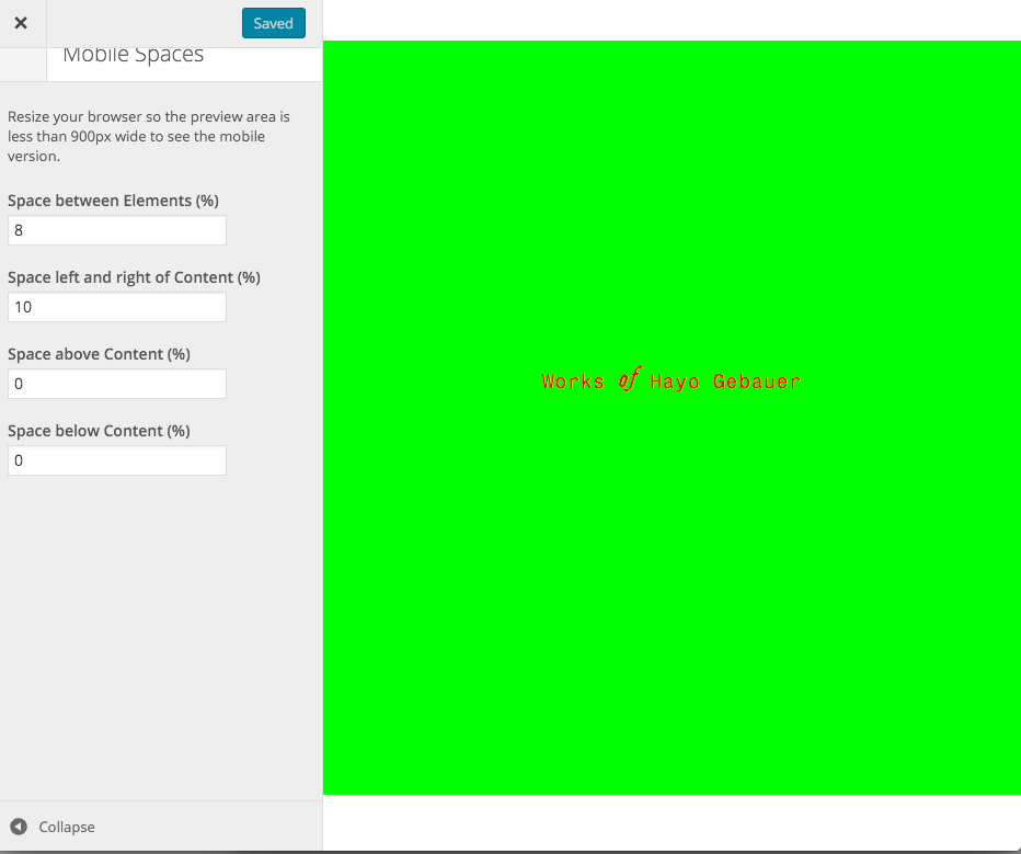
I'm testing out some of the stuff and see that with a Cover image in the mobile version, there seems to be a white bar on top, visible if the cover is a different color (or picture) than white.I tried putting the mobile space on top to 0%, didn't help.
And also now with the Cover option it would be nice to be able to set the the background color of the gridder to transparent, so the cover stays visible in the background.
Cheers!
-
Problem solved:
added this code to Custom CSS & HTML:
/background transparent/
body, #footer-region, #rows-region, #cover-region {
background-color: transparent;
} -
Hey, I'm happy that you like the new update!
I'm testing out some of the stuff and see that with a Cover image in the mobile version, there seems to be a white bar on top, visible if the cover is a different color (or picture) than white.
Can you maybe post a screenshot of that?
And also now with the Cover option it would be nice to be able to set the the background color of the gridder to transparent, so the cover stays visible in the background.
Ah but I thought the point of this feature is that the cover gets hidden in a nice way, but interesting way to do it :D
-
Ah thanks!
Hmm I guess that happened because the mobile menu is hidden. Thanks, will write that down and fix it one day. -
Problem solved:
added this code to Custom CSS & HTML:
/background transparent/
body, #footer-region, #rows-region, #cover-region {
background-color: transparent;
}
I also code custom websites or custom Lay features.
💿 Email me here: 💿
info@laytheme.com
Before you post:
- When using a WordPress Cache plugin, disable it or clear your cache.
- Update Lay Theme and all Lay Theme Addons
- Disable all Plugins
- Go to Lay Options → Custom CSS & HTML, click "Turn Off All Custom Code", click "Save Changes"
This often solves issues you might run into
When you post:
- Post a link to where the problem is
- Does the problem happen on Chrome, Firefox, Safari or iPhone or Android?
- If the problem is difficult to explain, post screenshots / link to a video to explain it

