Keep distance between Menu and Text content when minimized
-
Hi all,
I hope somebody can help me out with this.
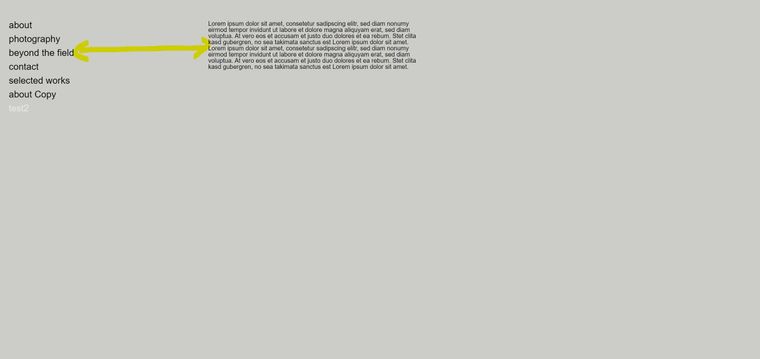
On my homepage i have a vertical menu. When i click one of the pages, the content (Text or picture) appears parallel to it with an specific distance (
 picture1)
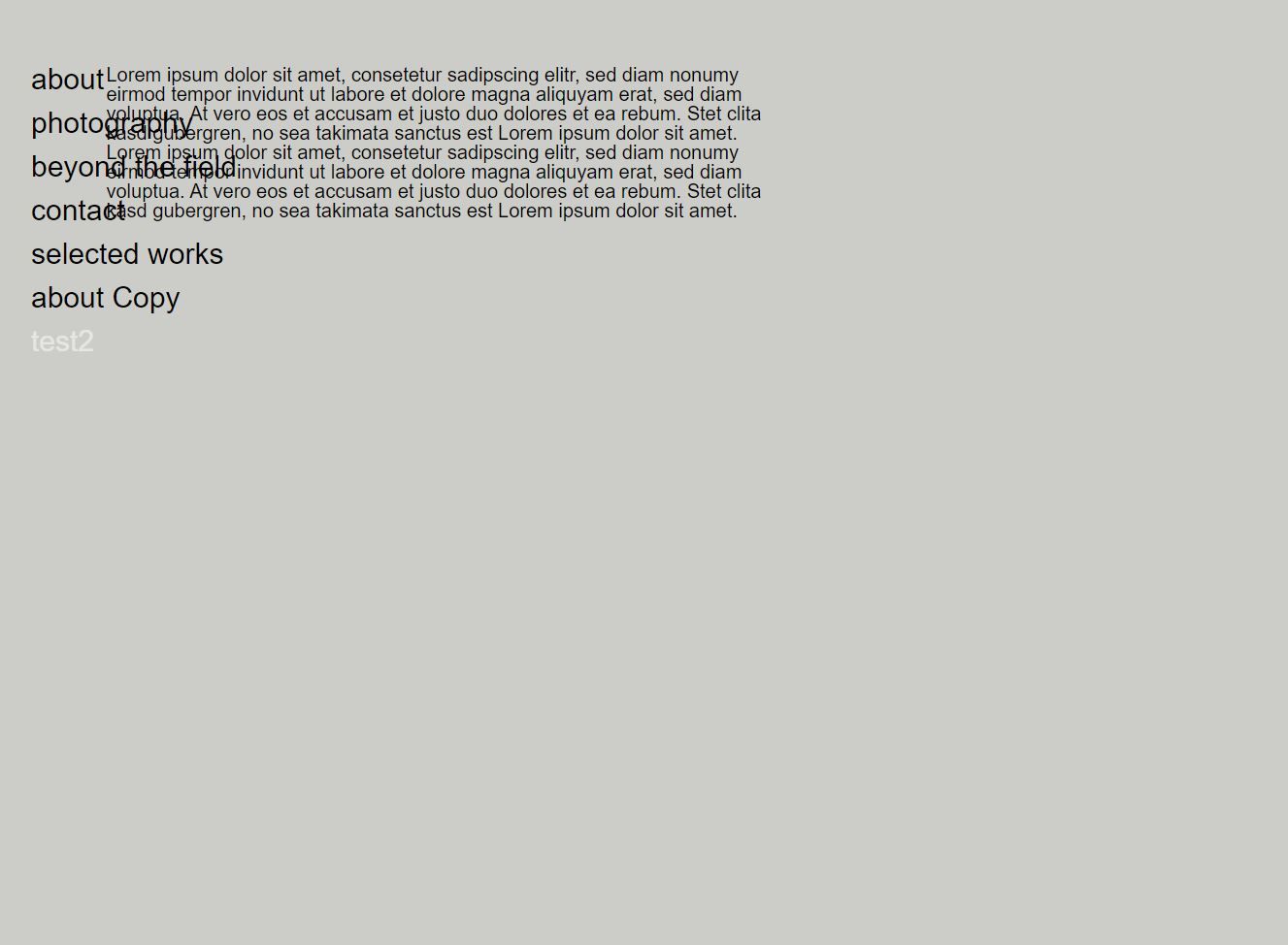
Which is pretty much want I want. When i minimize it, the text comes closer to the menu and it crashes into it (picture2) Even if its so much space that it could easily shrink it without moving. Is there a possibility to keep the same distance and only break it when its getting really small, like for a phone.Thank you

-
Hey!
hmm the spaces are all in percent, what you'd need is a space that is in pixels
use this css
.grid-inner{
padding-left: 300px;
}
in "custom css for desktop" in lay options -> custom css & html
now your grid will start at 300px so you can put ur text in the first column in the gridder and that should be cool
the css above is just for when u use the new lay theme version
I also code custom websites or custom Lay features.
💿 Email me here: 💿
info@laytheme.com
Before you post:
- When using a WordPress Cache plugin, disable it or clear your cache.
- Update Lay Theme and all Lay Theme Addons
- Disable all Plugins
- Go to Lay Options → Custom CSS & HTML, click "Turn Off All Custom Code", click "Save Changes"
This often solves issues you might run into
When you post:
- Post a link to where the problem is
- Does the problem happen on Chrome, Firefox, Safari or iPhone or Android?
- If the problem is difficult to explain, post screenshots / link to a video to explain it