Mobile Styles Not Working
-
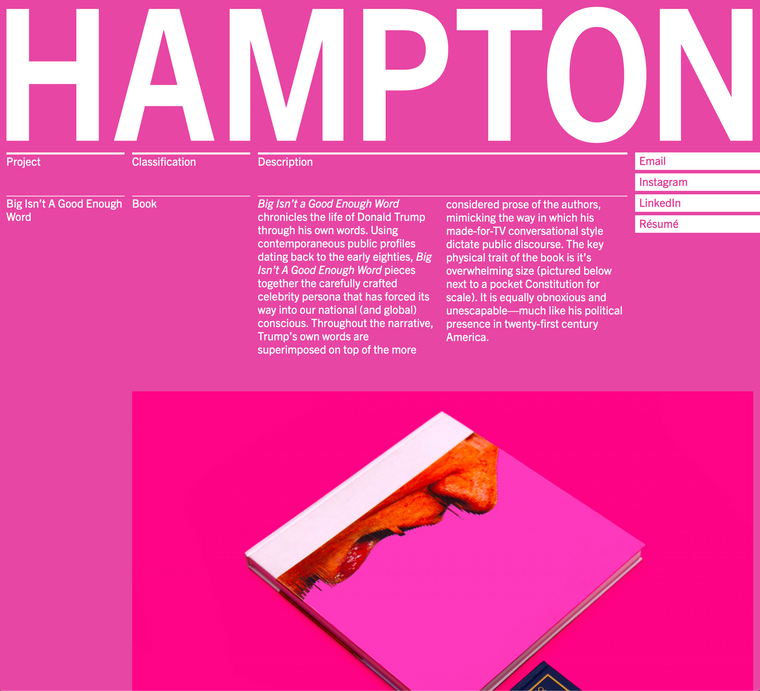
http://hampton.design/bigisntagoodenoughword
I am experiencing an issue where styles (which are page-specific and have been applied via jQuery) are not being applied correctly on mobile. What is confusing is that they continue to work fine on desktop (please see screenshots). This is happening across browsers. The issue first started appearing after the most recent update.


-
I have resolved this issue. These elements were being targeted by their ID. In the HTML DOM, the phone layout now appears underneath the standard desktop layout (I am not sure if this was always the case). So, the elements could not be targeted by their ID because they were appearing in the DOM for the second time. That is why the styles were being applied in desktop, but not mobile. Changing them from IDs to a class resolved the issue. Of course this is best practice, but I was unaware that the phone layout is a different set of DOM elements than the desktop layout.
-
Dear @hddunlap
Nice!
Thank you for letting us know!
Best and have a wonderful day!
Marius
I also code custom websites or custom Lay features.
💿 Email me here: 💿
info@laytheme.com
Before you post:
- When using a WordPress Cache plugin, disable it or clear your cache.
- Update Lay Theme and all Lay Theme Addons
- Disable all Plugins
- Go to Lay Options → Custom CSS & HTML, click "Turn Off All Custom Code", click "Save Changes"
This often solves issues you might run into
When you post:
- Post a link to where the problem is
- Does the problem happen on Chrome, Firefox, Safari or iPhone or Android?
- If the problem is difficult to explain, post screenshots / link to a video to explain it