Title visible on thumbnail on ipad and smartphones
-
Hi,
I just made my new website with LAY, it’s awesome, really, you can do a lot of things.
I just have two questions:1/ On my homepage, I put the title on the projects’ thumbnails.
Hidden with mouseout, visible in mousein with a low opacity for the photo.
The problem is with Ipad and smartphone screens, the title is always visible and not legible (because there isn’t low opacity on the photo).
Is it possible to hide the title on those devices ?2/ Under 900px width the website turns in smartphone layout.
Isn't it strange on a computer to have this layout (each elements under each other ) between 500 px and 900px.Would it be possible to have an other layout between those dimensions?
For example, could we have 2 thumbnails on the same line between 500 and 900px ( when usually it’s 3 or 4 thumbnails for a window larger than 900px) ?
Or a reorganisation of the pictures, so that for exemple, the last picture on the first line can go to the beginning of the second line and so on.Thanks a lot for your help
Adrien -
Hey Adrien!
- Yeah, the thumbnails titles show up on touch devices because theres no mouseover and normally you wouldn't be able to read the titles.
Try this CSS for both "desktop css" and "mobile css" in "misc options"
html.touchevents{ .title a, .title{ opacity: 0!important; } }- Ok, nice idea! Hm, not sure if I will code that.
-
Hi Armin,
Thank you for your answer,
1/ Unless there is a cache memory I think it doest work, I can still see titles on the thumbnails :confused:
2/ and can we still have the same layout when the window is between 500 and 900px as when it is 1200 ?
-
Oh yeah, I used the sass syntax :O but the proper css is:
html.touchevents .title a{ opacity: 0!important; } html.touchevents .title{ opacity: 0!important; }- Nope, the breakpoint is hard coded at 900px. Maybe I will code that as a feature one day that ppl will be able to set that value by themselves
-
Perfect, thanks Armin
You deserve a donation !
++ -
haha <3 thx
-
Hi Armin,
I still use the first free version of Laytheme.
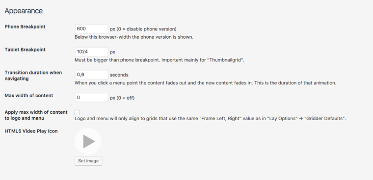
Does is possible to move the breakpoint from 900px to 600px in the new version ?
I would have the same layout when the window is between 600 and 900px as when it is 1200.Thanks in advance !
Adrien -
Hey Adrien!
In the updated version of LAyTheme you can set the breakingpoint:

All the best!
Marius
-
Awesome — Thanks a lot Marius.
Best.
I also code custom websites or custom Lay features.
💿 Email me here: 💿
info@laytheme.com
Before you post:
- When using a WordPress Cache plugin, disable it or clear your cache.
- Update Lay Theme and all Lay Theme Addons
- Disable all Plugins
- Go to Lay Options → Custom CSS & HTML, click "Turn Off All Custom Code", click "Save Changes"
This often solves issues you might run into
When you post:
- Post a link to where the problem is
- Does the problem happen on Chrome, Firefox, Safari or iPhone or Android?
- If the problem is difficult to explain, post screenshots / link to a video to explain it