Cover feature: Mobile margin
-
Hey hey,
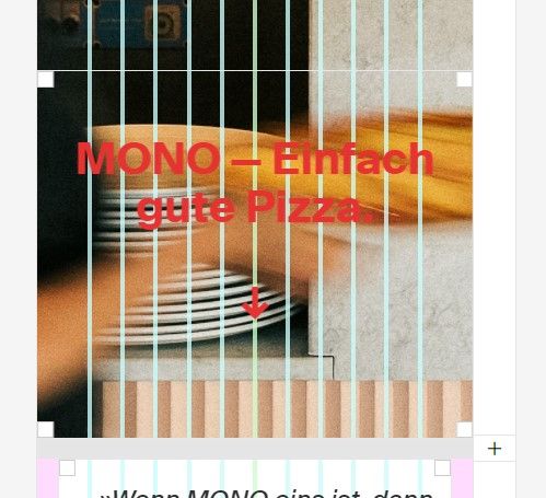
after a round of updates, I've noticed a weird margin appeard in my phone/mobile layouts (desktop is fine) when using the Cover feature:

As far as I can tell, there's no custom CSS / or Plugin that would cause this. (And I can't figure out how to move it back via custom css)

(it should be centered)some curiosities:
When I disable the cover completely on a project, the text is back where it should be.
When I use the checkbox in the settings to disable the cover on mobile-layouts, the feature is disabled but the margin stays :Dhere's a link: https://merkmal.de/category/projekte/
Thanks in advance :)
-
hey thanks for the heads up, will fix this
-
if you update lay theme, this should be fixed! <3
I also code custom websites or custom Lay features.
💿 Email me here: 💿
info@laytheme.com
Before you post:
- When using a WordPress Cache plugin, disable it or clear your cache.
- Update Lay Theme and all Lay Theme Addons
- Disable all Plugins
- Go to Lay Options → Custom CSS & HTML, click "Turn Off All Custom Code", click "Save Changes"
This often solves issues you might run into
When you post:
- Post a link to where the problem is
- Does the problem happen on Chrome, Firefox, Safari or iPhone or Android?
- If the problem is difficult to explain, post screenshots / link to a video to explain it