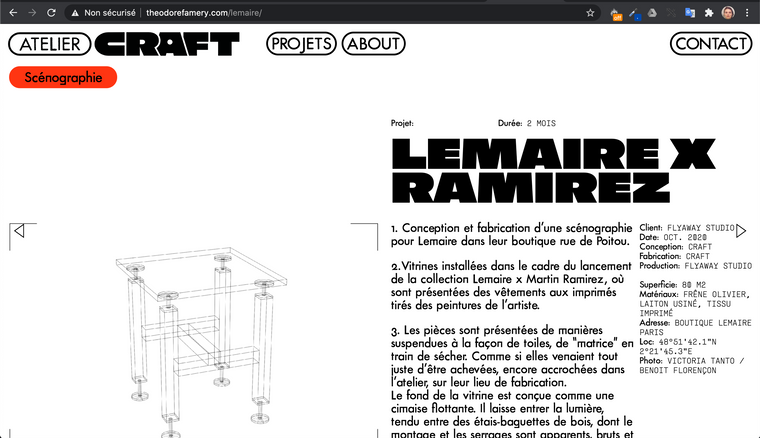
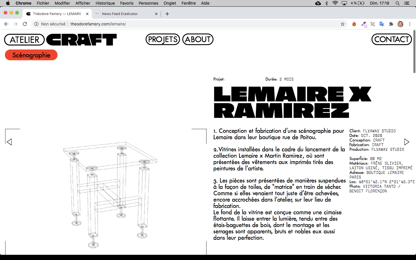
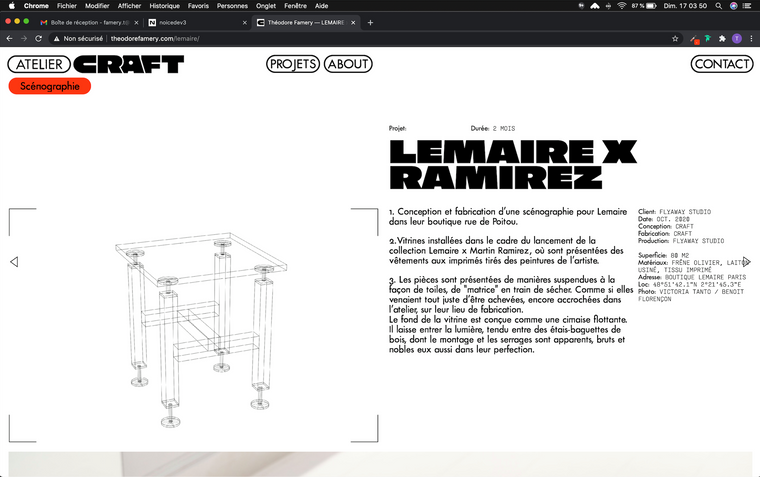
Different scale between laptops
-
Hi all,
I have a resolution (or a responsive?) problem. My website doesn't have the same typographie and buttons size on different laptops.
- The first screenshot one from a MacBook Pro (13-inch, 2017) Google Chrome Version 86.0.4240.198

- The second one is from a MacBook Air (13-inch, 2011) Google Chrome Version 86.0.4240.80

- The third one from a MacBook Pro (15inch, 2016) Google Chrome 87.0.4280.88

The problem is mostly on the first screenshoot, but It's the most recent laptop, so it's quite anoying.
How can I fix it ?
Thanks
- The first screenshot one from a MacBook Pro (13-inch, 2017) Google Chrome Version 86.0.4240.198
-
Dear @EvaAnna
It could be to do with you using 'px' pixels for your 'font-size' settings, on different machines/screen this can be affected.
In text formats changing to a 'font-size: % ' may have some results:

Further you could force them with Custom CSS and set font-size: to 'em' or "rem'
https://www.w3schools.com/cssref/css_units.aspHope this helps @EvaAnna, website looks awesome BTW :)
Best
Richard
I also code custom websites or custom Lay features.
💿 Email me here: 💿
info@laytheme.com
Before you post:
- When using a WordPress Cache plugin, disable it or clear your cache.
- Update Lay Theme and all Lay Theme Addons
- Disable all Plugins
- Go to Lay Options → Custom CSS & HTML, click "Turn Off All Custom Code", click "Save Changes"
This often solves issues you might run into
When you post:
- Post a link to where the problem is
- Does the problem happen on Chrome, Firefox, Safari or iPhone or Android?
- If the problem is difficult to explain, post screenshots / link to a video to explain it