Chrome Bottom Navbar Overlapping 100vh content
-
Hey guys,
I have the same problem with the fullscreen-slider in mobile chrome browser. The bottom navbar of chrome overlaps important content of the fullscreen slider – as shown in the pictures. Is there any fix for that?
URL PW: Studio_W-2021!
Best, Johannes.


-
@Richard-K said in Chrome Bottom Navbar Overlapping 100vh content:
body{
height:100vh;
}Hey @Richard-K thanks for your quick reply and a happy 2021 for you as well.
No, unfortunately it seems, that the fullscreen-slider doesn't work with mobile chrome, because the height of the slides is overflowing the height of the viewport – top browser bar too bottom browser bar.
Is there any workaround for chrome?
Best, Johannes.
-
Hey have you updated both lay theme and the fullscreen slider addon and then made sure to clear your cache in case you use a caching plugin?
-
Mmh yes i see you did update both, looking into this now!
-
Hey
So on an iPhone 8, Chrome I see it works properly:
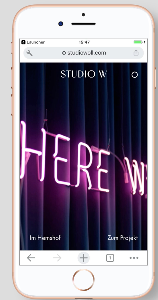
on an iPhone 11 it works too:

It also works on an Android Samsung Galaxy in Chrome:

Which smartphone and which iOS version are you using?
-
@arminunruh Hey Armin, I'm sorry but now I have the exact same problem with the carousel slider add-on :/ Do you have any solution for that? Best, Johannes.


-
hey please create a slider where you're having the issue and send the link to me to info@laytheme.com and also include a link to this topic
-
-
Hey,
Sorry I didn't have time to fix this fast.So a 100vh carousel works for me without overlaps on an iPhone on Safari and Chrome.
A fullscreen slider slide also has the correct height on a mobile browser.
However, I do see that when we have a carousel inside of a fullscreen slider an overlap can result.
I cannot access the link you sent to me so I'm not sure what is going on on your website. Please send it again and send the password that it is protected with and maybe send your /wp-admin/ login.
-
hey @jwk
Ok I could take a closer look now.
Only the first row that is browserheight gets a special height that is browserheight minus browserbars.
All following browserheight rows dont have that special height.
Cause when you scroll down the browserbars disappear and then these rows would not fill out the browser.In your layout, your first row is a special row that you use custom css with. It seems that this row is position absolute and this way it is not part of the so called "document flow" and this way your second row is actually your first row.
If I just change their order like this:
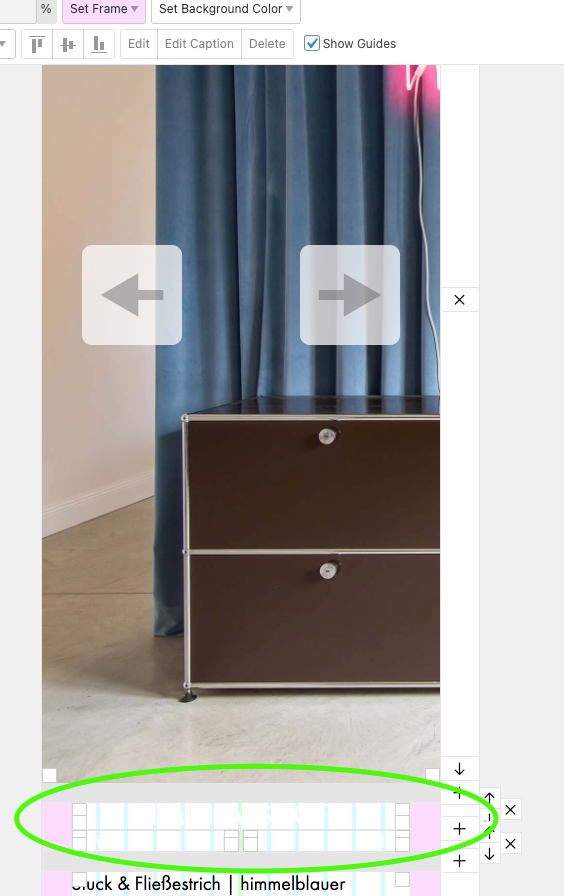
This way the first row is the browser height row and this way it gets the correct height.
I also code custom websites or custom Lay features.
💿 Email me here: 💿
info@laytheme.com
Before you post:
- When using a WordPress Cache plugin, disable it or clear your cache.
- Update Lay Theme and all Lay Theme Addons
- Disable all Plugins
- Go to Lay Options → Custom CSS & HTML, click "Turn Off All Custom Code", click "Save Changes"
This often solves issues you might run into
When you post:
- Post a link to where the problem is
- Does the problem happen on Chrome, Firefox, Safari or iPhone or Android?
- If the problem is difficult to explain, post screenshots / link to a video to explain it