Problem with Row Gutter
-
Hi, thank you very much for this great theme!
I have one problem:
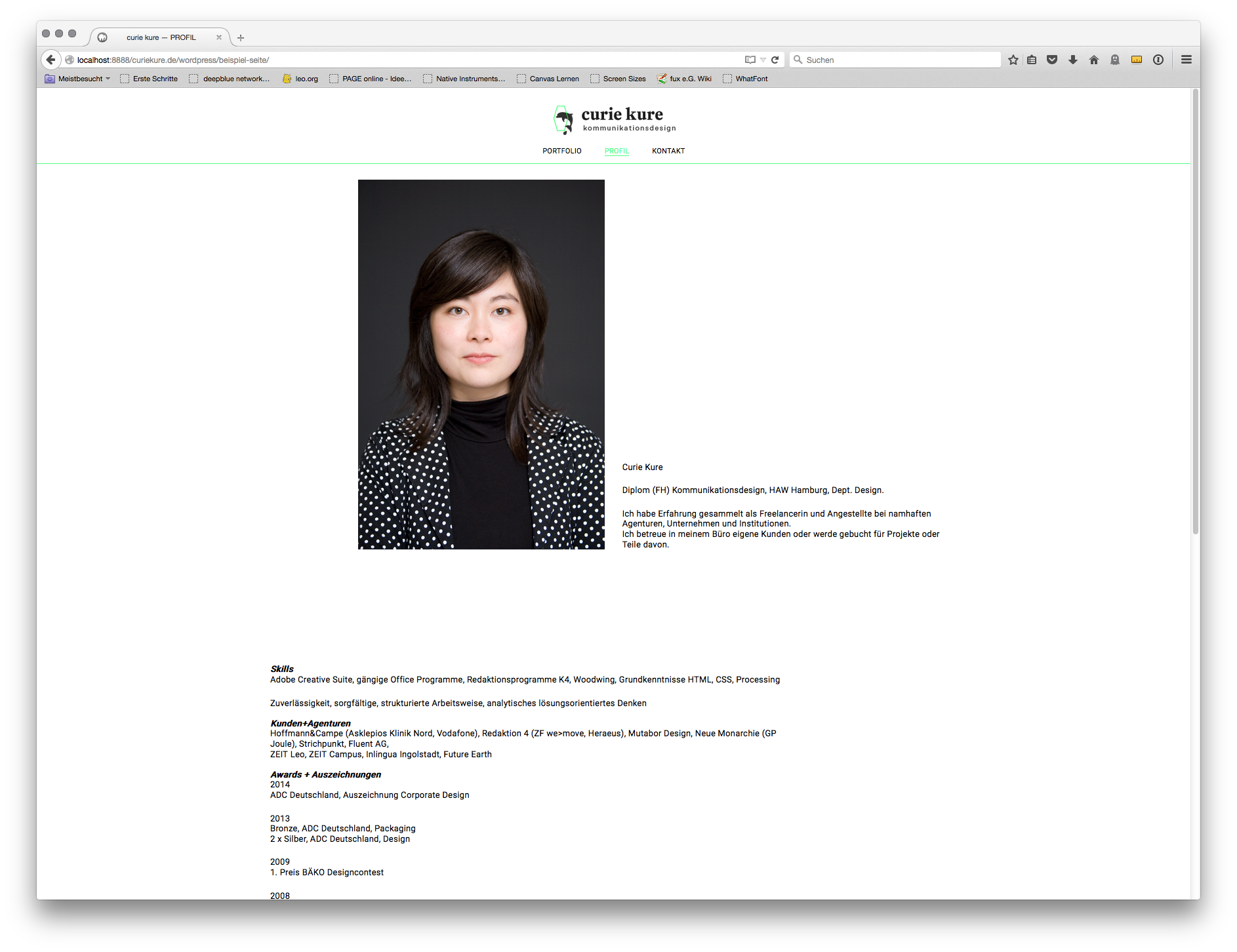
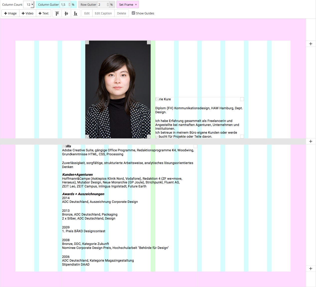
I created a page with one image and two texts in two rows. In the upper row is the photo and text 1. Then I added one gutter row, and at the bottom the 2nd text box. I adjusted the gutter rows to 2% in the general gridder options.
This works perfectly on all pages except for this one. On the website it looks like the text is maybe aligned to the bottom. But I changed that in the options already.
I tried to delete the text and add it from scratch. And I also created the whole new page from scratch. But still no change...
Do you have a clue or any experience with this?

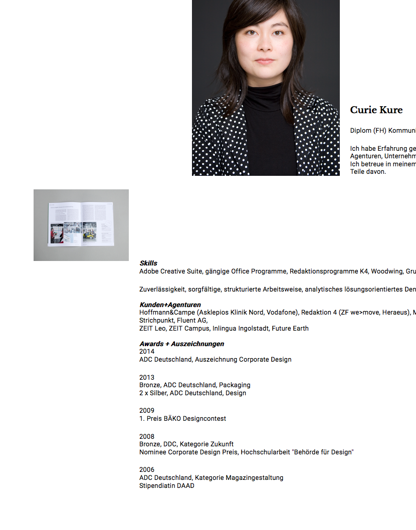
When I add another image aligned to top of the text box, the image is aligned correctly, the text stays in its position.

Thank you very much for any tips!
-
Hey! :)
Hmm ok as it looks you don't have an empty row in between do you? Maybe in the gridder you can click on the rowgutter thats misbehaving and set it again manually?
Maybe you are using a textformat that has a big "space top" value for the last text?Can you upload the site somewhere so I can take a look?
-
Yeah you have to export your database, rename all the urls in your database and import that to your host ^^. If you like I can help u with that.
I also code custom websites or custom Lay features.
💿 Email me here: 💿
info@laytheme.com
Before you post:
- When using a WordPress Cache plugin, disable it or clear your cache.
- Update Lay Theme and all Lay Theme Addons
- Disable all Plugins
- Go to Lay Options → Custom CSS & HTML, click "Turn Off All Custom Code", click "Save Changes"
This often solves issues you might run into
When you post:
- Post a link to where the problem is
- Does the problem happen on Chrome, Firefox, Safari or iPhone or Android?
- If the problem is difficult to explain, post screenshots / link to a video to explain it