Website on the phone : optimisation and ergonomy problems
-
Hello :)
Here my unfinished website : cactusauvage.com
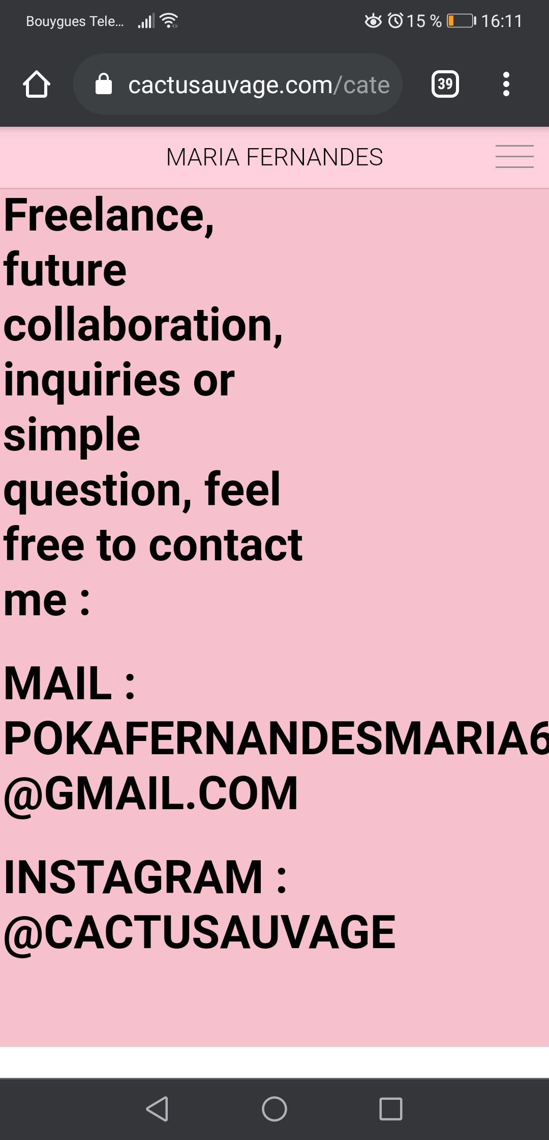
After spending time on pages of my website, I've realise that my about page was clean on the website but completely out of the page on my phone, how to fix that ?
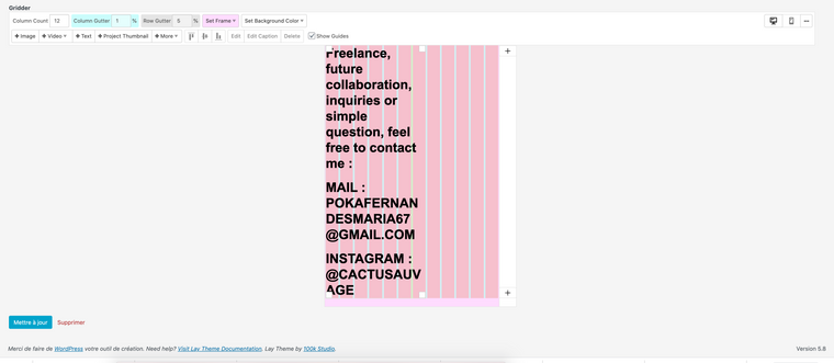
I've noticed the same problems on the contact page and the title of the website seen on ipad.Also in the custom phone layouts, results aren't matching reality, here an exemple :


-
Dear @cactusauvage
Great website 🌞
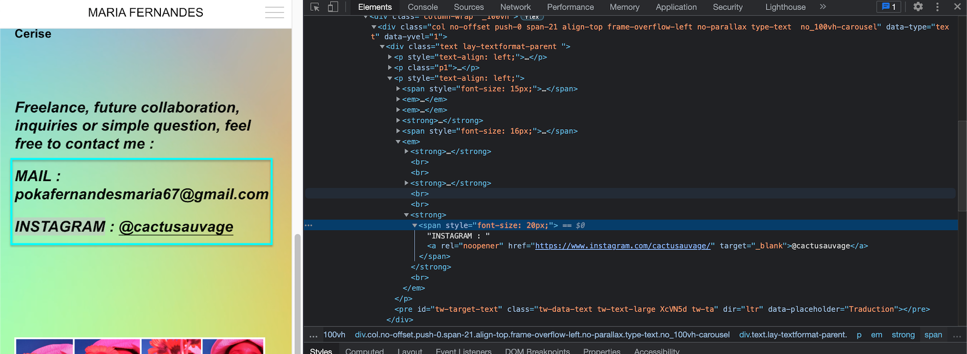
Did you have "text formats" applied that would make them like that on mobile? Currently everything is working correctly? :

Talk soon & best wishes
Richard
-
I've never use that tool "text formats", I will make more investigations about it, merci !
-
Dear @cactusauvage
Good luck!, please refer to the Text Formats documentation if needed. 🌝
Best wishes
Richard
I also code custom websites or custom Lay features.
💿 Email me here: 💿
info@laytheme.com
Before you post:
- When using a WordPress Cache plugin, disable it or clear your cache.
- Update Lay Theme and all Lay Theme Addons
- Disable all Plugins
- Go to Lay Options → Custom CSS & HTML, click "Turn Off All Custom Code", click "Save Changes"
This often solves issues you might run into
When you post:
- Post a link to where the problem is
- Does the problem happen on Chrome, Firefox, Safari or iPhone or Android?
- If the problem is difficult to explain, post screenshots / link to a video to explain it