Full Screen Slider slides overflowing on PHONE
-
Dear @treh16
I understand its urgent, so going into deeper debugging may come later. For now please see the following code:
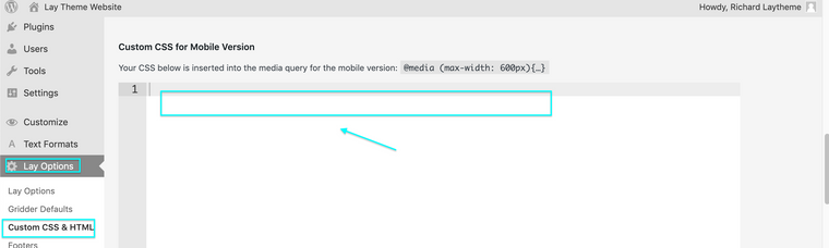
html.is-iphone.is-safari #custom-phone-grid .fp-section {min-height: 100vh !important}This is saying as long as its on Iphone and Safari (where the problem is occuring) all Full screen slider slides within a custom phone grid will be forced to 100vh or 100% height of the browser. This solves the issue on my end. Please add the above code into > Lay Options > Custom CSS & HTML > Custom CSS for Mobile Version >
Let me know how you go @treh16 & have a wonderful day! 🌻
Best wishes
Richard
-
Dear @treh16
When looking at the code, you may have entered it with a typo? (space-between 100vh & !important)
html.is-iphone.is-safari #custom-phone-grid .fp-section {min-height: 100vh!important}However If you would like, as it may speed things up for you, please send me your Login details via 'Chats' and i will have a closer inspection. 🔍
(NOTE: do not disclose private info on the thread itself)
Talk soon & best wishes 🌝
Richard
-
Dear @treh16
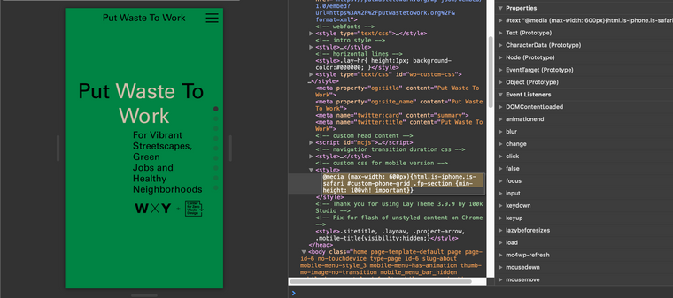
Thank you for the login details - so i was wondering why....
Then i realised- Only on Iphone - Only on Safari!
The area down the bottom is meant to be this way because of the menu bar at the bottom of Safari on Iphone:
I believe this is built in for that purpose because you would lose content due to the menu bar - sorry i did not think of this initially!!
When viewing within Safari responsive mode this is not taken into account - Maybe there is still issue you can see so let me know your thoughts and if i can help further 🌝
Best wishes @treh16 & have a great day
Richard
-
Dear @treh16
Thank you for the login details - so i was wondering why....
Then i realised- Only on Iphone - Only on Safari!
The area down the bottom is meant to be this way because of the menu bar at the bottom of Safari on Iphone:
I believe this is built in for that purpose because you would lose content due to the menu bar - sorry i did not think of this initially!!
When viewing within Safari responsive mode this is not taken into account - Maybe there is still issue you can see so let me know your thoughts and if i can help further 🌝
Best wishes @treh16 & have a great day
Richard
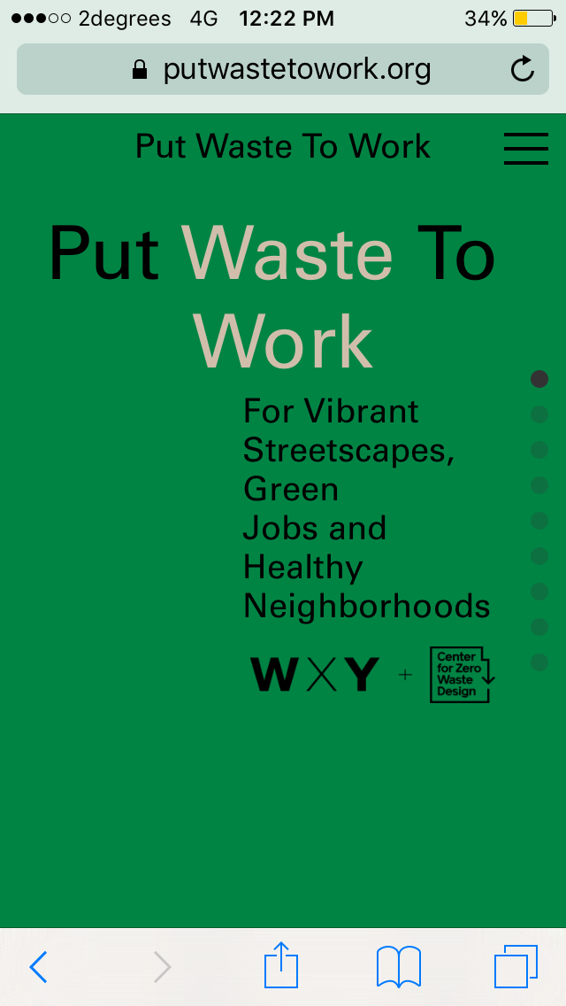
@Richard the new iOS 15 has put Safari's address bar on the bottom, is that what you meant? This is not my customisation -> this is how all new iPhones Safaris look like now.
If yes, how can we make sure that all people on iOS 15 Safari would be able to view the site without this problem?
-
Dear @treh16
"If yes, how can we make sure that all people on iOS 15 Safari would be able to view the site without this problem?"
I have added some small code to fix the issue, could you confirm on your end no problems? please test in incognito windows to be sure its not the old cache coming through.
Best wishes ✨
Richard
-
@Richard thanks, this solved it for Portrait view. When I flip the phone to landscape, the slider is not fullscreen anymore and has lot's of content overflow.
See video below:
-
Dear @treh16
Could you please put the Custom CSS from earlier into the main CSS Area rather than mobile, I think the Browser width when the device rotates is not respecting the Mobile CSS media query. I would do this myself to save you the trouble of testing but i am unable to login as earlier.
.is-safari #custom-phone-grid .fp-section {
    min-height: 100vh !important;
    height:100vh !important;
}

.is-iphone #custom-phone-grid .fp-section {
    min-height: 100vh !important;
    height:100vh !important;
}
.is-safari #custom-phone-grid .fp-auto-scroll {
    min-height: 100vh !important;
    height:100vh !important;
}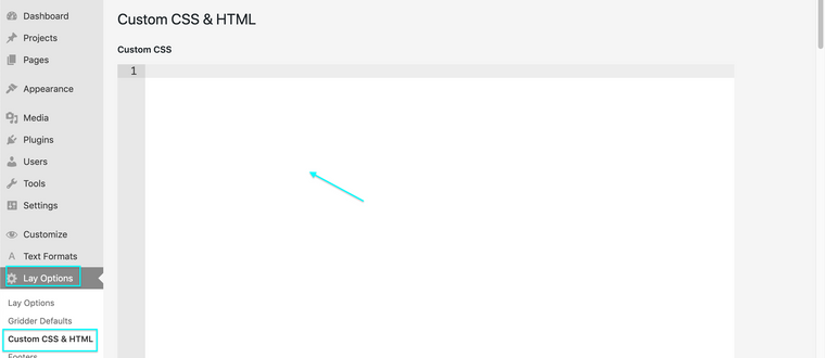
Talk soon @treh16 & best wishes
Richard
-
Dear @treh16
Could you please put the Custom CSS from earlier into the main CSS Area rather than mobile, I think the Browser width when the device rotates is not respecting the Mobile CSS media query. I would do this myself to save you the trouble of testing but i am unable to login as earlier.
.is-safari #custom-phone-grid .fp-section {
    min-height: 100vh !important;
    height:100vh !important;
}

.is-iphone #custom-phone-grid .fp-section {
    min-height: 100vh !important;
    height:100vh !important;
}
.is-safari #custom-phone-grid .fp-auto-scroll {
    min-height: 100vh !important;
    height:100vh !important;
}
Talk soon @treh16 & best wishes
Richard
@Richard said in Full Screen Slider slides overflowing on PHONE:
.is-safari #custom-phone-grid .fp-section {
min-height: 100vh !important;
height:100vh !important;
}.is-iphone #custom-phone-grid .fp-section {
min-height: 100vh !important;
height:100vh !important;
}
.is-safari #custom-phone-grid .fp-auto-scroll {
min-height: 100vh !important;
height:100vh !important;
}Hi @Richard , tried that, unfortunately didn't help. This is not an issue only with Safari, the same on mobile Chrome, or Desktop's Safari "Responsive design mode feature"


I also code custom websites or custom Lay features.
💿 Email me here: 💿
info@laytheme.com
Before you post:
- When using a WordPress Cache plugin, disable it or clear your cache.
- Update Lay Theme and all Lay Theme Addons
- Disable all Plugins
- Go to Lay Options → Custom CSS & HTML, click "Turn Off All Custom Code", click "Save Changes"
This often solves issues you might run into
When you post:
- Post a link to where the problem is
- Does the problem happen on Chrome, Firefox, Safari or iPhone or Android?
- If the problem is difficult to explain, post screenshots / link to a video to explain it