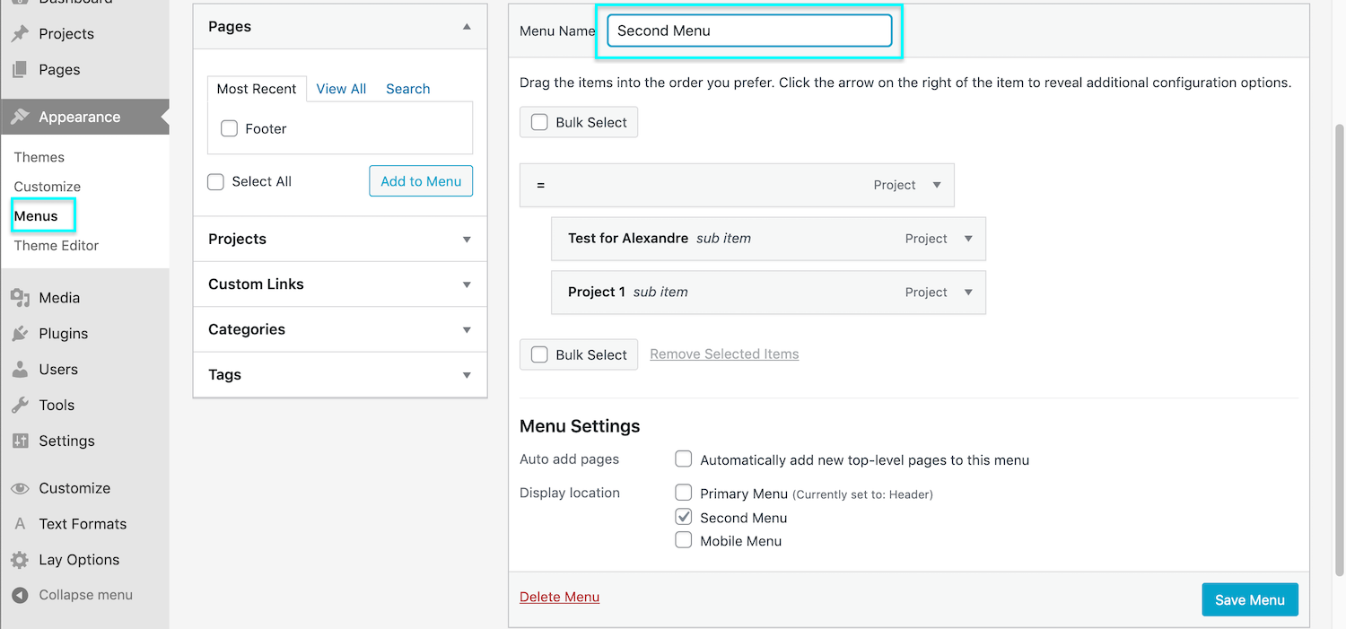
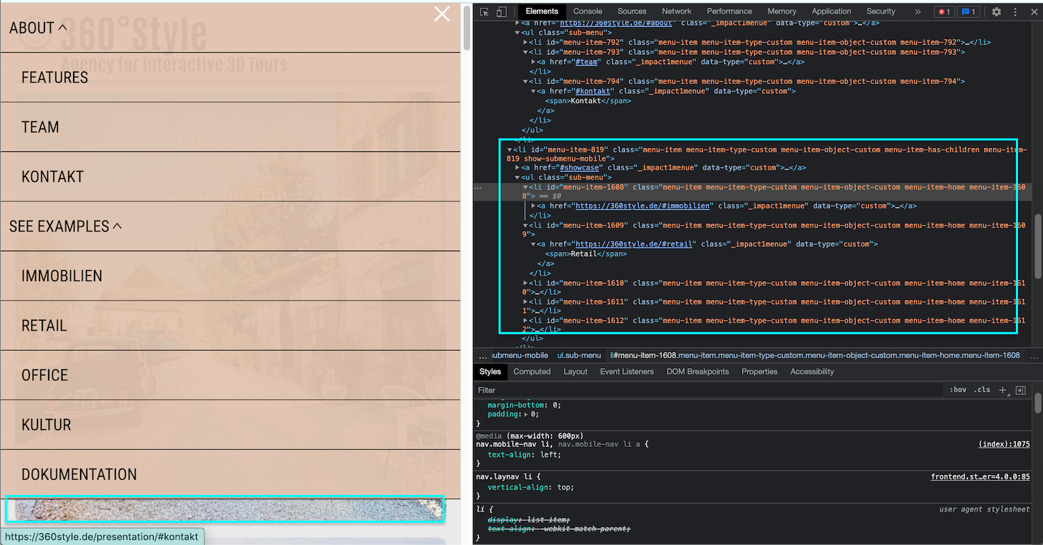
2 different mobile menus on 2 different sites
-
Dear G
@vernandel
Could you please share the Code you are currently using?
Best wishes & have a wonderful day 🌝
Richard
-
hey richard!
see below custom cssi am looking for how to:
online_april-21 with main menu at desktop and mobilepresentation with second menu at desktop and mobile
thank you so much
}
.slug-presentation .laynav.primary {
display:none;
}.slug-presentation .laynav.mobile-nav {
display:none;
}.slug-presentation .sitetitle {
display:none;
}.slug-online_april-21 .navbar {
display:none;
}.slug-online_april-21 nav.desktop-nav.second_menu {
display:none;}
-
Dear @vernandel
online_april-21 has the main menu for desktop & mobile but no secondary menu:
.slug-online_april-21 .navbar .second_menu {
display:none;
}
Presentation has the second menu for desktop & mobile but no main menu:
.slug-presentation .laynav.primary {
display:none;
}
I am unable to find your Second Menu on Mobile on the page presentation. It should normally be added to the other menu points. For example here i have a "second menu" set:

& The result:

however with your Secondary Menu we have it present:

But it's not present in the HTML (with your css removed - to make it display):

Do you know why this may be? 🤔
Talk soon @vernandel & have a great day 🏖
Richard
-
Dear @vernandel
online_april-21 has the main menu for desktop & mobile but no secondary menu:
.slug-online_april-21 .navbar .second_menu {
display:none;
}
Presentation has the second menu for desktop & mobile but no main menu:
.slug-presentation .laynav.primary {
display:none;
}
I am unable to find your Second Menu on Mobile on the page presentation. It should normally be added to the other menu points. For example here i have a "second menu" set:

& The result:

however with your Secondary Menu we have it present:

But it's not present in the HTML (with your css removed - to make it display):

Do you know why this may be? 🤔
Talk soon @vernandel & have a great day 🏖
Richard
@Richard
dear richard,
to answer your question: i really don't know.is it generally possible to have main menu displayed as mobil menu at site online_april-21 (YES)
and in the sam time have a second menu displayed as a mobil menu at presentation? or is it something that just don't work?thank YOU
g. -
Dear @vernandel
It is very possible for both ✅
However you second menu is not appearing on the presentation page in Mobile view, you will need to look into that.-
Create a test a page and setup a secondary menu.
-
Does the second menu appear on Mobile as well as desktop?
-
If it appears on Mobile good, we can then work from there
-
If not then further debugging is needed
Talk soon & best wishes 🌞
Richard
-
-
hey hey,
test page: https://360style.de/test/
the second menu appears as desktop but not on mobile
CSS:
.slug-test .laynav.primary {
display:none;
}.slug-test .laynav.mobile-nav {
display:none;
}any idea what to do next?
thank you
g. -
hey hey,
test page: https://360style.de/test/
the second menu appears as desktop but not on mobile
CSS:
.slug-test .laynav.primary {
display:none;
}.slug-test .laynav.mobile-nav {
display:none;
}any idea what to do next?
thank you
g. -
Dear @vernandel
This is turning into quite the problem isnt it!? 🌝🤔
If you feel comfortable doing so, please send me your login details via 'Chats' and i will look further into why this secondary menu is not displaying as it should.( Note: Please do not disclose your private info on the thread itself )
Best wishes & have a wonderful day ✨
Richard
-
Dear @vernandel
Great thank you for the Login details, also thank you for having such a clean setup 🌝
Please check out https://360style.de/presentation/ as now i believe it's the setup you wanted.
The Sub-menu was not showing up because the Mobile Menu in > Appearance > Menu's was set to only display the primary menu, I set it back to default so that your Sub-menu would appear.

The following CSS was removed:
.slug-presentation .laynav.mobile-nav {
    display:none;
 }
& Replaced by:
.slug-presentation .laynav.mobile-nav .menu-item-1244 {
   display:none;
}

.slug-presentation .laynav.mobile-nav .menu-item-819 {
   display:none;
}
Glad we finally got there @vernandel
Because I needed to change the Mobile-menu setup you may need to see if this has effected anything, but Im happy that Lay Theme functions are working as they should and not at fault 🐛
Best wishes ✨
Richard
-
Dear @vernandel
Great thank you for the Login details, also thank you for having such a clean setup 🌝
Please check out https://360style.de/presentation/ as now i believe it's the setup you wanted.
The Sub-menu was not showing up because the Mobile Menu in > Appearance > Menu's was set to only display the primary menu, I set it back to default so that your Sub-menu would appear.

The following CSS was removed:
.slug-presentation .laynav.mobile-nav {
    display:none;
 }
& Replaced by:
.slug-presentation .laynav.mobile-nav .menu-item-1244 {
   display:none;
}

.slug-presentation .laynav.mobile-nav .menu-item-819 {
   display:none;
}
Glad we finally got there @vernandel
Because I needed to change the Mobile-menu setup you may need to see if this has effected anything, but Im happy that Lay Theme functions are working as they should and not at fault 🐛
Best wishes ✨
Richard
-
I also code custom websites or custom Lay features.
💿 Email me here: 💿
info@laytheme.com
Before you post:
- When using a WordPress Cache plugin, disable it or clear your cache.
- Update Lay Theme and all Lay Theme Addons
- Disable all Plugins
- Go to Lay Options → Custom CSS & HTML, click "Turn Off All Custom Code", click "Save Changes"
This often solves issues you might run into
When you post:
- Post a link to where the problem is
- Does the problem happen on Chrome, Firefox, Safari or iPhone or Android?
- If the problem is difficult to explain, post screenshots / link to a video to explain it