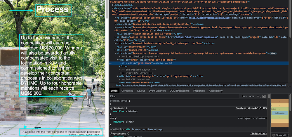
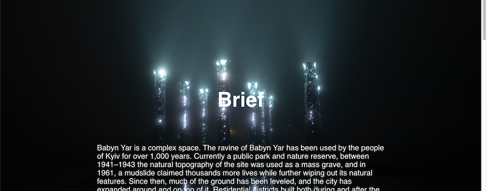
Text placement over background image gets lost on mobile
-
Hi there,
Been getting to know and enjoying the Lay Theme recently. I'm building a website that relies a lot on full-screen-height background images, or "Row Image Backgrounds" with "Use Browser Height for Row Height." It's working out great, but only on desktop. I have bigger text in the middle of the image, smaller towards the bottom, and a caption at the very bottom. But when I resize and go to tablet or mobile, this entire text placement formatting gets lost; all the text goes into different places. Is there any easy way to fix this (besides custom-coding each placement in CCS—assuming that's even possible...)?Here's the website, for reference: www.babynyarmasterplan.com
Thank you!
-
Dear @alucidwake
Maybe i am a bit late to this sorry, is there still an issue with text and image clashing? 🔍

BTW: That mirror's at night picture is so cool: 💥

Talk soon
Richard
-
Thanks so much Richard! Everything is working now; I had to discover the "Activate custom phone layouts" option in settings and then set the layout for each page individually.
-
Dear @alucidwake
Happy to hear all is working now for you, thank you for coming back and providing a conclusion to the thread 🌝
Best of luck
Richard
I also code custom websites or custom Lay features.
💿 Email me here: 💿
info@laytheme.com
Before you post:
- When using a WordPress Cache plugin, disable it or clear your cache.
- Update Lay Theme and all Lay Theme Addons
- Disable all Plugins
- Go to Lay Options → Custom CSS & HTML, click "Turn Off All Custom Code", click "Save Changes"
This often solves issues you might run into
When you post:
- Post a link to where the problem is
- Does the problem happen on Chrome, Firefox, Safari or iPhone or Android?
- If the problem is difficult to explain, post screenshots / link to a video to explain it