Row height on desktop vs mobile (and some other questions)
-
Hello, I'm struggling with some of these issues..
I've finished a website https://holymountain.co.uk/how-to-burn-a-million-quid/ and am working on the phone version.
There are a few things I can't resolve (and maybe they can't be resolved..) but if anyone has any tips it would be a great help!
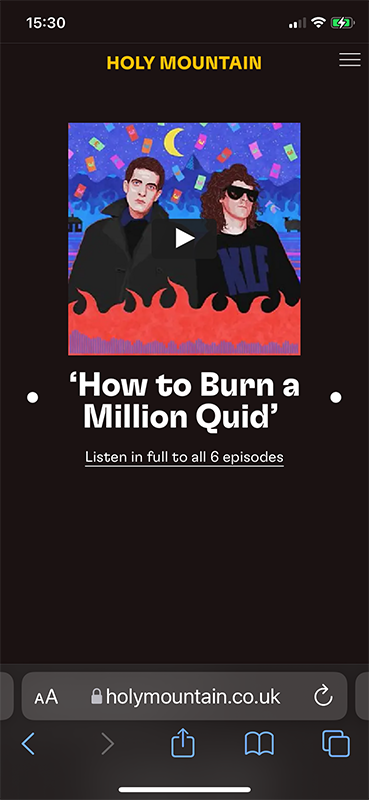
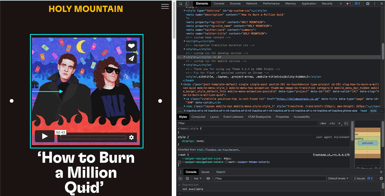
- I am using a cover for the desktop version, which is disabled on phone. A captioned Vimeo video is centred with a small text 'floating' on the right. This content stacks on the phone version and pushes the video player up, so it's no longer centered (it centers fine on other pages which don't have that extra text, so I can always remove that text... but is there a way round this?)
On desktop:

and on phone:
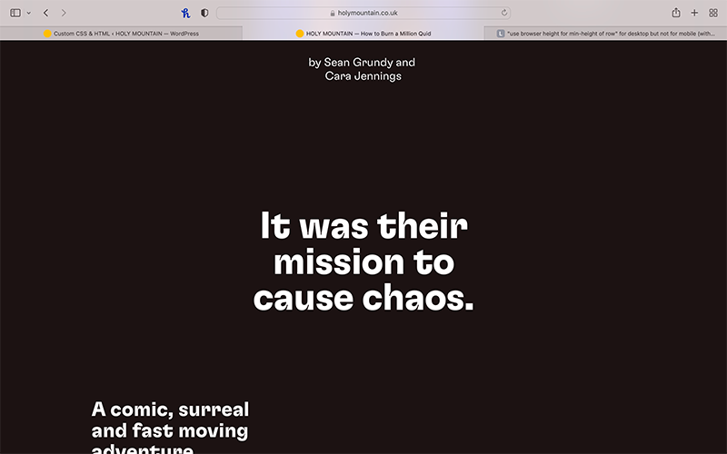
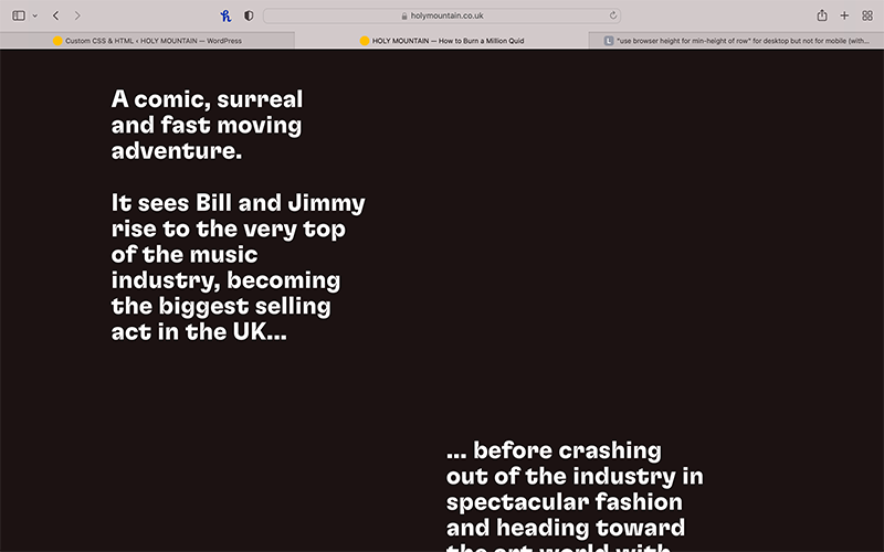
- When I click the cover on desktop, the page slides to this, with 3 text boxes appearing in a certain order
But on the phone the text boxes get stacked (which is fine) and appear in a different order (which is not fine). Is there a way to control the order in which they stack on the phone?
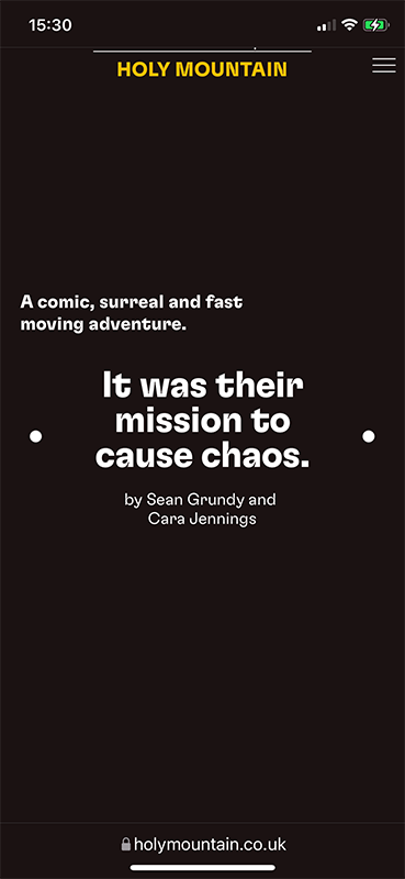
- And finally, the large empty spaces which appear on the phone... I used the code mentioned in this thread, but it doesn't seem to change anything.

If anyone has any tips about any of these issues, it would be great!
-
Dear @billykioso
Q1: Is the Video centered correctly now?
Regarding Questions 2 & 3 could you please take some screenshots of these layouts in the Gridder - Desktop & Mobile?
Best wishes and talk soon 🌝
Richard
-
This post is deleted!
-
This post is deleted!
-
Dear @billykioso
Q1: Is the Video centered correctly now?

Regarding Questions 2 & 3 could you please take some screenshots of these layouts in the Gridder - Desktop & Mobile?
Best wishes and talk soon 🌝
Richard
@Richard sorry for the delay in responding. I mistakenly started two new threads instead of replying to your message... I'll delete them both and respond here.
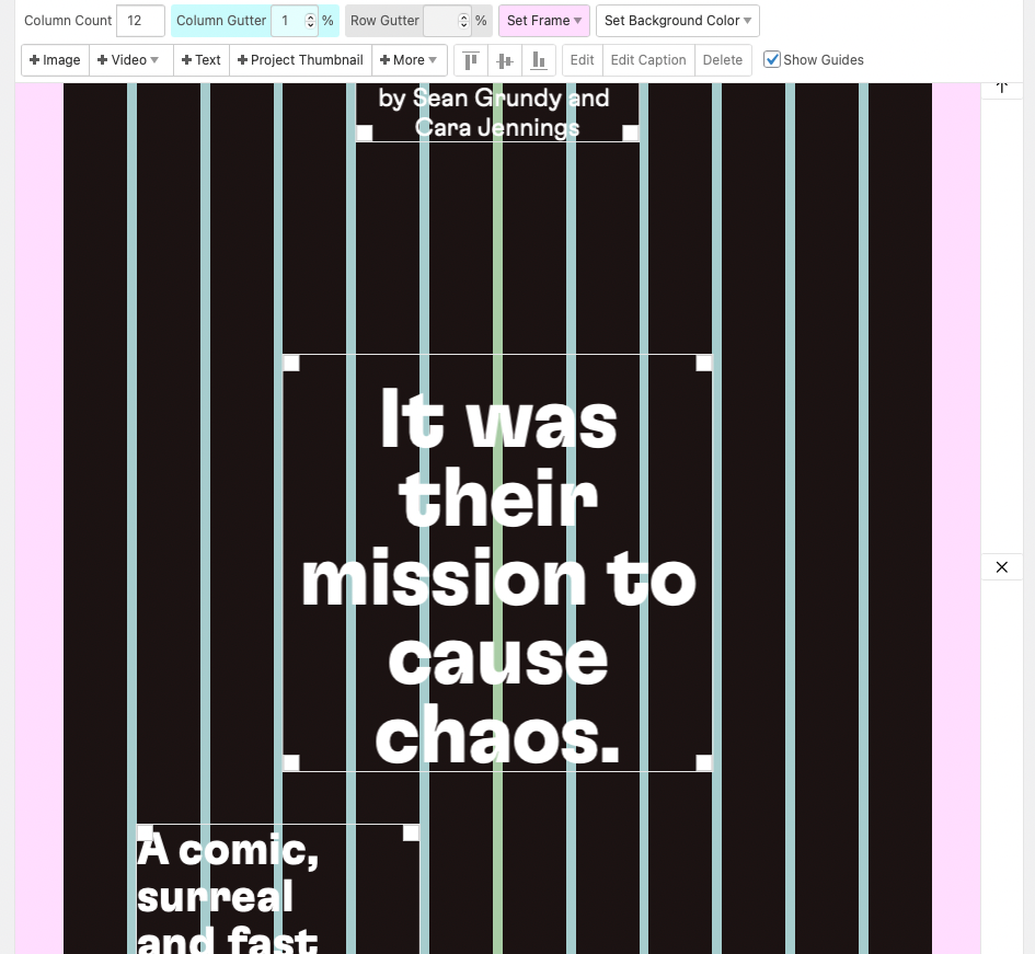
I'm attaching a screenshot from the Gridder showing the position of the text boxes which displays wrong on the mobile version.
The text box on the top in the Gridder appears bottom in the mobile version. And the text box on the bottom of the Gridder appears top in the mobile version.
What seems to be happening is that the mobile version takes the text box which is further to the left in the Gridder and places it top in the mobile version.
Whereas I need items to appear in the top-to-bottom order.
Perhaps this is not possible?
-
@Richard sorry for the delay in responding. I mistakenly started two new threads instead of replying to your message... I'll delete them both and respond here.
I'm attaching a screenshot from the Gridder showing the position of the text boxes which displays wrong on the mobile version.
The text box on the top in the Gridder appears bottom in the mobile version. And the text box on the bottom of the Gridder appears top in the mobile version.
What seems to be happening is that the mobile version takes the text box which is further to the left in the Gridder and places it top in the mobile version.
Whereas I need items to appear in the top-to-bottom order.
Perhaps this is not possible?

@billykioso any news on this? Maybe it's not possible to get text appearing the right way unless each box has the same width?
-
Dear @billykioso
Q1: Is the Video centered correctly now?

Regarding Questions 2 & 3 could you please take some screenshots of these layouts in the Gridder - Desktop & Mobile?
Best wishes and talk soon 🌝
Richard
@Richard, did you get a chance to ready my reply?
-
I also code custom websites or custom Lay features.
💿 Email me here: 💿
info@laytheme.com
Before you post:
- When using a WordPress Cache plugin, disable it or clear your cache.
- Update Lay Theme and all Lay Theme Addons
- Disable all Plugins
- Go to Lay Options → Custom CSS & HTML, click "Turn Off All Custom Code", click "Save Changes"
This often solves issues you might run into
When you post:
- Post a link to where the problem is
- Does the problem happen on Chrome, Firefox, Safari or iPhone or Android?
- If the problem is difficult to explain, post screenshots / link to a video to explain it