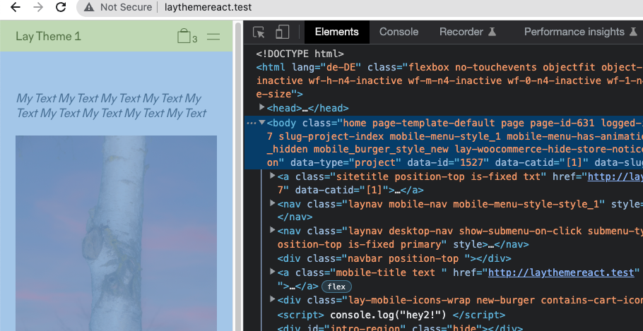
hide menu-bar on mobile site doesn't work
-
Hi!
On my site https://tanzhausbern.ch/einstieg/
I would like to hide the menu bar, side-title and menu icons in order do show the carousel in fullscreen – like this

I tried to do that in the costume css for mobile area with the following code:
body.slug-einstieg .mobile-title,
body.slug-einstieg .burger {
display: none!important;
}

body.slug-einstieg .navbar {
height: 0px!important;
z-index:0!important;
}
I also tried:
body.slug-einstieg .mobile-title,
body.slug-einstieg .burger,
body.slug-einstieg .navbar {
display: none!important;
both versions work for the side-title and the burger, but not for the menu-bar:
it still takes the height of the menu-bar settings as top-frame (65px)
the carousel has class and id 'einstieg' , the row on which it is placed has class and id 'frontrow'
and I tried to shift the carousel on top and front of the page by the following code:#einstieg { top:0px!important; z-index:100000!important; } #frontrow { top:0px!important; z-index:100000!important; }but it didn't work.
do you know how I can get rid of the menu-bar offset?Thankyou for helping!
Best,
Florine -
hey can you search the forum i think we had a similar post here
you only want to hide the menubar for that one page right

take a look.
body has a padding topjust make it have a padding top of 0
I also code custom websites or custom Lay features.
💿 Email me here: 💿
info@laytheme.com
Before you post:
- When using a WordPress Cache plugin, disable it or clear your cache.
- Update Lay Theme and all Lay Theme Addons
- Disable all Plugins
- Go to Lay Options → Custom CSS & HTML, click "Turn Off All Custom Code", click "Save Changes"
This often solves issues you might run into
When you post:
- Post a link to where the problem is
- Does the problem happen on Chrome, Firefox, Safari or iPhone or Android?
- If the problem is difficult to explain, post screenshots / link to a video to explain it