"Max width of content": content and site title/menu do not align
-
Hello
I don’t know if this is a bug or if I'm doing something wrong. But for me the "Max width of content" doesn't work.
These are my settings:
"Gridder defaults"
Frame Left, Right in: 10% (on both sides)Customize:
Site title: Space Left 10%
Primary Menu: Space Right 10%Lay Options:
Max width of content: 1600px
Apply max width of content to logo and menu: checked/activeWhen I visit the site on a large 27" Screen, the content-width is way smaller than the width of Site title/Menu.
But also none of both are close to 1600px.
The Content is 1280px.
Site title/Menu is 1440px.On Mac OS Montery. In Chrome, Firefox & Safari.
Any ideas what could be wrong?
Thanks in advance!
Have the same Issue on my new lay project.
I belive the space you can add to the sitetitle and menu gets added twice some how?!It looks fine until 1440px (maxwidth set in layoptions) but as soon it gets bigger the menu and title gets some weird added spacing ...
Made a screen capture with sime explaination here.
Thank you,
Fabi -
I played around with it and it seems like the 10% space left/right is subtracted from the max width.
In my example that i also mentioned above:
Max width of content: 1600px
1600px - 20% (10% left and 10% right) = 1280px (Thats what my content width is in the frontend)But for the site titel/menu it subtracts only 10% in total, not 10% left and right.
1600px - 10% = 1440px (Thats what my site titel/menu width is in the frontend)That’s why it is off.
EDIT: I tried it again with total random numbers, and it really is like described.
Max width of content: 1728px
1728px - 20% = 1382px (my content width in the frontend)
1728px - 10% = 1555px (my site titel/menu width in the frontend) -
I played around with it and it seems like the 10% space left/right is subtracted from the max width.
In my example that i also mentioned above:
Max width of content: 1600px
1600px - 20% (10% left and 10% right) = 1280px (Thats what my content width is in the frontend)But for the site titel/menu it subtracts only 10% in total, not 10% left and right.
1600px - 10% = 1440px (Thats what my site titel/menu width is in the frontend)That’s why it is off.
EDIT: I tried it again with total random numbers, and it really is like described.
Max width of content: 1728px
1728px - 20% = 1382px (my content width in the frontend)
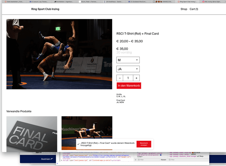
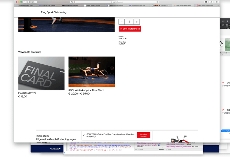
1728px - 10% = 1555px (my site titel/menu width in the frontend)Mhm intressting ... In the meantime I also noticed, dass max-witdh does not affect the WooCommerce Layout:


mehhh :/
-
ah damn!
im writing this down going to fix it!
-
ah damn!
im writing this down going to fix it!
Great, thank you!
-
Hey, we have a similar problem.
Content, logo and menu align properly - like adjusted via "max width of content" and "apply max width of content to logo and menu" - until the window gets to wide, then the logo and menu will jump to the left and right, and dont align anymore. What are we doing wrong? Or is it the same bug described here?
[distance settings left & right are 25 % in logo and menu and frames of sites and projects - Logo is left aligned and menu right.]
Can you help?
-
i think its a bug i will work on this soon
-
i think its a bug i will work on this soon
@arminunruh nice, thanks for the quick response.
-
Hi @arminunruh
Are there any news about this topic? It’s almost 2 months now and the website is still looking "off" on large screens.
Thanks in advance.
-
oops
i just fixed it and will release the update later today
sorry it took so long!
-
oops
i just fixed it and will release the update later today
sorry it took so long!
Cool, thanks so much!
-
can u send the link
I also code custom websites or custom Lay features.
💿 Email me here: 💿
info@laytheme.com
Before you post:
- When using a WordPress Cache plugin, disable it or clear your cache.
- Update Lay Theme and all Lay Theme Addons
- Disable all Plugins
- Go to Lay Options → Custom CSS & HTML, click "Turn Off All Custom Code", click "Save Changes"
This often solves issues you might run into
When you post:
- Post a link to where the problem is
- Does the problem happen on Chrome, Firefox, Safari or iPhone or Android?
- If the problem is difficult to explain, post screenshots / link to a video to explain it