Fullscreen Slider – Mobile View not working correctly
-
do you have a link?
-
also its best to look at it on a real device instead of the simulated device
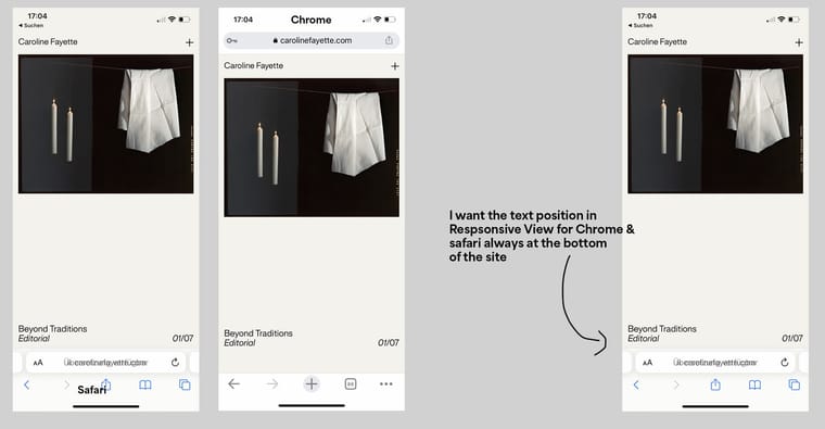
The text under the image - the Full Screen Slider
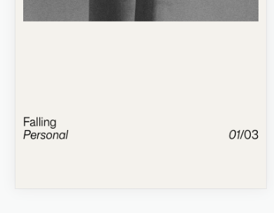
so you mean the text underneath the image is shown correctly in chrome on an iphone. you mean this screenshot right:

and then on safari the text is cut off and you cant move it higher, that doesnt work.
is that correct? just so i understand the issue
-
also its best to look at it on a real device instead of the simulated device
The text under the image - the Full Screen Slider
so you mean the text underneath the image is shown correctly in chrome on an iphone. you mean this screenshot right:

and then on safari the text is cut off and you cant move it higher, that doesnt work.
is that correct? just so i understand the issue
@arminunruh said in Fullscreen Slider – Mobile View not working correctly:
so you mean the text underneath the image is shown correctly in chrome on an iphone. you mean this screenshot right:
@arminunruh hey armin,
thank you for your answer. I would like to have the description of the images always at the bottom of the mobile viewsand then on safari the text is cut off and you cant move it higher, that doesnt work.
If I give the text below the image a "space bottom" of 13%, the projects look fine in Chrome on my Phone (text is then positioned at the bottom of the site). However, the text disappears on Safari (which is due to the browser bar of Safari). https://carolinefayette.com/sacred-traces/
I tried it out with an Y-offset -23%. With this the text is visible on Safari, but on Chrome the texts are placed differently in the two browsers.
https://carolinefayette.com/insomniacs-delight/Is there any solution to show the text always in safari & Chrome at the bottom of the site?
https://carolinefayette.com/overview/
PW: CaroThank you for your answer and best wishes
-
Hey @arminunruh Armin, sorry to come again with the question. Maybe I have expressed myself badly.
The text under the Fullscreen slider is positioned differently on Chrome and Safari (responsive view). To prevent the text from disappearing under the search bar on Safari, I set a Y-Offset value of the texts.
This has of course shifted the position of the text lines in the Chrome responsive display. Is there any way to always display the text at the bottom on chrome and safari (using the fullscreenslider Plugin)?
Thanks a lot in advance for your answer!

-
thanks! i understand it now, looking into this now
-
can you please remove the offsetY / space-Y of the texts, like set them to 0?
then make sure all of your custom phone layout layouts have a "frame top" value of 0. and a "frame bottom" value of 0.
-
then afterwards:
can you send your website address, /wp-admin/ username and password and a link to this topic to info@laytheme.com?
-
then afterwards:
can you send your website address, /wp-admin/ username and password and a link to this topic to info@laytheme.com?
@arminunruh thank you Armin! <3 I wrote you a Mail
-
then afterwards:
can you send your website address, /wp-admin/ username and password and a link to this topic to info@laytheme.com?
Dear @arminunruh, could you find a solution? I do not want to be intrusive, however, the titles in responsive can not be read at all since they were set to 0. For me, time is now pressing. The page should be launched to 3.12. Thank you again so much in advance and best wishes
-
hey there still on my todo list!
I also code custom websites or custom Lay features.
💿 Email me here: 💿
info@laytheme.com
Before you post:
- When using a WordPress Cache plugin, disable it or clear your cache.
- Update Lay Theme and all Lay Theme Addons
- Disable all Plugins
- Go to Lay Options → Custom CSS & HTML, click "Turn Off All Custom Code", click "Save Changes"
This often solves issues you might run into
When you post:
- Post a link to where the problem is
- Does the problem happen on Chrome, Firefox, Safari or iPhone or Android?
- If the problem is difficult to explain, post screenshots / link to a video to explain it