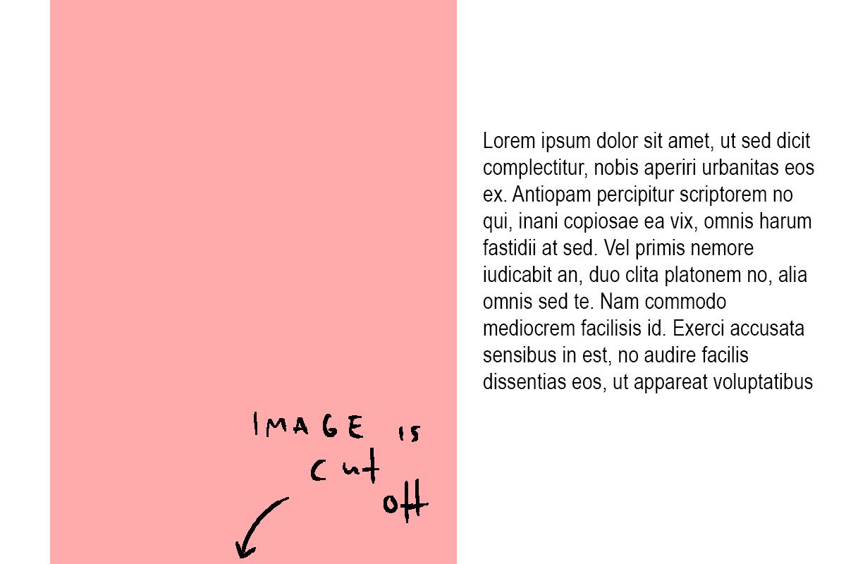
Fullscreen slider / image vertically cut-off / make content fit
-
Hello,
I'm trying to build a website with the Fullscreen slider plugin, and I can't figure how to make images fit vertically so they don't get cut off at the bottom or at the top and put some text next to them.
I tried to give them a class with "Set HTML Class and Id", but this just effects their DIV container, and the Image ist still cut off vertically. I tried "Use browser height for row height", but this also had no effect on the oversized image.
The only thing that worked so far was the fullscreen slider setting "Give elements a max-width and max-height and center them", which centers the image and stops it from being cut off, but with this setting, I can't stop the text from overlapping the image.
I also searched the forum and couldn't find an answer. I really hope someone can help me, because I didn't expect that to be so tricky.
To sum it up: I want to avoid that any content in a specific fullscreen slider row is cut off vertically.
Thanks so much.
-
oh and you want text to the right of the image
right click on the row, choose "set left image background"
use this custom css:
and change the values like width height top and left if u wanthtml.objectfit .background-image.background-image-style-left img{ object-fit: contain; width: 50%; height: 100%; position: absolute; right: auto; left: 0; top: 0; }
I also code custom websites or custom Lay features.
💿 Email me here: 💿
info@laytheme.com
Before you post:
- When using a WordPress Cache plugin, disable it or clear your cache.
- Update Lay Theme and all Lay Theme Addons
- Disable all Plugins
- Go to Lay Options → Custom CSS & HTML, click "Turn Off All Custom Code", click "Save Changes"
This often solves issues you might run into
When you post:
- Post a link to where the problem is
- Does the problem happen on Chrome, Firefox, Safari or iPhone or Android?
- If the problem is difficult to explain, post screenshots / link to a video to explain it