project thumbnail grid in masonry layout is getting distorted
-
Hello,
I have a problem with my homepage where the project thumbnail grid in masonry layout is getting distorted: www.patrickslesiona.de I suspect that the issue may be related to the video. Is this problem already known and are there any suggestions on how to fix it?
Thank you!
Best regards
Patrick -
there seem to be empty spots and in the markup i see: simple-translate-light-theme divs

can you for example go to the "movimento" project, then go to the project description text box

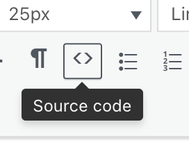
click the <> source code button and remove the html that says:
width: 600px; height: 800px; top: 0px; left: 0px; font-size: 13px;repeat for the other projects where you see the big gaps underneath
-
Thanks a lot! That was the solution.
I also code custom websites or custom Lay features.
💿 Email me here: 💿
info@laytheme.com
Before you post:
- When using a WordPress Cache plugin, disable it or clear your cache.
- Update Lay Theme and all Lay Theme Addons
- Disable all Plugins
- Go to Lay Options → Custom CSS & HTML, click "Turn Off All Custom Code", click "Save Changes"
This often solves issues you might run into
When you post:
- Post a link to where the problem is
- Does the problem happen on Chrome, Firefox, Safari or iPhone or Android?
- If the problem is difficult to explain, post screenshots / link to a video to explain it