I want to create a thumbail grid but with images and not projects
-
I have a question on another site I am designing.
The client wants a grid of images displaying the artists he works with, with each image linking away to their social media page.
I have had best results creating a project thumbnail grid but the client does not want a whole project page for each artist. Is there away to override the link in the project thumbnail so it opens a different link and not a project?
When I try to create this with the element grid it is not behaving correctly and I think I have messed up the CSS.
Please see the comparison between the two options here:
https://leightonspace.co.uk/brainmarrow/test/What do you suggest doing?
-
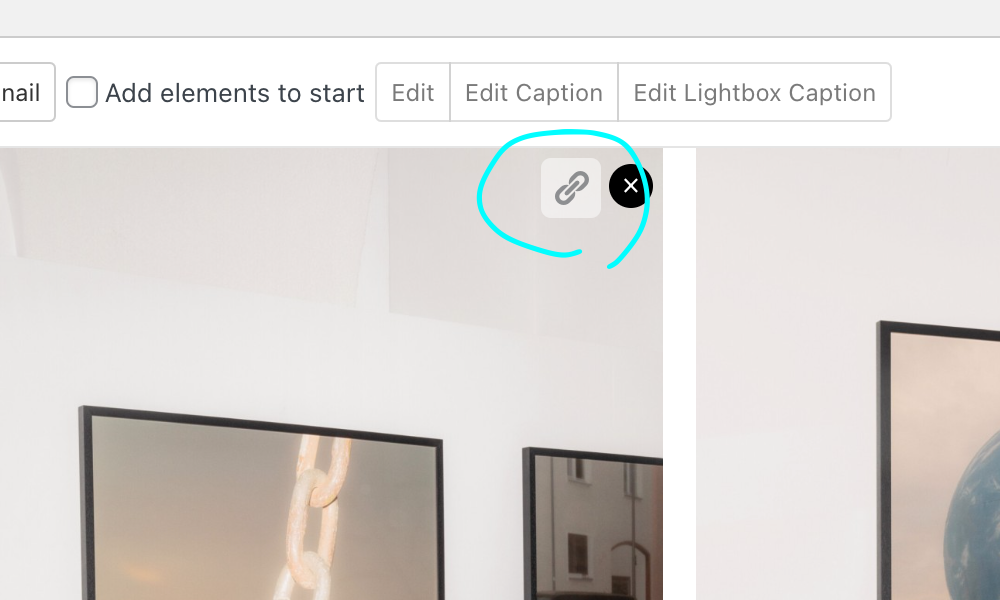
use the element grid
+more → +elementgrid
-
and when u hover over an image use the link button

-
and when u hover over an image use the link button

@arminunruh
Ok I will do that but it still leave me with a few problems that were working better in the thumbnail grid option.-
I have added a border to the grid elements using CSS however this seems to have broken the grid columns. You can see that if there is not a multiple of 3, the last image in the grid scales across all 3 columns instead of keeping the same size. https://leightonspace.co.uk/brainmarrow/test/
-
The element grid is not scaling in the same way responsively as the thumbnail grid.
-
I cannot get my text animation on the artist name hoverstate to work. On the project thumbnail version I have a cool hoverstate animation that changes the font. I cant get that to work on the element grid.
-
I like the hoverimage effect on the project thumbnails where it scales up a bit on hover. How do I add that to the element grid?
Can you help with any of these issues?
-
-
@peterroden said in I want to create a thumbail grid but with images and not projects:
I like the hoverimage effect on the project thumbnails where it scales up a bit on hover. How do I add that to the element grid?
that is just for the project thumbnails. you'd need to do a transform: scale(1.1); transition for example
I have added a border to the grid elements using CSS however this seems to have broken the grid columns. You can see that if there is not a multiple of 3, the last image in the grid scales across all 3 columns instead of keeping the same size. https://leightonspace.co.uk/brainmarrow/test/
maybe try a 1px box shadow instead of a border
also the padding you added makes the boxes bigger than they're supposed to be so they dont fit inyou added this css. and it makes the elements get too big because you use flexbox i think:
.element-wrap {
border-width: 1px 1px 0px 1px;
border-style: solid;
border-color: #2C56A2;
padding-left: 16px;
padding-right: 16px;
padding-top: 16px;
box-sizing: border-box;
display: -webkit-box;
display: -webkit-flex;
display: -ms-flexbox;
display: flex;
-webkit-box-orient: column;
-webkit-box-direction: column;
-ms-flex-direction: column;
flex-direction: column;
-ms-flex-wrap: nowrap;
flex-wrap: nowrap;
-webkit-box-flex: 1 1 0%;
-ms-flex: 1 1 0%;
flex: 1 1 0%;
}best to dabble around with the css and learn about flexbox
The element grid is not scaling in the same way responsively as the thumbnail grid.
for me it does scale
I cannot get my text animation on the artist name hoverstate to work. On the project thumbnail version I have a cool hoverstate animation that changes the font. I cant get that to work on the element grid.
you probably need to target the parent container like
.element-wrap:hover .caption{
}
instead of
.caption:hover{
}
I also code custom websites or custom Lay features.
💿 Email me here: 💿
info@laytheme.com
Before you post:
- When using a WordPress Cache plugin, disable it or clear your cache.
- Update Lay Theme and all Lay Theme Addons
- Disable all Plugins
- Go to Lay Options → Custom CSS & HTML, click "Turn Off All Custom Code", click "Save Changes"
This often solves issues you might run into
When you post:
- Post a link to where the problem is
- Does the problem happen on Chrome, Firefox, Safari or iPhone or Android?
- If the problem is difficult to explain, post screenshots / link to a video to explain it