Responsive textfield in carousel
-
Hi
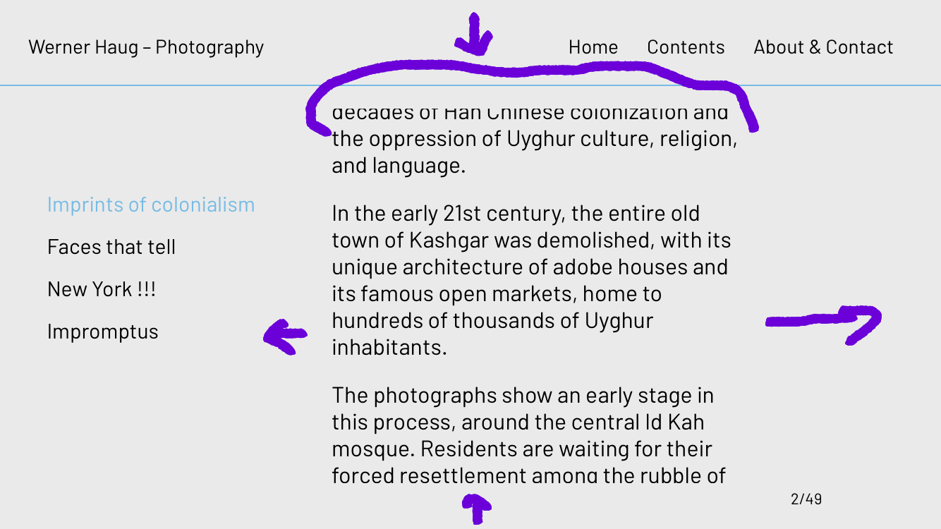
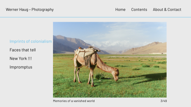
I am working on a photography website with a carousel containing photos and text.
Could I have a text field for the iPad/horizontal Phone view that is different from the horizontal desktop view?
And make the text field larger.
The iPad text format is working fine, but making the font smaller is not enough to display the text entirely.The photos are fine as well as the vertical phone view that has a different layout.
How can I distinguish between the horizontal desktop and the horizontal iPad/Phone carousel?

 image URL)
Many thanks for you input, best Sarah
-
Could I have a text field for the iPad/horizontal Phone view that is different from the horizontal desktop view?
no you cant :/
i think that textfield size is based on the size of the carousel and the carousel size is % based
so you probably need to make the carousel bigger and the text smaller
or maybe its a better idea to put the text out of the carousel and like put it next to the carousel
@arminunruh ok, thank you for your answer.
This problem actually gave me the idea for the alternative phone layout, where I made a collapsed
row with the text that you can open and close below the first photo. -
ah very good!
yea the text element in a carousel is probably only good for shorter texts :/
I also code custom websites or custom Lay features.
💿 Email me here: 💿
info@laytheme.com
Before you post:
- When using a WordPress Cache plugin, disable it or clear your cache.
- Update Lay Theme and all Lay Theme Addons
- Disable all Plugins
- Go to Lay Options → Custom CSS & HTML, click "Turn Off All Custom Code", click "Save Changes"
This often solves issues you might run into
When you post:
- Post a link to where the problem is
- Does the problem happen on Chrome, Firefox, Safari or iPhone or Android?
- If the problem is difficult to explain, post screenshots / link to a video to explain it