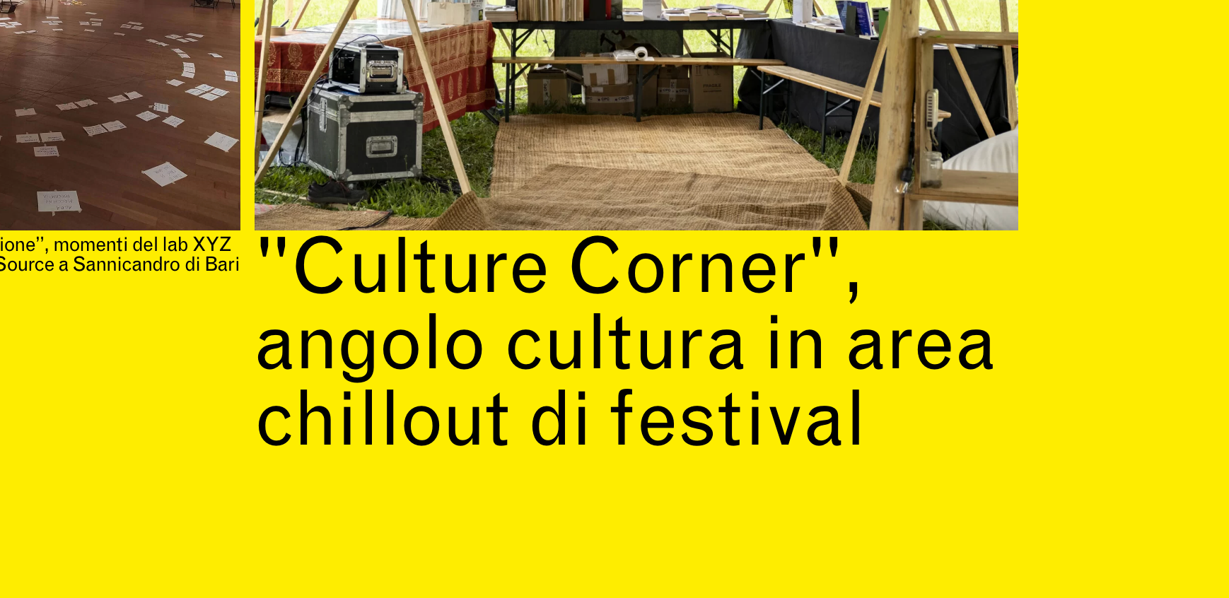
captions cut on mobile
-
Hello there! I was wondering why the captions on mobile in this page https://www.unatresca.it/cosafa are cut on mobile. If i increase the size (24px) they are no more cut. If i put more space above caption in carousel options there's no change (they just go down).
I increased the space top in the text format (class didascalie) but no change
and I tried this .lay-carousel-sink-parent .captions-wrap {
margin-top: 20px !important;
}and I tried also to address only the text format class in the custom css for mobile
.didascalie {margin-top: 20px !important;
}but no change.
There's a little "cut" also on desktop.
I tried also to delete text format and re-add it.Any idea how can i fix this?
R -

when i increase the font size here the caption is not cut
is that what u mean?
u mean the S here no?

you may need to add a padding top there.
.sink-caption ._didascalie{padding-top: 20px !important;}
i think this happens with some fonts only
I also code custom websites or custom Lay features.
💿 Email me here: 💿
info@laytheme.com
Before you post:
- When using a WordPress Cache plugin, disable it or clear your cache.
- Update Lay Theme and all Lay Theme Addons
- Disable all Plugins
- Go to Lay Options → Custom CSS & HTML, click "Turn Off All Custom Code", click "Save Changes"
This often solves issues you might run into
When you post:
- Post a link to where the problem is
- Does the problem happen on Chrome, Firefox, Safari or iPhone or Android?
- If the problem is difficult to explain, post screenshots / link to a video to explain it