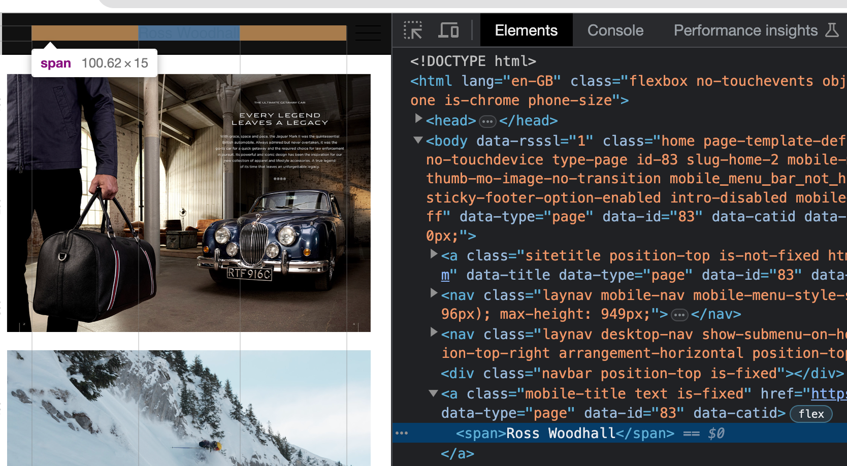
SITE TITLE & MENU NOT DISPLAYING ON MOBILE
-
Hi-
I've played about with the settings, but not been able to figure out a way to get them to work. Things are working well at desktop and tablet widths, but all I see is a black background when at mobile width.
In case it's relevant, I'm using Max Mega Menu for the navigation and an SVG logo embedded using the Site Title HTML option.
The dev site is here: https://new23.rosswoodhall.com
Thanks
-

the site title does exist, however, its set to black and your menubar is black too, so you dont see it
same goes for the mobile menu icon
you can set them to white in customize → mobile
-

the site title does exist, however, its set to black and your menubar is black too, so you dont see it
same goes for the mobile menu icon
you can set them to white in customize → mobile
Thanks so much @arminunruh - I'd totally missed the Mobile (Smarthphone) options in Customize!
All working great now :)
I also code custom websites or custom Lay features.
💿 Email me here: 💿
info@laytheme.com
Before you post:
- When using a WordPress Cache plugin, disable it or clear your cache.
- Update Lay Theme and all Lay Theme Addons
- Disable all Plugins
- Go to Lay Options → Custom CSS & HTML, click "Turn Off All Custom Code", click "Save Changes"
This often solves issues you might run into
When you post:
- Post a link to where the problem is
- Does the problem happen on Chrome, Firefox, Safari or iPhone or Android?
- If the problem is difficult to explain, post screenshots / link to a video to explain it