How can I get a responsive design with the carousel gridder ?
-
Hi evrebody,
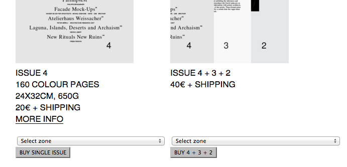
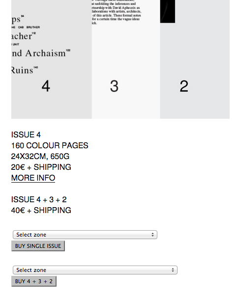
the website I made with the caroussel addon is not visible correctly when I reduce the screen or when I open it on a smartphone. On some pages of the website, I put several images with texts under each one but the gridder understand the two elements (the image and the text associated) separated, which it causes a problem when I see the website on a smartphone or reduced laptop's screen : if two images are side by side on the gridder (on a same row) and two texts are under each images (on an other row), it appears differently on the smartphone than a laptop screen : the two images will follow and after the two texts appears.. but it is really important for the website that one image is associated with the text.
examples of the problem :-
laptop's screen :

-
reduced laptop's screen :

on the gridder of laytheme caroussel :


Do you know if I can put two elements on the same row and columns so I can associate this two elements ?
Or maybe the solution would be to modify the css and put the HTML tag of the text in the HTML tag of the image ? But I don't how to access to the css....
Does someone have the same problem ?
Thank you so much ! -
-
hey sorry for my late reply.
Maybe this is a good solution: Click on the carousel in the gridder and click "edit caption". Now put the text that should always be underneath that carousel there. :) Does that fix the problem?
-
Thank you very much for your answer !
But there is two elements I have to put underneath each image. As you see on the screen shot, there is the description of the magazine issue and a button to buy the magazine.... So the solution to put in caption doesn't work.. How can I get access to the css ? or do you know other solutions to associate the text AND the button to each image ?
Thank you ! -
So if you are in the text editor, there is the "<>" code button. When you click that you can insert the html markup of your "buy" button.
If you don't like that solution you can still use the "custom phone layouts" feature:
http://laytheme.com/documentation.html#custom-phone-layouts
I also code custom websites or custom Lay features.
💿 Email me here: 💿
info@laytheme.com
Before you post:
- When using a WordPress Cache plugin, disable it or clear your cache.
- Update Lay Theme and all Lay Theme Addons
- Disable all Plugins
- Go to Lay Options → Custom CSS & HTML, click "Turn Off All Custom Code", click "Save Changes"
This often solves issues you might run into
When you post:
- Post a link to where the problem is
- Does the problem happen on Chrome, Firefox, Safari or iPhone or Android?
- If the problem is difficult to explain, post screenshots / link to a video to explain it