menu items to be distributed as in the gridder
-
Hi,
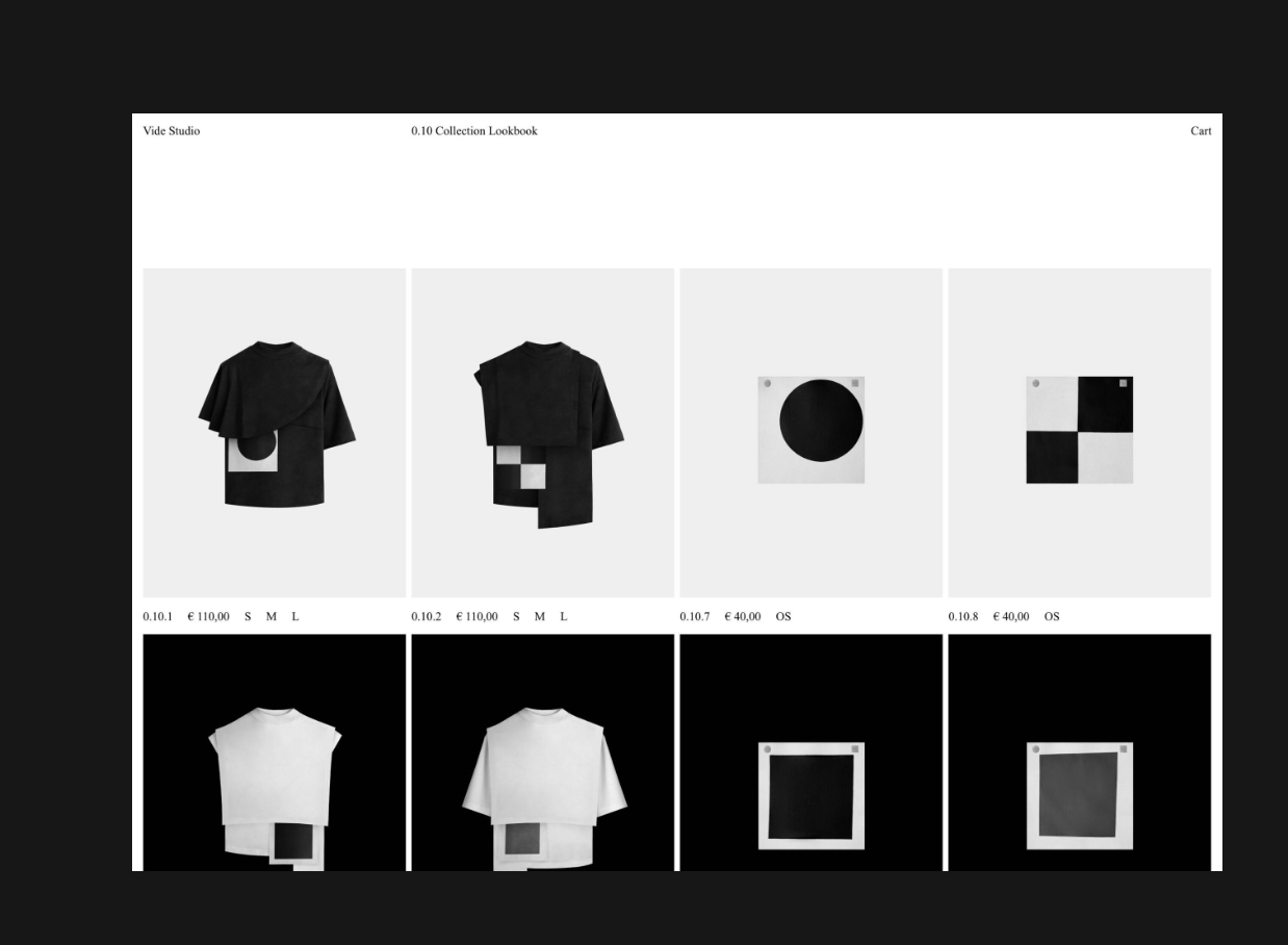
I was wondering, is there any way to make the menu items to be in the same grid as the overall content.
For example:
 Screenshot 2023-10-18 at 4.23.45 PM
I was thinking probably the same way as the Footer works. So having a page with the menu items only, and then displaying it in every page sticked to the top.
Thanks, 🙏
-
true, working on a header feature is on my todo list, however its not high priority and has been on the list for a very long time
mmh but how about you do this using custom css
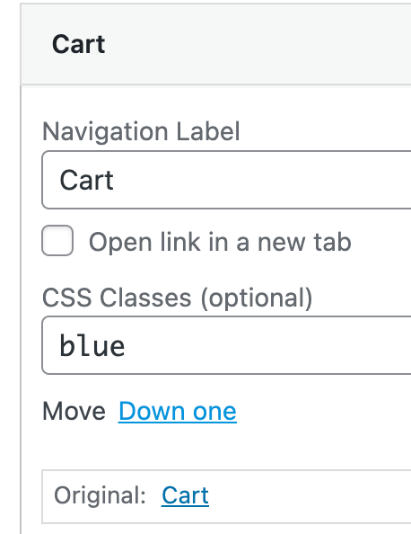
appearance → menus
→ screen options → css classes

then add css classes

and use css to change the width of your menu points
-
 A arminunruh referenced this topic on
-
Found a way of doing it, not ideal but does the job.
Leaving the solution here in case somebody else may want to do the same.-
Create a row at the top of the page

-
Right-Click to the row and add the class 'sticky'.
-
Add the following CSS Code
div.sticky {
  position: -webkit-sticky;
  position: sticky;
  top: 0.5%;
  z-index: 1;
}
You have to do it for every page tho' 😅
👊 -
-
you could also use lay options → custom css & custom html
and then add your html and css code to "html at top"
then that html is at the top of every page
I also code custom websites or custom Lay features.
💿 Email me here: 💿
info@laytheme.com
Before you post:
- When using a WordPress Cache plugin, disable it or clear your cache.
- Update Lay Theme and all Lay Theme Addons
- Disable all Plugins
- Go to Lay Options → Custom CSS & HTML, click "Turn Off All Custom Code", click "Save Changes"
This often solves issues you might run into
When you post:
- Post a link to where the problem is
- Does the problem happen on Chrome, Firefox, Safari or iPhone or Android?
- If the problem is difficult to explain, post screenshots / link to a video to explain it