split screen mobile
-
Hi @arminunruh
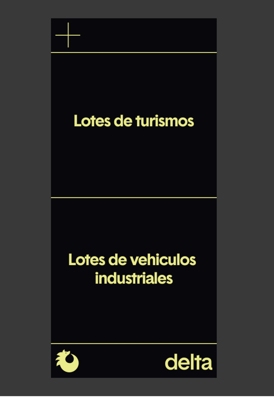
Hope you're good! I am currently working on a very simple site that has a page with two CTAs/buttons that split the screen horizontally in desktop and vertically in mobile, as per the screen shots below


For the desktop version I have managed to more or less create this with a few columns and a vertical key line http://das-fleet.com/home-1-copy/?preview_id=39&preview_nonce=ec5b446376&preview=true
However for the mobile version this doesn't seem to work when using the browser height and I am failing to recreate the above design stacking elements. How would you recommend to go about approaching this?
Thanks a lot for your time and help,
Christian -
you can create two rows in a custom phone layout
right click each row and click "set custom row height"
in there, enter 50vh, to two half-screen-height rows.
in between add another row where you add a horizontal line
I also code custom websites or custom Lay features.
💿 Email me here: 💿
info@laytheme.com
Before you post:
- When using a WordPress Cache plugin, disable it or clear your cache.
- Update Lay Theme and all Lay Theme Addons
- Disable all Plugins
- Go to Lay Options → Custom CSS & HTML, click "Turn Off All Custom Code", click "Save Changes"
This often solves issues you might run into
When you post:
- Post a link to where the problem is
- Does the problem happen on Chrome, Firefox, Safari or iPhone or Android?
- If the problem is difficult to explain, post screenshots / link to a video to explain it