More space for lots of variations
-
Hey all!
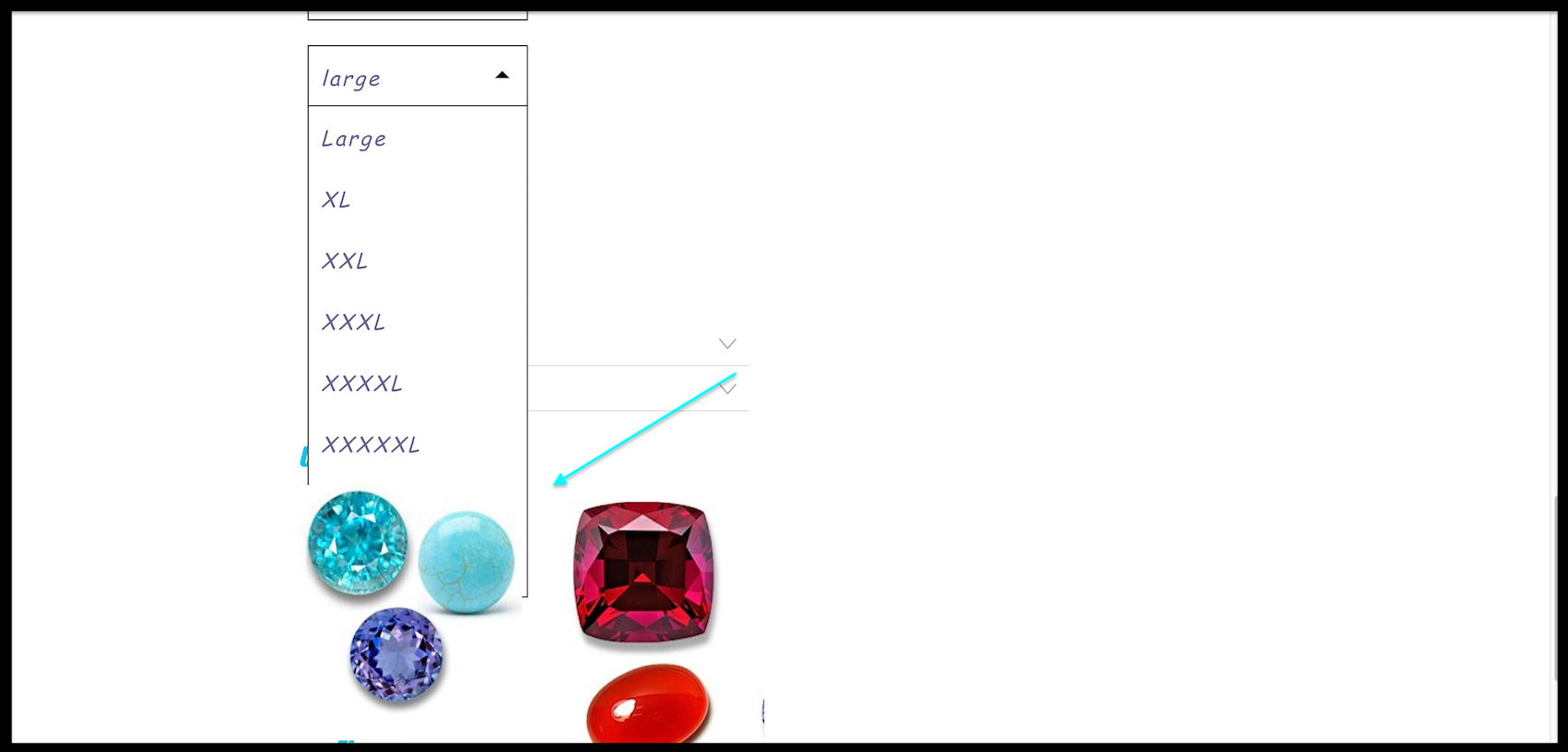
Love the shop feature. Everything is working great for me. I was wondering however if the variation dropdowns could be expanded + some padding added at the bottom of the page. Sometimes a few sizes are cutting off on a site I am making for a jeweller. Obviously it's not really the norm to have 14+ sizes but something that I've run into which I thought would be good to mention.
Example here: http://box2016.temp.domains/~aistudi3/product/triangle-band/
Thank you!
Checking in here!
-
Dear @willcanning
This thread got past me, sorry for such delay 🌝
I dont believe there are any built in options e.g customizer that change this.
We run into things like this:

Will forward to Armin for his knowledge ✅

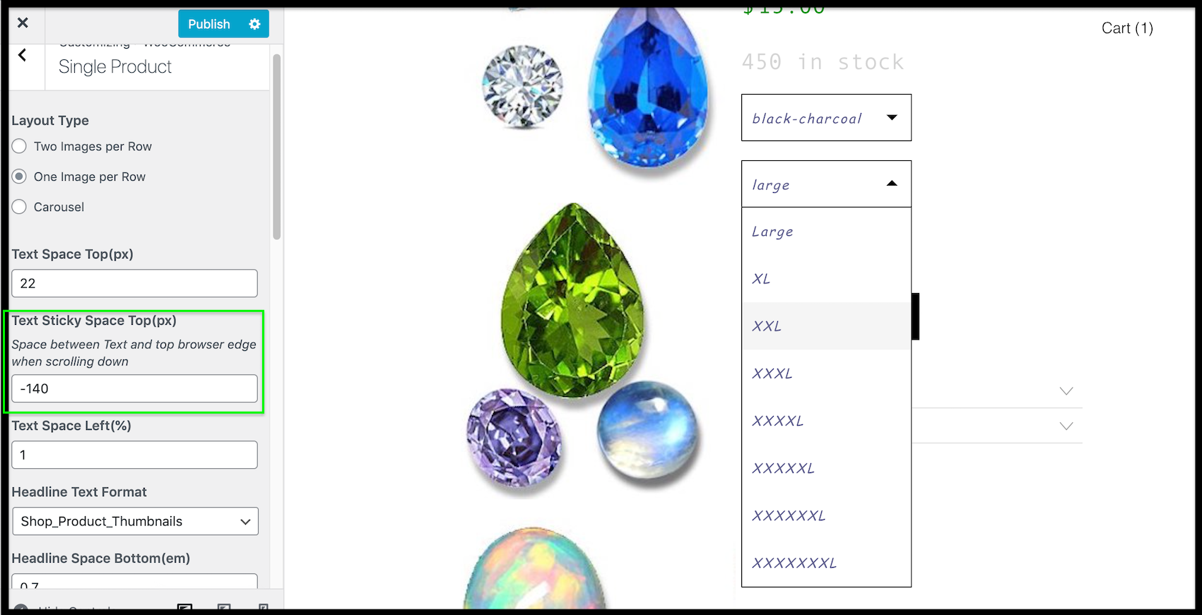
using negative units to push the selection box upwards is an option E.g -140px - this way the whole selection is in view at least for user interface.
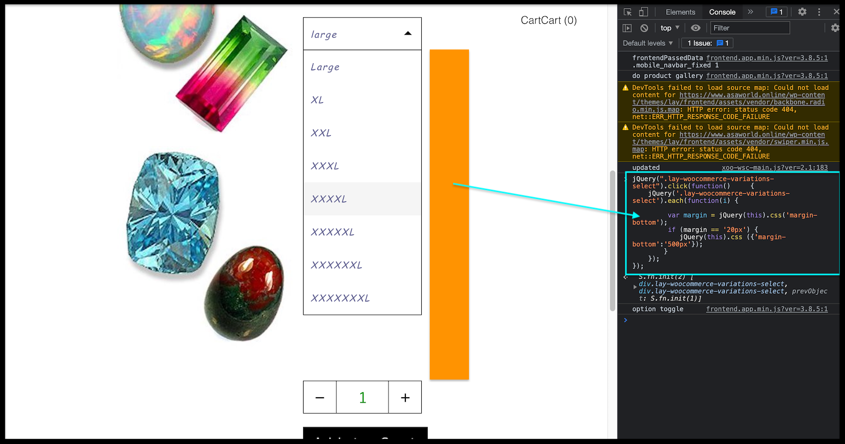
A short-term solution could be adding some Custom Code extending the margins when needed. Here is a very basic Example: that would need to be altered. Text Formats could also be taken advantage of as they are used in the Customizer settings > Single Product > Variations Selectbox Text Format >
jQuery(".lay-woocommerce-variations-select").click(function()     {
    jQuery('.lay-woocommerce-variations-select').each(function(i) {

         var margin = jQuery(this).css('margin-bottom');
         if (margin == '20px') {
            jQuery(this).css ({'margin-bottom':'500px'});
        }
    });
});
Best wishes Will 🏖
Richard
-
interesting. sorry for the very delayed response, had to take a break from working.
I'll think about this!I think a different way of showing variants would be useful. Not showing them in a dropdown, but as just boxes that can be selected, side by side.
-
Hey there,
I have a simliar problem with the dropdown on the product pages. If the product information is too long, you can't reach the size L or XL in the dropdown. I tried all the Variation Swatches Plugins to change the dropdown to boxes, but it doesn't work. Do you have any idea for that problem? Or did you think about showing variants in other ways again? :)
You can see the problem here: https://sleepovereurope.com/produkt/pinstripepants/P.S. I know the problem wouldn't exist if the text on the right side wouldn't be sticky, but I think its quite usefull to see the information while scrolling through the pictures on the left.
-
.lay-woocommerce-variations-select-selected-list > div{
height: 30px!important;
line-height: 30px!important;
}
this just makes it flatter
is that ok for u?
I also code custom websites or custom Lay features.
💿 Email me here: 💿
info@laytheme.com
Before you post:
- When using a WordPress Cache plugin, disable it or clear your cache.
- Update Lay Theme and all Lay Theme Addons
- Disable all Plugins
- Go to Lay Options → Custom CSS & HTML, click "Turn Off All Custom Code", click "Save Changes"
This often solves issues you might run into
When you post:
- Post a link to where the problem is
- Does the problem happen on Chrome, Firefox, Safari or iPhone or Android?
- If the problem is difficult to explain, post screenshots / link to a video to explain it