fade in / out hidden menus
-
Hi,
I'm using a second menu on a few pages and have it hidden on all other pages using simple code (code at bottom of this post, which is working well).
However I'd like to add a finishing touch and have this second menu fade in and out when needed, or copy the same page transition animation as the rest of my site when you navigate away from those pages. At the moment is just disappears and appears as needed, which looks a little clunky when seen next to the other smooth transitions.
Page is linked here (for now at least). hopefully this help you see what i'm trying to achieve.
Many thanks for any help, Paul.
// Code that hides and reveals the second menu as needed .second_menu{ display: none !Important; } body.slug-portraits .second_menu{ display: block !Important; } body.slug-sport .second_menu{ display: block !Important; } body.slug-lifestyle .second_menu{ display: block !Important; } -
try this:
.second_menu{
opacity: 0!important;
pointer-events: none!important;
transition: opacity 300ms ease;
}
body.slug-portraits .second_menu{
opacity: 1!important;
pointer-events: auto!important;
}
body.slug-sport .second_menu{
opacity: 1!important;
pointer-events: auto!important;
}
body.slug-lifestyle .second_menu{
opacity: 1!important;
pointer-events: auto!important;
}
or copy the same page transition animation as the rest of my site when you navigate away from those pages.
ah not easily possible that one
-
Very nice, thank you :)
-
On another (hopefully small ask), on my mobile site, I have this second menu as well. However I'm not sure how I make the current 'active' page to also be highlighted somehow in the second menu. I see if I make all of the menu's 'desktop style' the underline system kicks in, but if I want to use a mobile style burger menu for the main menu, the second menu is left just as text. I've used CSS to positioning it, but not sure on the current page / link being highlighted.
Tried this so far, but no luck:
#headerNav nav .active a:visited, #portraits nav .active a:visited{
 color:red !important;
}
Screenshot of the mobile page:

Thanks again for any help :)
-
u mean here:
https://paulcalver.cc/edits/sport/the menu item sport should be active, right
how do u even get to display multiple menus on mobile?
the way i coded it, on mobile there is only one menuyou're using custom css to show the desktop menu on mobile right
here:

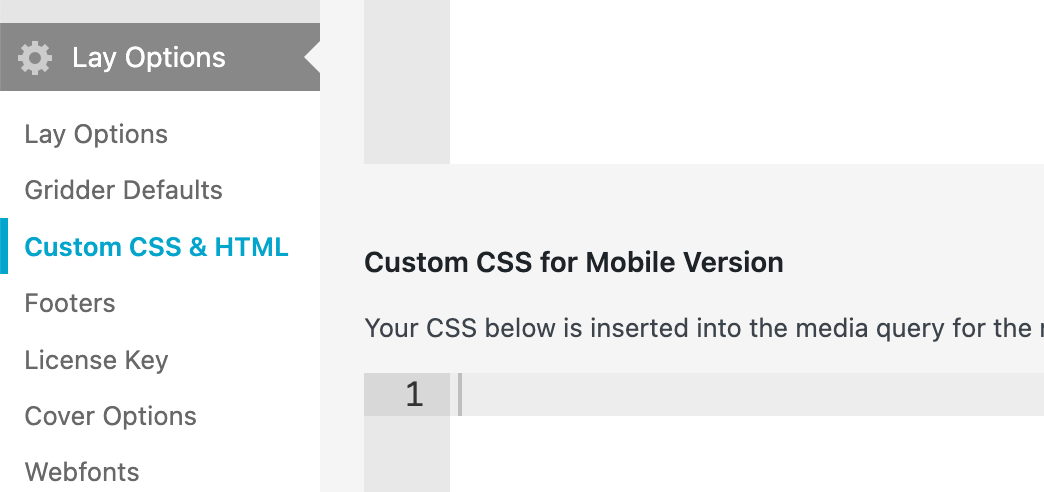
in css for !mobile! add:
.desktop-nav .current-menu-item > a span {
    text-decoration-thickness: 0.7px;
  }

.desktop-nav .current-menu-item > a span {
    text-decoration-style: solid;
    text-decoration-line: underline;
  }


.desktop-nav .current-menu-item > a span {
    text-decoration-color: #000000;
  }

.desktop-nav a span {
  text-underline-offset: 3px;
}
i just copied over your desktop css
-
This works perfectly, thank you very much :)
The code I used to display the second menu on the mobile site is:
.second_menu{
display: none !Important;
}
body.slug-portraits .second_menu{
display: block !Important;
}
body.slug-sport .second_menu{
display: block !Important;
}
body.slug-lifestyle .second_menu{
display: block !Important;
}

#menu-item-1648 {
    text-align: center;
}
#menu-item-1649 {
    text-align: center;
}
#menu-item-1650 {
    text-align: center;
}
I also code custom websites or custom Lay features.
💿 Email me here: 💿
info@laytheme.com
Before you post:
- When using a WordPress Cache plugin, disable it or clear your cache.
- Update Lay Theme and all Lay Theme Addons
- Disable all Plugins
- Go to Lay Options → Custom CSS & HTML, click "Turn Off All Custom Code", click "Save Changes"
This often solves issues you might run into
When you post:
- Post a link to where the problem is
- Does the problem happen on Chrome, Firefox, Safari or iPhone or Android?
- If the problem is difficult to explain, post screenshots / link to a video to explain it