Horizontal images looking distorted in lightbox
-
Hi!
Recently, I noticed that I have this problem: images in horizontal orientation look compressed and distorted when opened in the lightbox. Vertical images are ok. Previously I had the problem that horizontal images in the lightbox would get super small, but now they are also weirdly squashed.
Is there anything I could do?
I see it while using Chrome (but haven't tried others options). Lightbox and Lay Theme are updated. Here is the link to the website: https://alicjapakosz.pl/paintings/
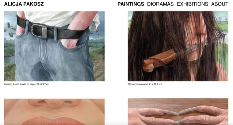
looks good here,

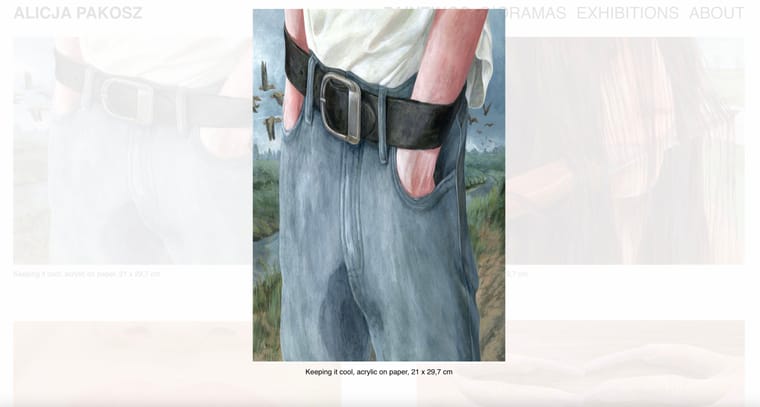
but when you click on the horizontal image it looks squashed:

I would greatly appreciate your help as I have no idea how to fix it.
Have a nice day,
Alicja -

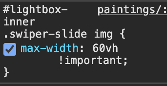
its ur custom css
please always read the blue box on the right that says "Before you post:"
very nice artwork btw!! :O
-
so in the blue box this would be point number 4
lmk if that fixes it
I also code custom websites or custom Lay features.
💿 Email me here: 💿
info@laytheme.com
Before you post:
- When using a WordPress Cache plugin, disable it or clear your cache.
- Update Lay Theme and all Lay Theme Addons
- Disable all Plugins
- Go to Lay Options → Custom CSS & HTML, click "Turn Off All Custom Code", click "Save Changes"
This often solves issues you might run into
When you post:
- Post a link to where the problem is
- Does the problem happen on Chrome, Firefox, Safari or iPhone or Android?
- If the problem is difficult to explain, post screenshots / link to a video to explain it