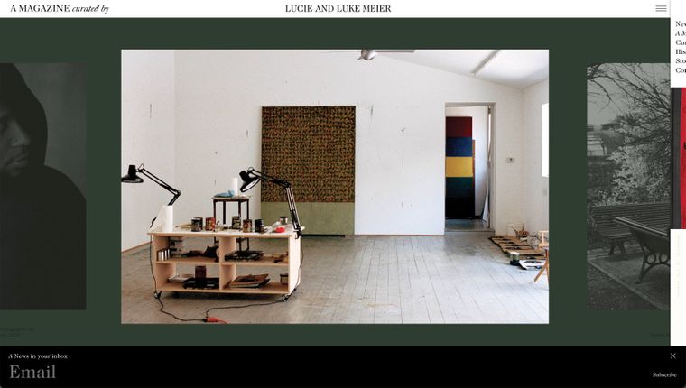
Carousel styling
-
Hi,
When the option for "Show multiple slides" and "Centred" is selected, is there any way to style the carousel so that the images on the sides are shown either at a smaller height or with less opacity (or both)? Like in the example below.

Here is also a link to the example (please scroll to the bottom):
https://amagazinecuratedby.com/collection/lucie-and-luke-meier/ -
sure!
.lay-carousel-slide{ will-change: opacity,transform; transition-property: opacity,transform; transition-duration: .5s; transition-timing-function: ease-in-out; opacity: .5; transform: scale(.9); } .lay-carousel-slide.is-selected{ opacity: 1; transform: scale(1); } -
Thank you so much, this is so helpful!
I have another question for you about a different styling, this is for a different idea I'm working on. Is there a way to style a carousel so that the images layer on top of each other – when the format of the image is different the previous image would be seen underneath, like in the example below:

-
ah that is a very cool idea,
i will write it down and may work on itnot sure when!
i dont think you can do this by yourself -
hello @arminunruh,
i was also wondering if it would be possible to style the carousel so that the images layer on top of each other? like this website?
thanks
-
hello @arminunruh,
i was also wondering if it would be possible to style the carousel so that the images layer on top of each other? like this website?
thanks
@jcktylr_ I think they've manually layered the images together in photoshop then inserted them into the carousel. Be cool to have this option in lay though.
I also code custom websites or custom Lay features.
💿 Email me here: 💿
info@laytheme.com
Before you post:
- When using a WordPress Cache plugin, disable it or clear your cache.
- Update Lay Theme and all Lay Theme Addons
- Disable all Plugins
- Go to Lay Options → Custom CSS & HTML, click "Turn Off All Custom Code", click "Save Changes"
This often solves issues you might run into
When you post:
- Post a link to where the problem is
- Does the problem happen on Chrome, Firefox, Safari or iPhone or Android?
- If the problem is difficult to explain, post screenshots / link to a video to explain it