stuck with simple pictures alignment within an element grid with custom row height
-
Hey there,
I am stuck with the alignment of some pictures inside an element grid which is within a row, I gave a custom row height of
70vh.I want the pictures to be aligned like this:
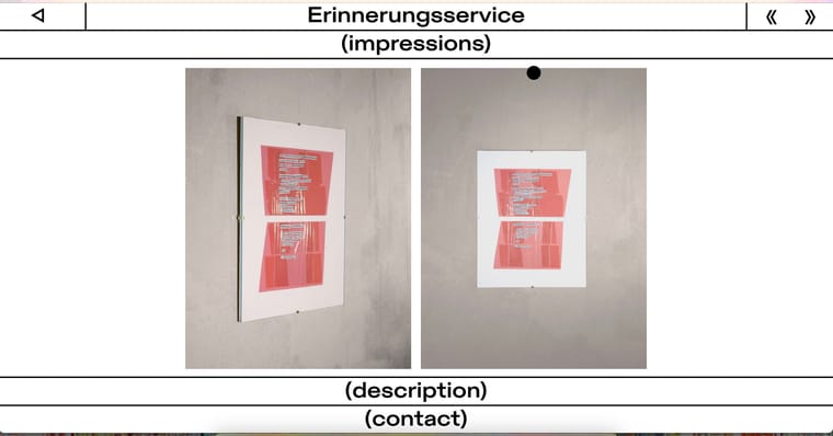
Which is achieved with custom HTML input inside the gridder...
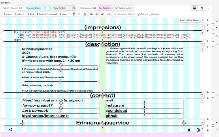
<div class="erinnerungsContainer">
    <img id="erinnerungsPic1" src="https://luiskueffner.com/wp-content/uploads/2024/09/erinnerungsservice1.jpeg">
    <img id="erinnerungsPic2" src="https://luiskueffner.com/wp-content/uploads/2024/09/erinnerungsservice2.jpeg">
</div>
... and this corresponding CSS:
.erinnerungsContainer {
    display: flex;
    justify-content: center;
    height: 70vh;
    align-items: center;
    overflow: hidden;
    gap: 20px;
}

.erinnerungsContainer img {
    height: 100%;
    width: auto;
    object-fit: contain;
}
... so the corresponding gridder looks like this:
But currently it looks like this...
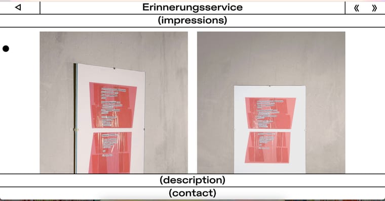
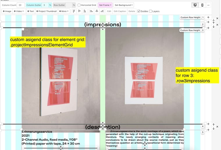
...where the corresponding gridder without custom HTML input but the two pictures inside an element grid looks like the follwing screenshot. I assigend the third row a custom row height of
70vh. If needed, I also provided the custom class names, which are currently without any custom CSS.
I would be very thankful if someone could advise me on how to achieve my desired alignment by using Laytheme elements like the existing element grid or even the simple placement of single pictures (in combination with custom CSS if needed)...
Thank you all in advance!
-
Hello! You seem very code-savvy, but I wonder if you are over-complicating this (or I misundertood it).
Looking at the screenshots, the design is not working as you wish becuase of a ratio problem. Those images are too tall to fit, and laytheme does not ´crop´them.
I would start by simply reducing their width (=less columns) so each takes about a 1/4 of the screen – as in your original.
@marcos Yeah, it really seems like that lol
Sure, it is about ratio – the issue with that is, when I reduce the width by keeping the original ratio, I am unable to place it exactly between the menu bars as in my first screenshot.
Your suggestion does look like this:
So it is always missing the ideal spot. It also needs to be responsively aligned in the horizontal middle on all desktop/table screen sizes.
I'm sure I'm just missing a super simple thing...
-
hey!
if you create an elementgrid, choose same-height for the layout type, enter any pixel value
then enter this css into lay options → custom css & html:
.elements-collection-region.same-height img{ height: 70vh!important; width: auto!important; } .elements-collection-region.same-height .element-collection{ display: flex; justify-content: center; } .elements-collection-region.same-height .element-wrap:last-child{ margin-right: 0!important; } .elements-collection-region.same-height .element-wrap{ margin-bottom: 0!important; } -
hey!
if you create an elementgrid, choose same-height for the layout type, enter any pixel value
then enter this css into lay options → custom css & html:
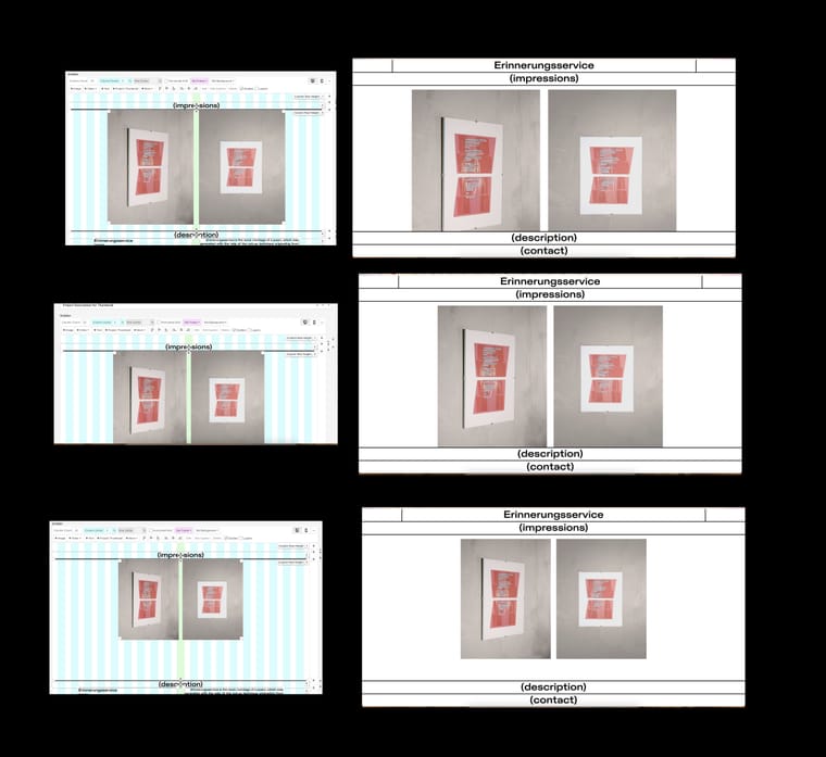
.elements-collection-region.same-height img{ height: 70vh!important; width: auto!important; } .elements-collection-region.same-height .element-collection{ display: flex; justify-content: center; } .elements-collection-region.same-height .element-wrap:last-child{ margin-right: 0!important; } .elements-collection-region.same-height .element-wrap{ margin-bottom: 0!important; }@arminunruh Thank you, that worked well!
The only problem left is, that the top and bottom padding between the images seems to behave different on different screen sizes:
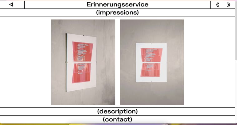
On this screen size, the bottom padding is equal to the top one.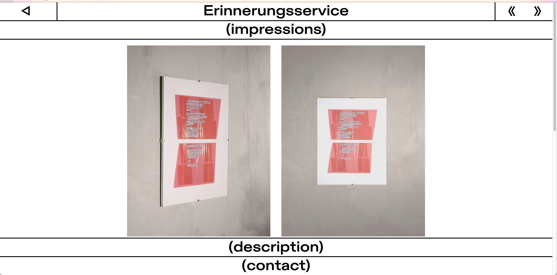
But here, the bottom padding is smaller than the one on the top.I got some custom top and bottom padding for the row itself with:
.row3impressions {
    padding-top: calc(0.6vh * 2);
    padding-bottom: calc(0.6vh * 2);
    position: sticky;
    top: calc(2 * (0.29vw + 2.63vw + 0.29vw + 3px));
    width: 100%;
    z-index: 0;
}
The (description) and (contact) menu are both sticky with a
bottomproperty.Any guess how I could approach this?
Thanks and all best
-
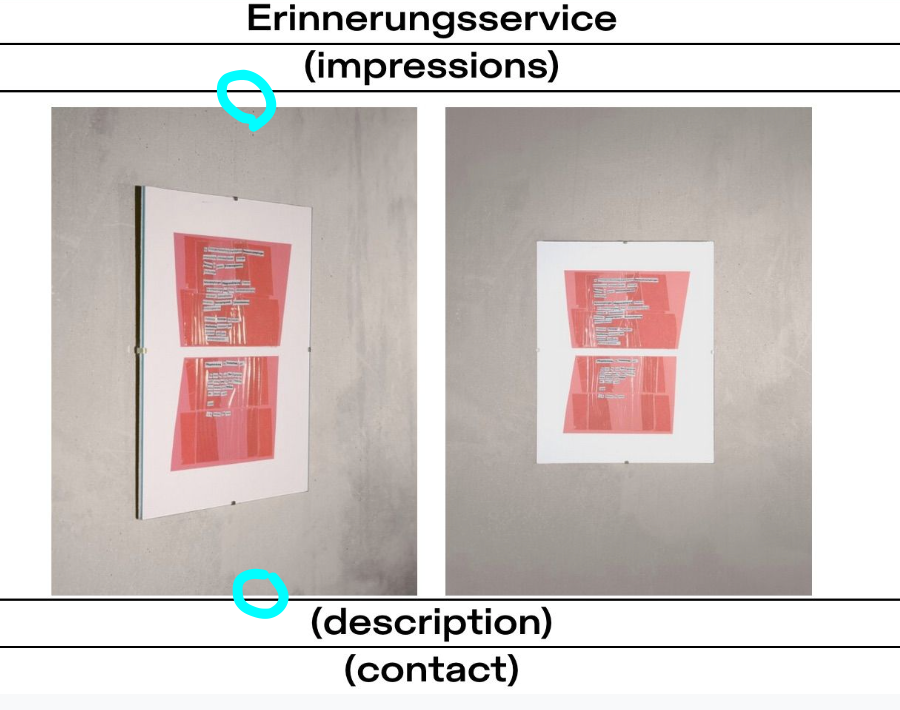
i think the spaces in the two cyan circles i marked are different, because you use
top: calc(2 * (0.29vw + 2.63vw + 0.29vw + 3px));probably better to just have a row thats 70vh, then use my code and approach from my last post to insert your images
then comment out your code
then add your code piece by piece to see which part of it makes it not work properly
maybe you can simplify your top: statement
-
and i always need a link to really see whats going on. otherwise im just guessing
-
i think the spaces in the two cyan circles i marked are different, because you use
top: calc(2 * (0.29vw + 2.63vw + 0.29vw + 3px));probably better to just have a row thats 70vh, then use my code and approach from my last post to insert your images
then comment out your code
then add your code piece by piece to see which part of it makes it not work properly
maybe you can simplify your top: statement
I did use your code for sure! But still got this fitting problem...
The top statement is actually
.row3impressions {
    padding-top: calc(var(--row-top-padding) * 2);
    padding-bottom: calc(var(--row-bottom-padding) * 2);
    position: sticky;
    top: calc(2 * (var(--menu-top-padding) + var(--menu-font-size) + var(--menu-bottom-padding) + var(--line-strokewidth)));
    width: 100%;
    z-index: 0;
}
while my global variables are as follows:
:root {
    --menu-top-padding: 0.29vw;
    --menu-bottom-padding: 0.29vw;
    --menu-font-size: 2.63vw;
    --row-top-padding: 0.6vh;
    --row-bottom-padding: 0.6vh;
    --line-strokewidth: 3px;
}
I write it like this because the sum of the top values are equal to the two menu bars I placed there (namely (Erinnerungsservice) and (impressions). With this, it is way easier to tweak the parameters which are on multiple project sites.
Also, sorry for not posting a link, should have done that before. Here it is! Pw is
laythemeThank you for your help, appreciate it!
-
then add your code piece by piece to see which part of it makes it not work properly
did u try this?
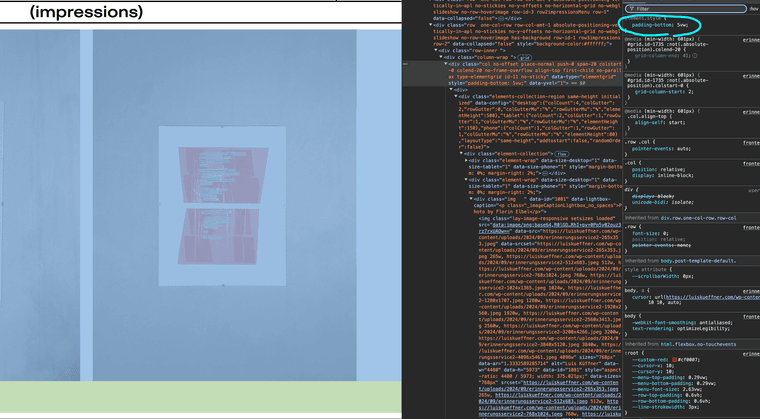
there is a huge padding bottom set here
you need to use for example the chrome inspector and look at the elements and see which css is applied to see why
-
.type-elementgrid{
padding-bottom:0!important;
}
maybe
-
you need to find out the sizes
look, the two bars: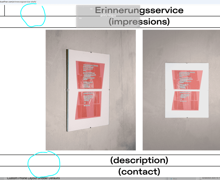
they are both around 164px in height
so your row should be
100vh - 328px
(whole browser height minus the bar heights)
use a program like https://flexruler.apponic.com/mac/
or https://apps.apple.com/de/app/free-ruler/id1483172210?mt=12to measure things
70vh doesnt make any sense i think
not sure how you came up with 70vh, this would only make sense if both bars had a height of 15vh -
you need to find out the sizes
look, the two bars:they are both around 164px in height
so your row should be
100vh - 328px
(whole browser height minus the bar heights)
use a program like https://flexruler.apponic.com/mac/
or https://apps.apple.com/de/app/free-ruler/id1483172210?mt=12to measure things
70vh doesnt make any sense i think
not sure how you came up with 70vh, this would only make sense if both bars had a height of 15vh@arminunruh I tried to add my code piece by piece and as far as I could see, it is always about the height value of
.elements-collection-region.same-height img {
    height: 70vh !important;
    width: auto !important;
}
in combination with the
padding-bottomyou posted in the screenshot. This padding is added via right-clicking the element grid and giving it a 5% value for "Space Below". I removed those 5% and tried the calculation you suggested. Since it is 2 times the menu bar, this is:height: calc(100vh - (2 * (var(--menu-top-padding) + var(--menu-font-size) + var(--menu-bottom-padding) + var(--line-strokewidth)))) !important;I also tried:
height: calc(100vh - 328px) !important;Unfortunately, both didn't help. (The
padding-bottomproperty of the.type-elementwas also not the right choice... )I would be truly thankful if you could still try to help me with this problem. Your support is very much appreciated...
All the best
-
can you send your website address, /wp-admin/ username and password and a link to this topic to info@laytheme.com?
I also code custom websites or custom Lay features.
💿 Email me here: 💿
info@laytheme.com
Before you post:
- When using a WordPress Cache plugin, disable it or clear your cache.
- Update Lay Theme and all Lay Theme Addons
- Disable all Plugins
- Go to Lay Options → Custom CSS & HTML, click "Turn Off All Custom Code", click "Save Changes"
This often solves issues you might run into
When you post:
- Post a link to where the problem is
- Does the problem happen on Chrome, Firefox, Safari or iPhone or Android?
- If the problem is difficult to explain, post screenshots / link to a video to explain it