Fullscreen slider Dynamic viewport iPad
-
I’m having issues with the dynamic viewport on Safari on iPad:
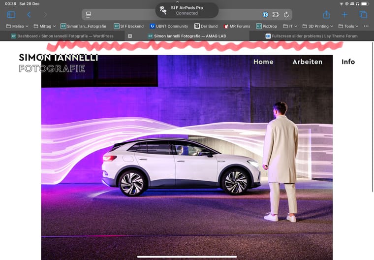
When using full screen slider in full browser height the images are only shown without border (as intended) when the site was scrolled before and parts of the safari menubars are hidden
I tried to set
.fp-tableCell {
    height: 100dvh;
}
But this doesn’t seem to work..any ideas?
-
When scrolled it looks correct:

-
hey simon!
there are many containers that are set to 100svh, not just one:
.row._100vh, .row._100vh.empty, .fp-section, .fp-slide, .fp-tableCell, .row._100vh .row-inner, .row._100vh .column-wrap, .row._100vh.empty .row-inner, .row._100vh.empty .column-wrap, ._100vh, .fullpage-wrapper{
min-height: 100svh;
}
so if you want to try to change this value, you need to change it for all the containers listed above, not just one.
i see you disabled fullscreen slider on your frontpage
if you like you can duplicate this page and enable it again there and post the link here so i can check on an ipad?
-
can you try this css please:
.fp-section, .fp-slide, .fp-tableCell{
height: 100svh!important;
}
i just realized i set all browser height containers to 100svh, but this is the only one that is set to 100lvh
-
can you try this css please:
.fp-section, .fp-slide, .fp-tableCell{
height: 100svh!important;
}
i just realized i set all browser height containers to 100svh, but this is the only one that is set to 100lvh
@arminunruh said in Fullscreen slider Dynamic viewport iPad:
can you try this css please:
.fp-section, .fp-slide, .fp-tableCell{
height: 100svh!important;
}
i just realized i set all browser height containers to 100svh, but this is the only one that is set to 100lvh
This seems to fix it thanks! I was only able to verify it on iPad Simulator (Xcode) as I left my iPad at the office and won't have access to it for few days.
Will check on the actual device when I get to the office, but will leave the custom css live so you can check? Will you implement this fix in an update of the theme?
-
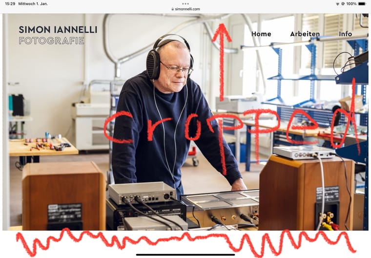
Verified on actual device. Now it behaves the other way round: looks correct unscrolled (with menubar), scrolled (without menubar) the images are cut off on top.
-
-
can you try this css please:
.fp-section, .fp-slide, .fp-tableCell{
height: 100svh!important;
}
i just realized i set all browser height containers to 100svh, but this is the only one that is set to 100lvh
@arminunruh said in Fullscreen slider Dynamic viewport iPad:
can you try this css please:
.fp-section, .fp-slide, .fp-tableCell{
height: 100svh!important;
}
i just realized i set all browser height containers to 100svh, but this is the only one that is set to 100lvh
Tried 100svh (see above), then 100dvh: works best. Only revealing the menubar in scrolled view (no menubar) doesn’t resize the images correctly. This could be improved, but I can live with it.
-
hey i dont see a difference between your two screenshots
ah actually a little bit of the image is cut off on top yea
well. you can change it to use 100vh instead. or dvh
.fp-section, .fp-slide, .fp-tableCell{
height: 100dvh!important;
}
.row._100vh, .row._100vh.empty, .fp-section, .fp-slide, .fp-tableCell, .row._100vh .row-inner, .row._100vh .column-wrap, .row._100vh.empty .row-inner, .row._100vh.empty .column-wrap, ._100vh, .fullpage-wrapper{
min-height: 100dvh!important;
}
Will you implement this fix in an update of the theme?
ok sure
the viewport height of the ipad changes depending if the menubar is shown or not.
100svh means 100% of the height of when the menubar is shown, so 100% of the small height.if you use 100vh or dvh, the website will jump around because the heights of the containers change depending on if a menubar shows or not.
i dont like when it jumps around so i went with 100svhu know ur page doesnt have the fullscreen slider activated, that would be really helpful for me to test it
in lay options → fullscreen slider
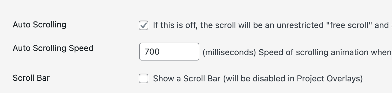
make sure autoscrolling is on and scrollbar is off
i think this way the menubar wont show and hide on scroll
-
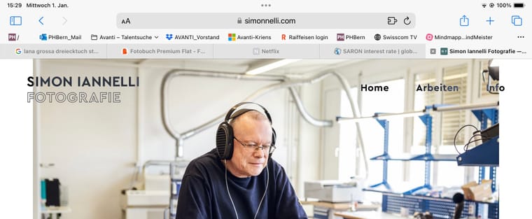
ah i see your fullscreen slider is active here:
https://simonnelli.com/merason/pls next time post the link to where the issue is <3
cause i only saw the frontpage and i thought "oh theres no fullscreen slider" -
hey i dont see a difference between your two screenshots
ah actually a little bit of the image is cut off on top yea
well. you can change it to use 100vh instead. or dvh
.fp-section, .fp-slide, .fp-tableCell{
height: 100dvh!important;
}
.row._100vh, .row._100vh.empty, .fp-section, .fp-slide, .fp-tableCell, .row._100vh .row-inner, .row._100vh .column-wrap, .row._100vh.empty .row-inner, .row._100vh.empty .column-wrap, ._100vh, .fullpage-wrapper{
min-height: 100dvh!important;
}
Will you implement this fix in an update of the theme?
ok sure
the viewport height of the ipad changes depending if the menubar is shown or not.
100svh means 100% of the height of when the menubar is shown, so 100% of the small height.if you use 100vh or dvh, the website will jump around because the heights of the containers change depending on if a menubar shows or not.
i dont like when it jumps around so i went with 100svhu know ur page doesnt have the fullscreen slider activated, that would be really helpful for me to test it
in lay options → fullscreen slider
make sure autoscrolling is on and scrollbar is off
i think this way the menubar wont show and hide on scroll
.fp-section, .fp-slide, .fp-tableCell{
height: 100dvh!important;
}
.row._100vh, .row._100vh.empty, .fp-section, .fp-slide, .fp-tableCell, .row._100vh .row-inner, .row._100vh .column-wrap, .row._100vh.empty .row-inner, .row._100vh.empty .column-wrap, ._100vh, .fullpage-wrapper{
min-height: 100dvh!important;
}
I've set it to this, works most of the time as i'd wish. Only when revealing the menubar again, the image is shifted upwards (showing white margin on bottom) and cropped at the top. I can live with it, but if you have a hint on how to improve it I'd be happy to test :)
-
im not sure, i would try 100vh maybe mmh
-
Thanks, tested vh, shv, lvh and dvh. dvh still works best and only breaks when manually revealing the menu bar. Works as intended when the menubar is hidden or revealed by scrolling.
I also code custom websites or custom Lay features.
💿 Email me here: 💿
info@laytheme.com
Before you post:
- When using a WordPress Cache plugin, disable it or clear your cache.
- Update Lay Theme and all Lay Theme Addons
- Disable all Plugins
- Go to Lay Options → Custom CSS & HTML, click "Turn Off All Custom Code", click "Save Changes"
This often solves issues you might run into
When you post:
- Post a link to where the problem is
- Does the problem happen on Chrome, Firefox, Safari or iPhone or Android?
- If the problem is difficult to explain, post screenshots / link to a video to explain it