Border width on mobile navbar
-
I would like to change the border width of my menú on mobile versión to a 2px border, I have added this code in my custom CSS but it doesn't work.
How could I do it?@media (max-width: 900px)
.navbar {
display: block;
top: 0;
left: 0;
bottom: auto;
right: auto;
width: 100%;
position: fixed;
min-height: 39px;
z-index: 30;
border-bottom-style: solid;
border-bottom-width: 2px;
} -
Hey Silvia!
Put this into:
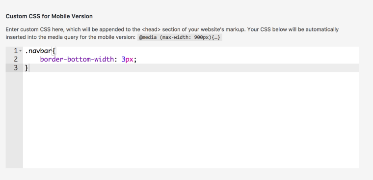
"Lay Options" -> "Custom CSS & HTML" -> "Custom CSS for mobile version":
.navbar{
    border-bottom-width: 5px;
}
Should work :)
-
Thank you! It works perfectly!! <3
-
Hey Silvia!
Put this into:
"Lay Options" -> "Custom CSS & HTML" -> "Custom CSS for mobile version":
.navbar{
    border-bottom-width: 5px;
}
Should work :)
@arminunruh
Hi Again Armin!
Hope not to bother you again with the same question.
But I think the css code for the menu border on mobile version doesn't work since the last update ¿Is it possible that I would need to change it?¿what should I write?Thank you so much in advance. ;)
-
hum, should still be the same :/
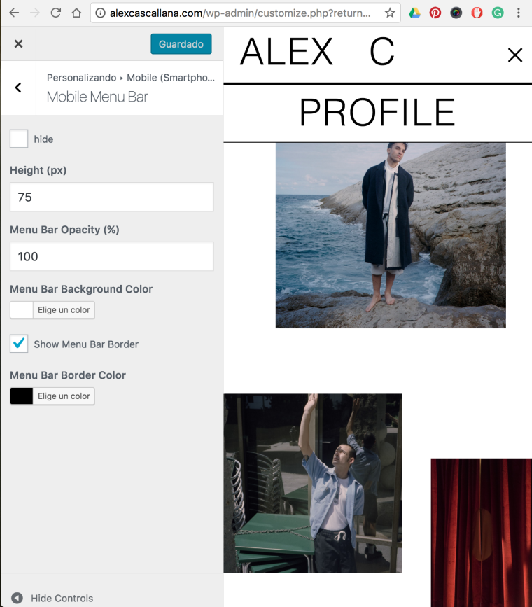
Can you go to customize -> "mobile" -> "mobile menu bar" and check if the settings there are ok?
-
hum, should still be the same :/
Can you go to customize -> "mobile" -> "mobile menu bar" and check if the settings there are ok?
@arminunruh said in Border width on mobile navbar:
Can you go to customize -> "mobile" -> "mobile menu bar" and check if the settings there are ok?
I think there are ok. I attach you here a screen captures.


-
Ok so under "Alex C", that border is the one we mad more thick using css.
If you want to change the other line use:
body.use-mobile-menu nav.primary li a{ border-bottom-width: 3px; } -
It works perfectly !! Thank you so much!!!
I also code custom websites or custom Lay features.
💿 Email me here: 💿
info@laytheme.com
Before you post:
- When using a WordPress Cache plugin, disable it or clear your cache.
- Update Lay Theme and all Lay Theme Addons
- Disable all Plugins
- Go to Lay Options → Custom CSS & HTML, click "Turn Off All Custom Code", click "Save Changes"
This often solves issues you might run into
When you post:
- Post a link to where the problem is
- Does the problem happen on Chrome, Firefox, Safari or iPhone or Android?
- If the problem is difficult to explain, post screenshots / link to a video to explain it