Issues with Fullscreen Slider on Landing Page
-
Hey,
I tried to create a fullscreen slider as a landing page, but I encountered several issues:
-
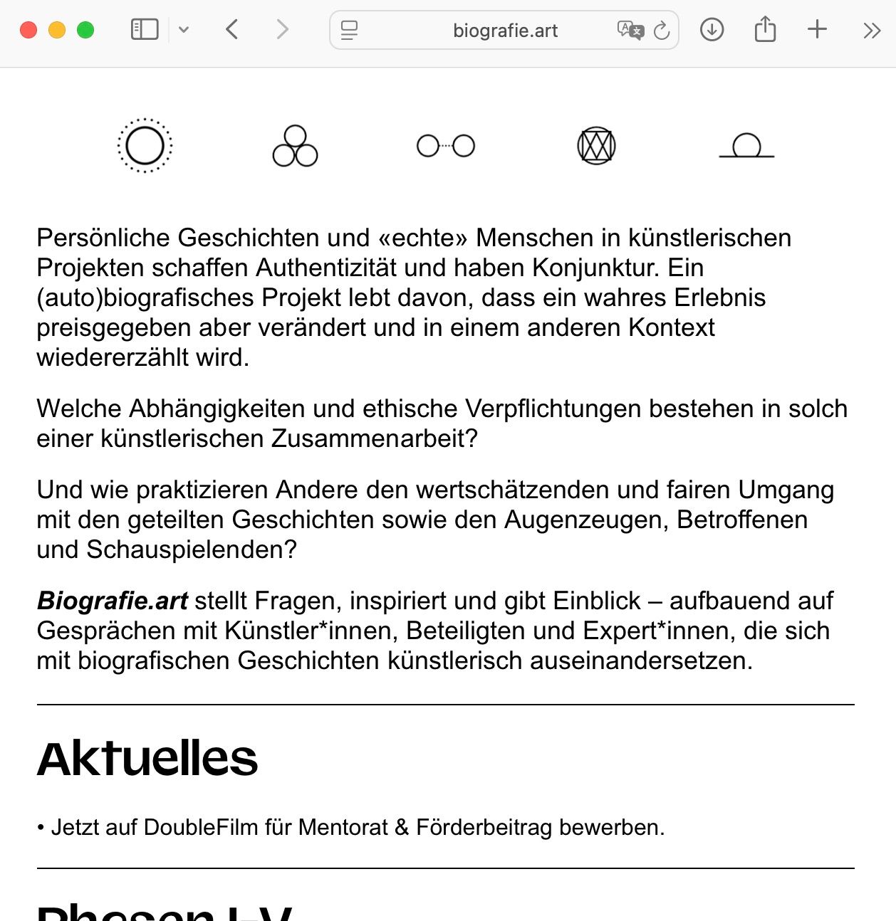
The fullscreen slider images don’t adapt to the browser width when I resize the window. How can I make them responsive?
-
I can’t completely hide the site title and menu bar. I used the following CSS code, which works for the footer but not for the navigation and title:
/* Hide Navbar on LANDING */
.slug-front .laynav {
    display: none !important;
}

/* Hide Site Title on LANDING */
.slug-front .sitetitle {
    display: none !important;
}

/* Hide Footer on LANDING */
.slug-front .footer {
    display: none !important;
}
Is there something I’m missing?
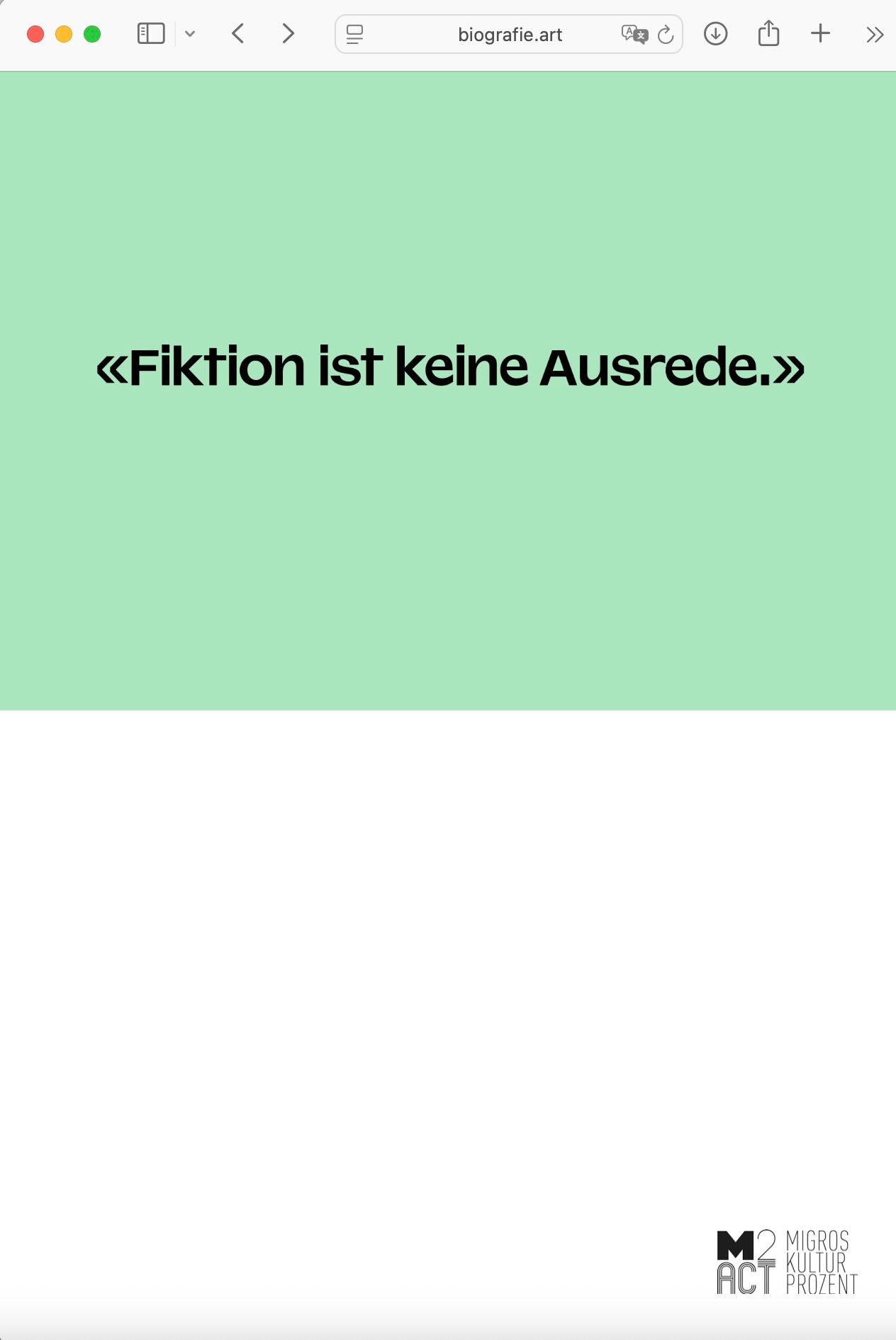
- The images appear pixelated. The resolution seems fine, but maybe I’m overlooking something. Is there a way to improve the image quality?
Thanks in advance for your help, LayTheme forum! You’re a great support.
-
-
1.:
The fullscreen slider images don’t adapt to the browser width when I resize the window. How can I make them responsive?you are using row background. a webgl row background.
row background images or row background webgl slideshows. they will always be sized in a way where they would create no gaps around them. so they will get cut off.hmm with just using a custom row background image we would have a chance of using custom css to size it differently.
but with webgl slideshows, the sizing logic is in the js and theres no workaroundif you would just use plain images inside the row, not a row background image, that would work
or a fading autoplay carousel that shows the different texts
please go to customize -> menu bar -> click hide
or maybe its in menu style -> menu barcause now you have this white bar at the top
2.:
I can’t completely hide the site title and menu bar. I used the following CSS code, which works for the footer but not for the navigation and title:you also need to hide mobile title and mobile navbar, mobile icons:
.mobile-title,
.navbar,
.lay-mobile-icons-wrap{
display: none!important;
}
and set mobile body padding to 0. that padding is there so the mobile menu bar doesnt overlap any content:
body{
padding-top: 0!important;
}
on desktop, site title and nav seem to be hidden
-
pixelated images:
looking at what images are loaded to be used inside the webgl slideshow, i see the biggest image size available is already loaded for me on my bigger screen.
try to export your images to an even bigger sizethe images appear to have a width of only 1684px which may not be enough
but the webgl may also display the images not that well mmh
can u first try to export your images to have a width of 4000px?
then use those.
lay theme will load smaller versions of the images if needed, based on what browser size u use when looking at the website -
also please note with texts it can be better to have them as texts instead of as an image, cause of google
-
also please note with texts it can be better to have them as texts instead of as an image, cause of google
@arminunruh So I made a carousel with my slider. And with the CSS code you gave me, its a perfect result, what I want for my site:
https://biografie.art/front_var
Thanks a lot.
About the pixelated text: It would be a perfect solution for me if I could write the slides directly in the carousel addon. But: I need different background colours for each text. I think this is not possible or is it?
-
@arminunruh : Sorry, I just realised I still have problems with the CSS code. I think my code is too complicated.
https://biografie.art/front_var/
- With the code below I do not have a navbar or menu on mobile/responsive pages at all when I go to my main page (it should be only on the landing page). It works fine on the desktop version.

- When I open the page, I have a white bar at the bottom. Also another problem in the mobile/responsive version of the site the footer is still activated.
Mobile:

Desktop:

Here ist my Code:
/* Hide Footer on LANDING*/
.slug-front_var .footer{
display: none!important;
}.slug-front_var .head{
display: none!important;
}/* Hide Navbar on LANDING*/
.slug-front .laynav{
display: none!important;
}/* Hide Navbar on LANDING*/
.slug-front .sitetitle{
display: none!important;
}.mobile-title,
.navbar,
.lay-mobile-icons-wrap{
display: none!important;
}body{
padding-top: 0!important;
}/* Hide Footer on LANDING*/
.slug-front .footer{
display: none!important;
}.slug-front .head{
display: none!important;
}/* Hide Navbar on LANDING_VARIANTE*/
.slug-front_var .laynav{
display: none!important;
}/* Hide Navbar on LANDING*/
.slug-front_var .sitetitle{
display: none!important;
} -
The problem with the footer is solved. I am now manually adding the footer to each page.
But still the menu on mobile is missing after clicking on the landing page (on the landing page it is correct that the mobile is hidden).
-
it should be
.slug-front .mobile-title,
.slug-front  .navbar,
.slug-front  .lay-mobile-icons-wrap{
display: none!important;
}
This way, the mobile title, mobile navigation bar, and mobile menu icon are hidden only on the front page. I mean the page that has the slug front.
You look closely at the CSS that I gave you for hiding the mobile title, mobile navigation, and mobile bar. Then you see, it just hides it for all pages on a website.
Now, if you look at the code that you gave me when you first created this post, you used a slug class to only target one page.
Maybe you forgot that you can use this way to target CSS to only get applied to one page.
Please check the slug of your page if this is correct. I don't know if slug-front is the right CSS class.
-
No, there are no options to give text a colored background in a carousel.
-
Can you Google how to use Chrome Inspector? Because with the inspector you can easily find out the HTML classes or IDs to use to write your CSS. Because, for example, you are staying on one page, the footer is showing. You could find out the CSS class of that footer. It might be different for desktop or mobile. And then write CSS to display:none that container.
-
If you want your carousel to fill out the whole browser height, then you have to create a carousel with a fixed height and set it to 100vh.
In the carousel modal where you edit or create your carousel, there is a radio input that you can select for fixed height.
Also make sure (of course) in your gridder of the page frame top is set to zero, frame bottom is set to zero and the carousel is sized to the whole width.
-
it should be
.slug-front .mobile-title,
.slug-front  .navbar,
.slug-front  .lay-mobile-icons-wrap{
display: none!important;
}
This way, the mobile title, mobile navigation bar, and mobile menu icon are hidden only on the front page. I mean the page that has the slug front.
You look closely at the CSS that I gave you for hiding the mobile title, mobile navigation, and mobile bar. Then you see, it just hides it for all pages on a website.
Now, if you look at the code that you gave me when you first created this post, you used a slug class to only target one page.
Maybe you forgot that you can use this way to target CSS to only get applied to one page.
Please check the slug of your page if this is correct. I don't know if slug-front is the right CSS class.
@arminunruh I cleaned up the code. And used yours. Now it works:
/* Hide Footer on LANDING*/
.slug-front_var .footer{
display: none!important;
}/* Hide Navbar on LANDING*/
.slug-front_var .sitetitle{
display: none!important;
}.slug-front_var .mobile-title,
.slug-front_var .navbar,
.slug-front_var .lay-mobile-icons-wrap{
display: none!important;
}/* Hide Menu on LANDING*/
.slug-front_var .laynav{
display: none!important;
} -
ok im happy it works for u
I also code custom websites or custom Lay features.
💿 Email me here: 💿
info@laytheme.com
Before you post:
- When using a WordPress Cache plugin, disable it or clear your cache.
- Update Lay Theme and all Lay Theme Addons
- Disable all Plugins
- Go to Lay Options → Custom CSS & HTML, click "Turn Off All Custom Code", click "Save Changes"
This often solves issues you might run into
When you post:
- Post a link to where the problem is
- Does the problem happen on Chrome, Firefox, Safari or iPhone or Android?
- If the problem is difficult to explain, post screenshots / link to a video to explain it