making thumbnails the same size
-
I used this code for a website I'm working on. It creates a 3:4 ratio for every thumbnail regardless of the original thumbnail dimensions. Add it to your Desktop & Mobile CSS:
.thumb-collection .ph {
position: relative;
width: 100%;
padding-bottom: 75% !important; /* 3 / 4 = 0.75 = 75% */
overflow: hidden;
}.thumb-collection .ph img,
.thumb-collection .ph video {
position: absolute;
top: 0;
left: 0;
width: 100% !important;
height: 100% !important;
object-fit: cover !important;
object-position: center !important;
} -
.element-wrap .ph{
    padding-bottom: calc(9 / 16 * 100%)!important;
}
.element-wrap img,
.element-wrap video{
    aspect-ratio: 16 / 9!important;
    object-fit: cover;
    object-position: center;
}
this is for 16:9 for example.
Enter this css in "lay options" -> "custom css & html" -> "custom css"
@zxhxri thanks a lot for your help! your css is correct, but its the right one for thumbnailgridsbut he uses an elementgrid
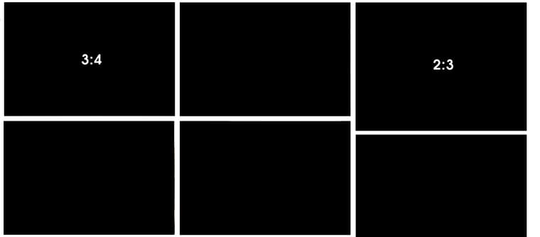 image url)
I also code custom websites or custom Lay features.
💿 Email me here: 💿
info@laytheme.com
Our Web Development company: 100k.studio
Want to tip me? https://www.paypal.com/paypalme/arminunruh
Before you post:
- When using a WordPress Cache plugin, disable it or clear your cache.
- Update Lay Theme and all Lay Theme Addons
- Disable all Plugins
- Go to Lay Options → Custom CSS & HTML, click "Turn Off All Custom Code", click "Save Changes"
This often solves issues you might run into
When you post:
- Post a link to where the problem is
- Does the problem happen on Chrome, Firefox, Safari or iPhone or Android?
- If the problem is difficult to explain, post screenshots / link to a video to explain it