image centered / resized on all screens
-
Hi everyone,
How do I get a single image horizontally and vertically centered and proportional scaled, so it doesn´t get cropped, no matter the screen or image format?
The images are displayed on single project pages.
(For example: https://sylviagoebel.de/paredus/)I tried to activate „Use browser height for row height“ and restrict the image through a class and max-width / max-height. But this doesn´t effect the image.
I´m struggling to find a solution and hope someone can help.
Best, jonas
-
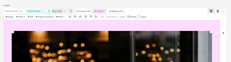
create a row, right click the row and choose "use browser height for row height"
insert an image.
right click the image, click "set html class and id"
use a class like:fluidimage
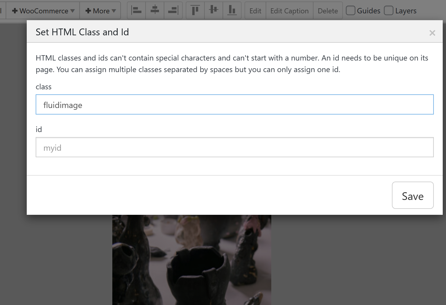
add this in:
lay options -> custom css & html -> custom css for desktop.fluidimage{ position: absolute!important; top: 5vh!important; left: 5vw!important; } .fluidimage .ph{ display: none; } .fluidimage img{ width: 90vw!important; height: 90vh!important; object-fit: contain!important; } -
Great, this works. Thanks a lot, Armin!
-
hey jonas!
with the latest lay theme update you can also do this:position an image over the whole full width:
select the image and in the sidebar, enable fixed height and use object fit contain.
play around with the height setting, you could also use a value like 90vh for example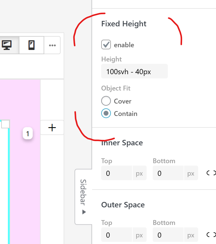
I also code custom websites or custom Lay features.
💿 Email me here: 💿
info@laytheme.com
Before you post:
- When using a WordPress Cache plugin, disable it or clear your cache.
- Update Lay Theme and all Lay Theme Addons
- Disable all Plugins
- Go to Lay Options → Custom CSS & HTML, click "Turn Off All Custom Code", click "Save Changes"
This often solves issues you might run into
When you post:
- Post a link to where the problem is
- Does the problem happen on Chrome, Firefox, Safari or iPhone or Android?
- If the problem is difficult to explain, post screenshots / link to a video to explain it