Skip to content
  • Recent
  • Tags
  • Popular
  • Users
  • Search
Skins
  • Light
  • Cerulean
  • Cosmo
  • Flatly
  • Journal
  • Litera
  • Lumen
  • Lux
  • Materia
  • Minty
  • Morph
  • Pulse
  • Sandstone
  • Simplex
  • Sketchy
  • Spacelab
  • United
  • Yeti
  • Zephyr
  • Dark
  • Cyborg
  • Darkly
  • Quartz
  • Slate
  • Solar
  • Superhero
  • Vapor

  • Default (No Skin)
  • No Skin
Collapse

Lay Theme Forum

  1. Home
  2. Feedback
  3. Table element responisveness

Table element responisveness

Scheduled Pinned Locked Moved Feedback
4 Posts 2 Posters 65 Views
  • Oldest to Newest
  • Newest to Oldest
  • Most Votes
Reply
  • Reply as topic
Log in to reply
This topic has been deleted. Only users with topic management privileges can see it.
  • E Offline
    E Offline
    ersc_
    wrote last edited by
    #1

    Is there a way to customize how the table element displays in tablet and mobile devices? I couldn't find it but it would definitely be nice. Similar to the element grid customization options at the bottom left.

    1 Reply Last reply
    0
    • arminunruhA Offline
      arminunruhA Offline
      arminunruh
      Global Moderator
      wrote last edited by
      #2

      hey there are no such settings. what would you like?
      Probably different widths for columns and different spacing right?

      1 Reply Last reply
      0
      • E Offline
        E Offline
        ersc_
        wrote last edited by
        #3

        It would be nice to make the columns stack, instead of becoming really narrow. In the element grid you can customize for tablet and mobile display. :-)

        1 Reply Last reply
        0
        • arminunruhA Offline
          arminunruhA Offline
          arminunruh
          Global Moderator
          wrote last edited by arminunruh
          #4

          Ok, but I'm not sure if that would make sense.
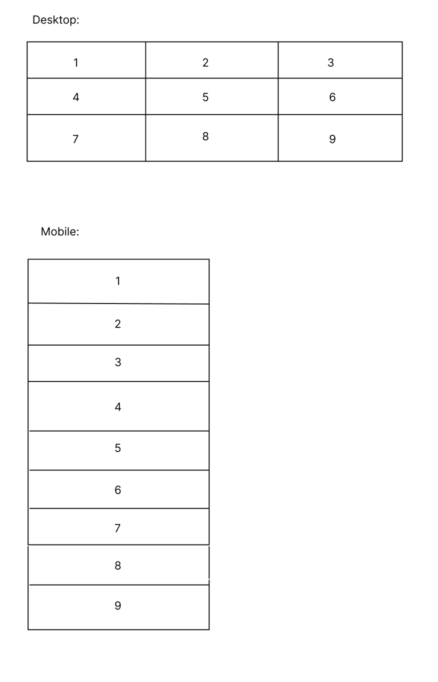
          Because the amount of columns a table has, they separate the texts in the table into a logical order, grouping them.

          I think your idea works if we had only two columns and then we would make it so the texts are on top of another instead of next to one another.

          But what happens if the table has three columns? If we then put all the text on top of another, the grouping gets lost:

          image.png

          You could, for example, create a custom phone layout at the moment.

          1 Reply Last reply
          1
          Reply
          • Reply as topic
          Log in to reply
          • Oldest to Newest
          • Newest to Oldest
          • Most Votes


          I also code custom websites or custom Lay features.
          šŸ’æ Email me here: šŸ’æ
          info@laytheme.com

          Before you post:
          1. When using a WordPress Cache plugin, disable it or clear your cache.
          2. Update Lay Theme and all Lay Theme Addons
          3. Disable all Plugins
          4. Go to Lay Options → Custom CSS & HTML, click "Turn Off All Custom Code", click "Save Changes"

          This often solves issues you might run into

          When you post:
          1. Post a link to where the problem is
          2. Does the problem happen on Chrome, Firefox, Safari or iPhone or Android?
          3. If the problem is difficult to explain, post screenshots / link to a video to explain it
          Online Users
          CKC
          CK
          U
          user-4'33''
          M
          MileneM
          Forgot your key, lost your files, need a previous Lay Theme or Addon version? Go to www.laykeymanager.com
          laytheme.com
          • Login

          • Don't have an account? Register

          • Login or register to search.
          • First post
            Last post
          0
          • Recent
          • Tags
          • Popular
          • Users
          • Search