Carousel full screen
-
Hi Daniel!
until now there is not an official feature for that option.
But what you can do is the following:
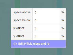
Add a custom class to your carousel. You can do this by right clicking on the carousel image

Then give the carousel a custom class like carousel-full.
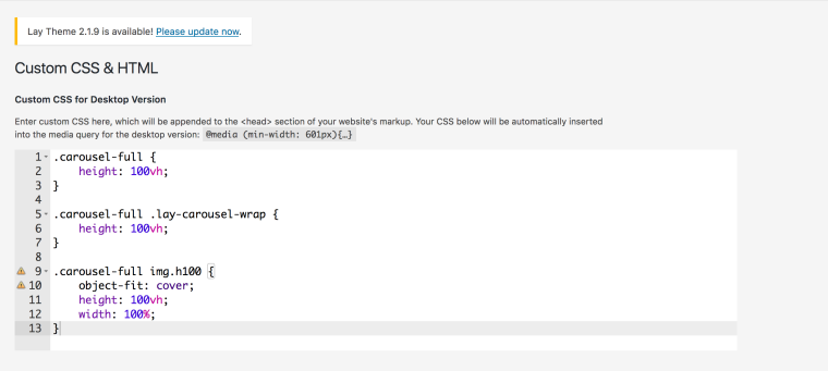
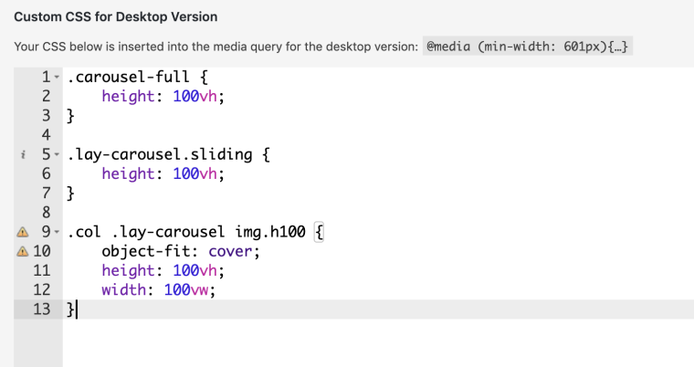
Then you can add a custom CSS code to your theme:
.carousel-full {
    height: 100vh;
}

.lay-carousel.sliding {
    height: 100vh;
}

.col .lay-carousel img.h100 {
    object-fit: cover;
    height: 100vh;
    width: 100vw;
}
The code above is maybe not compatible with all Browsers. For example Internet Explorer has trouble using those CSS styles.
Then the carousel has the window height and width.
Try to keep all the images with the same aspect ratio. Which means they should all have the same height and width.I hope I was able to help. If you have further questions – please let us know.
Enjoy your weekend!
Marius
-
Hello Marius,
I have the same problem; I'd like the carousel on my homepage to be fullscreen, and the other carousels in my website just normal/smaller on the page.
Now I'm trying to use the code you suggested. When I click on 'edit html class and id' I see a screen with 2 fill-in boxes: 'class' and 'id'. What do I fill in here? I tried the code you suggested above here, but that doesn't work. I'm not experienced in coding obviously ;)Hope to hear from you.
Thanks! -
I think it works right now, but it works on all my carousel slideshows! Not only the one I assigned the code to. That's strange, could you tell me how to solve this?
-
Hello,
sorry I was not too specific.
You need to add carousel-full as a class. Because this class gets called by the custom CSS here:
.carousel-full {
    height: 100vh;
}
Let me know if that worked for you!
All the best!
Marius
-
I think it works right now, but it works on all my carousel slideshows! Not only the one I assigned the code to. That's strange, could you tell me how to solve this?
@lve said in Carousel full screen:
I think it works right now, but it works on all my carousel slideshows! Not only the one I assigned the code to. That's strange, could you tell me how to solve this?
I'm having this exact same problem, when I put the class in front of it the css doesn't trigger this function anymore.
Though I only want the object-fit and height/width 100vh/vw to be triggered on the .carousel-full class
-
Hello,
sorry I was not too specific.
You need to add carousel-full as a class. Because this class gets called by the custom CSS here:
.carousel-full {
    height: 100vh;
}
Let me know if that worked for you!
All the best!
Marius
@mariusjopen Hello,
It still doesn't work for me. It always says: ... Unknown property: 'object-fit' ... can't get past this point.
What am I doing wrong?

Thanks!!!
-
Hi Lemo,
can you upload your website that I can have a look.Maybe it is also connected to the spaces in front of the object-fit.
Can you delete them and see what happens?
Also object fit is not supported on all browsers:

Speak you soon!
Marius
-
Hello Marius, I'm also trying to implement a full screen carousel but am struggling. I would like a full screen carousel to responsively fill the screen so the image is not cut off at the bottom, with a floating 'close' button in the top right like this example: http://www.querida.si/wet-poster
Could you please explain how is this done? -
Hello Marius, I'm also trying to implement a full screen carousel but am struggling. I would like a full screen carousel to responsively fill the screen so the image is not cut off at the bottom, with a floating 'close' button in the top right like this example: http://www.querida.si/wet-poster
Could you please explain how is this done?I also notice that the text is responsive in this example?
-
Hi Lemo,
can you upload your website that I can have a look.Maybe it is also connected to the spaces in front of the object-fit.
Can you delete them and see what happens?
Also object fit is not supported on all browsers:

Speak you soon!
Marius
Thanks for your help! I managed to make it work.
-
-
Dear @Mariinus,
I've found this thread while i have a problem adapting my Carousel into fullscreen.
My header images somehow still are not adjusted based on the appropriate screen size.
Do you think you could help me please? -
Dear @evey_k
you were almost there.
Just add this here:.flickity-viewport { height: 100vh; }Best!
Marius
-
Dear @evey_k
you were almost there.
Just add this here:.flickity-viewport { height: 100vh; }Best!
Marius
@mariusjopen
Hi Marius, thanks alot for your help!
My problem remains that the forward/previous arrow on the carousel is not quite in the middle at certain size of the browser. somehow it doesn't stay at the middle spot. -
Dear @mountain
play around with this:button.flickity-prev-next-button.next { top: 54vh; }Best!
Marius
I also code custom websites or custom Lay features.
💿 Email me here: 💿
info@laytheme.com
Before you post:
- When using a WordPress Cache plugin, disable it or clear your cache.
- Update Lay Theme and all Lay Theme Addons
- Disable all Plugins
- Go to Lay Options → Custom CSS & HTML, click "Turn Off All Custom Code", click "Save Changes"
This often solves issues you might run into
When you post:
- Post a link to where the problem is
- Does the problem happen on Chrome, Firefox, Safari or iPhone or Android?
- If the problem is difficult to explain, post screenshots / link to a video to explain it
