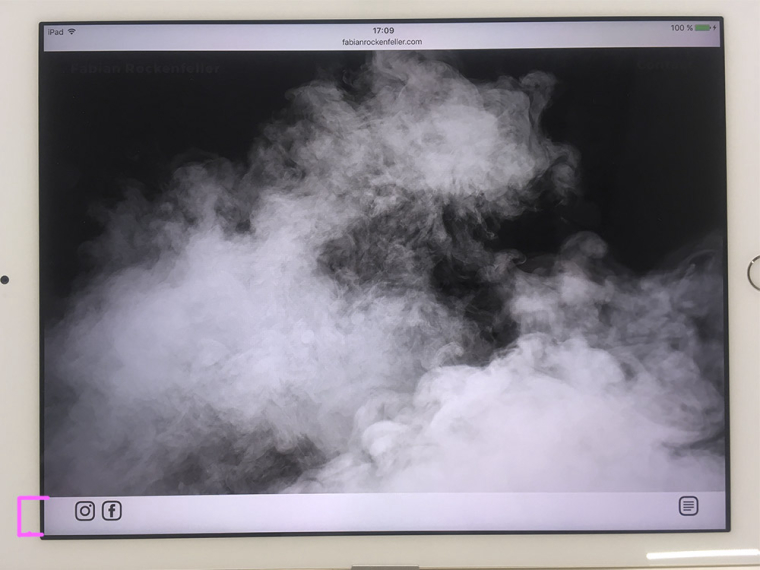
Fullscreen Slider after hiding tablet browserbar
-
Hi there,
my Fullscreenslider seems to have problems readjusting the center of the site after the navigationelements and url tab of the browser on tablet devices is slided up.
As when you slide downwards on the overview-site the browserbar hides/slides to top, as it does on every other website as well. (apple/android)
But as soon as it is hidden the Fullscreenslider positions every Element in projects on the very top of the site instead in the center. On Fullscreen Slides a wider bar in the bottom is left out white ( around the size of the browserelements/bar?)I have no clue how to fix that problem and hope to get some help here.
Best,
FabianFeel free to see for yourself ( on tablet devices)
www.fabianrockenfeller.com -
Hi Fabian!
On my iPad it works fine.
Which version do you use?Did you try to remove the Custom CSS code for a test?
Best!
Marius
-
Maybe your Browserbar was not slided in before entering the project.
See the attached images. Seems like the white space in the bottom is exactly the same size as the Browserbar that became smaller. I testet it on 4 different ipads with various sizes. The problem even occurs with empty Custom CSS.

-
Hi CX!
We will look into it and will keep you updated.
Please apologize if this will need a little while. It looks like a general bug which needs to be fixed.
Best!
Marius
I also code custom websites or custom Lay features.
💿 Email me here: 💿
info@laytheme.com
Before you post:
- When using a WordPress Cache plugin, disable it or clear your cache.
- Update Lay Theme and all Lay Theme Addons
- Disable all Plugins
- Go to Lay Options → Custom CSS & HTML, click "Turn Off All Custom Code", click "Save Changes"
This often solves issues you might run into
When you post:
- Post a link to where the problem is
- Does the problem happen on Chrome, Firefox, Safari or iPhone or Android?
- If the problem is difficult to explain, post screenshots / link to a video to explain it