Set up Problems - please help.
-
Hi @leo01
great!
-
You mean the transition when it goes from right to left in the slideshow? I also see that this flickers a bit at your website. You have any special things installed?
-
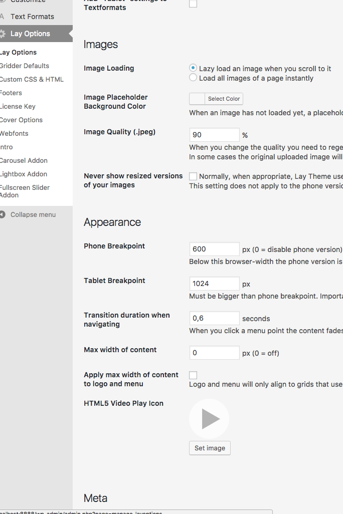
You can change the breakpoint here:

-
You need to do that with the Custom CSS:
.sitetitle img { width: 10vw; max-width: 100px !important; }-
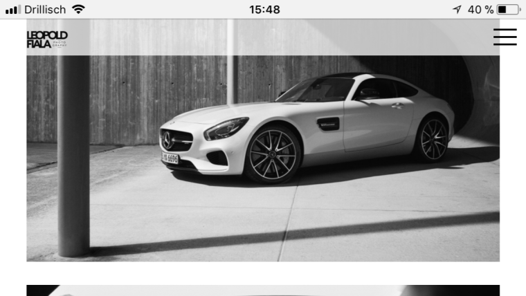
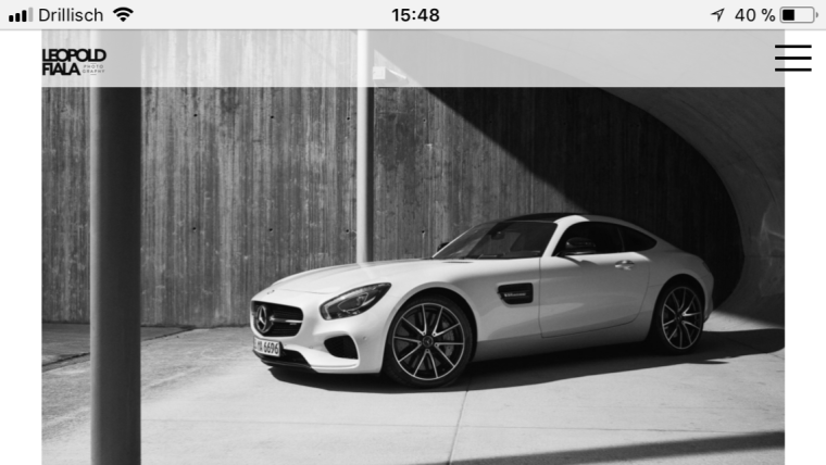
Can you post a screenshot of this?
-
To change this arrow you need to upload a new arrow file:
.cursor-right {
    cursor: url(http://new.leopoldfiala.com/wp-content/uploads/2017/11/arrow-next.svg) 20 20, pointer !important;
}
-
You can only link to projects. not to categories with the Thumbnail Grid.
-
We agree. We will do that ion the future!
I hope I could help!
Best!
Marius
-
-
Hi @mariusjopen
Thanks a lot for your reply!-
Yes exactly, no nothing special installed i think (or what do you mean by that? No extra plugins besides: WP supercharge, Toast SEO, Aksimet, Social Icons, Instagram Feed)
-
I found that thanks, but is it possible to use the "burger" menu for Tablets as well as an option?
-
Cool thanks a lot! What can i change with the 10vw setting?
-
shure: here u go:
The issue only accurres in landscape orientation, and is even more drastic if images are in a 6x45 medium format crop (3x4 ratio) - the screenshot shoes a normal 2x3 ratio image which is still cropped/not cited to screen)


-
Soory i made m self not clear enough: I would like to change the color for links in my footer, e.g.. i use next project, and previous project as text links in my footer. But they are styled like the usual links in every project text. But instead i would like to give them another color. But i cant seem to find the right selector for it. I tried .laynextproject and .layprevproject without success
6./ 7 Great Thanks!
-
Sorry a new one :) : Can i somehow space the navigation items by css individually? eg. i would like to have a bigger gab infant of my about nav item.
-
Cover Option: In lay options/Cover options i have the disable for Phone checkbox on, but the covers still show up on my phone. The Cover is set up as: I select a new project and i "set a new image background" also the box "use browser height for row height" is activated. It looks quite odd on the phone. How can i fix that?
THANKS A LOT.
Yours
Leo -
-
HI @leo01
You are welcome.
-
The flickering looks a bit weird. I assume you have all the latest versions of Laytheme, the plugins and Wordpress installed, right? We will look into this.
-
You can change the breakpoint. Then the burger-menu will be displayed also on tablets.
-
Actually this is enough:
.sitetitle img {
    max-width: 100px !important;
}
The width was inside the code because I needed it to test if it works.
-
No. There is not really a way to make the images or the white-space adjust to the horizontal phone layout.
-
Does that work for you?
#footer-region a:hover { color: blue; }-
You are welcome
-
Also here.
-
Have a look here:
.menu-item { margin-right: 60px !important; }- I don't see the cover on your mobile version. Does this problem still remain?
Best!
Marius
-
-
Hi @mariusjopen
Thanks for your reply!
-
Yes newest version of Laytheme and Wordpress installed. Lightbox sliding duration set to 1200 ms, but the same happened even more visible if i slow it down.
-
So the "Tablet breakpoint for Text formats" also effects the navigation? I would like to have the burger menu on tablets but with a bigger type than for the Phone, is tat possible?
-
Great
-
So the only way is to widen the grinder frame for Phone layouts? This is not so nice cause it looks weird to have a lot of white space if i hold my phone vertical, can i tweak that in java or css with a workaround maybe?
-
YES! thx.
6/7.
-
Well i would only like to space one specific menu item, so that the about menu gets separated from my Portfolio menu. So i would only like to have a margin for my about menu item.
-
Yes its still there! I am talking about the covers of the projects. They are still visible in Crome and safari on my phone.
The splash/welcome screen for the whole does not show, but in projects all projects still have that full screen cover image. -
Is it possible to easy access the captions for Lightbox without high clicking every image? In my case i have a lot of images i need to write captions for and its not easy to visually see where I've done that and where the caption is still missing. An Option to display the captions in the grinder would be awesome for a future release.
Subquestion: How can i style the captions via css? I would like to overlay them with the Lightbox image in a box with a transparent background.
Thanks Marius for your help!
Leo -
-
Hi @leo01
-
OK. We will look into hat.
-
NO. not really possible easily. You need to do some adjustments.
-
:-)
-
Of course. you can use Custom CSS to adjust this manually. Have a look here: https://www.w3schools.com/css/css_rwd_mediaqueries.asp
-
:-D
-
:-)
-
:-D
-
Your about mednu-item has the ID
#menu-item-7. So you can adjust it in Custom CSS. -
Yes. Exactly. The Splash screen gets only shown on the Start page. In the Phone Layout you can also change this behavior and make the first row a cover image.
-
I agree. Not possible yet.
-
You can use the Custom CSS section to make extra changes.
All the best!
Marius
-
-
Hello @leo01
Lightbox add on: The transition between the images is very unsmooth, it jumps and flickers. i tried to play around with the transition time but it doesn't change the flickering.
I could not reproduce this problem on safari and chrome.
Which browser and browser version do you use? -
Hello @leo01
Lightbox add on: The transition between the images is very unsmooth, it jumps and flickers. i tried to play around with the transition time but it doesn't change the flickering.
I could not reproduce this problem on safari and chrome.
Which browser and browser version do you use?Hi @arminunruh
That is weird, i use safari and firefox.
I did set up the transition a bit slower now to 2200ms, can u check again. It is very visible here.Thanks
Leo -
-
Thanks, i use: Safari 10.1 and Firefox 56.0
Thanks for clarifying how i can space a specific object.
Another question about that covers for projects. I would like NOT to show them on mobile.
"Activate Cover Feature" under Lay options is on - under cover options "Disable for phone" is on as well.But Covers still show up on my mobile? That is not expected right?
I do set up the cover like this: I go to the first column and rechtsklick, set image background. Use Browser height for row hight is also klickt by default.Now it shows up as expected on Desktop, but also on the mobile.
Thanks
Leo -
Hey @leo01
I've looked at the lightbox more and I do see on firefox it is not really fluid. Not sure if I can do something about this :/.
Cover disabled for phone just means that the cover effect is disabled for phone. It doesn't mean the first row is hidden on phone.
You could do that with custom css.
Have a good day
-
Ok thanks for the reply!
I do see the issue across all browsers i use (FF, Safari, Chrome)Thanks for clarifying the cover issue, so it seems i interpreted the check box wrong.
Could you give me a hint of how to use CSS to disable the cover row for mobile across the website, but only for project pages?Thanks!
Leo
I also code custom websites or custom Lay features.
💿 Email me here: 💿
info@laytheme.com
Before you post:
- When using a WordPress Cache plugin, disable it or clear your cache.
- Update Lay Theme and all Lay Theme Addons
- Disable all Plugins
- Go to Lay Options → Custom CSS & HTML, click "Turn Off All Custom Code", click "Save Changes"
This often solves issues you might run into
When you post:
- Post a link to where the problem is
- Does the problem happen on Chrome, Firefox, Safari or iPhone or Android?
- If the problem is difficult to explain, post screenshots / link to a video to explain it