Project description
-
Dear Marius,
I'm working on a website: kominekominekominek.com
In the Books category I've put the project thumbnails in every row and then I activated the fullscreen slider. I would like to know if there is a way to edit the project description (below the images) so that it is always on the bottom of the page, sort of what I did in the artists section, but this I did it in the gridder while in the Books section I would like it to be more automatic. Now I'm using the project description but I could do this also with the project title.
Thank you!
Gonzalo -
Hi @Gonzalo !
Great to hear from you here! Hope you are good!
So to get you right:
You want to use the project title under each image on the book page?
And each book is a project…But that is easy. It is just the title of the project. Do I understand you right about this?
Many wishes!!
Marius
-
Thank you!!
I'm not explaining myself well, sorry!
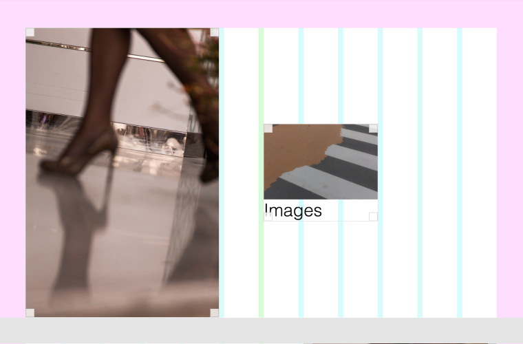
What I mean is that in every row, that contains one project thumbnail I would like to have the project description aligned at the bottom of the page, not at 15 px from the thumbnail image but at 1% from the bottom.
I've made an example here: kominekominekominek.com/example-2
Have a nice day!
Gonzalo -
Thank you!!
I'm not explaining myself well, sorry!
What I mean is that in every row, that contains one project thumbnail I would like to have the project description aligned at the bottom of the page, not at 15 px from the thumbnail image but at 1% from the bottom.
I've made an example here: kominekominekominek.com/example-2
Have a nice day!
Gonzalo@mariusjopen just an update, is no longer the project description but the project title that I need to align, Cheers!
-
Hi @Gonzalo
but this is already the case, right?element.style { padding-bottom: 1vw; }And when you resize it also works.
http://www.kominekominekominek.com/example-2I hope to get you right!
Best!
Marius
-
Hi Marius,
this was the case in the example I sent you because I did put two elements in the gridder, one image and one text which was 1vw from the bottom of the page.What I wanted was not to put two elements but to put only one element –a project thumbnail– and edit the css of the project description so that it places always at 1vw from the bottom of the page, even if the thumbnail is small.
I'm sorry I didn't explain myself well.
Thank you,
Cheers! -
Hi Gonzalo,
I made it work.
I did not polish the example but you will get the idea:
.col {
    height: 100vh;
}

.thumbnail-wrap {
    height:  100%;
}

.thumb {
    height:  100%;
}

.lay-textformat-parent {
    position:  absolute;
    bottom: 1vw;
}
You need a big image next to it. Otherwise the Thumbnail will behave differently.
It can also be a narrow, height, white bar as JPG.
Then you might need to adjust some things. But I think this is the way I would go.
All the best!
Marius
I also code custom websites or custom Lay features.
💿 Email me here: 💿
info@laytheme.com
Before you post:
- When using a WordPress Cache plugin, disable it or clear your cache.
- Update Lay Theme and all Lay Theme Addons
- Disable all Plugins
- Go to Lay Options → Custom CSS & HTML, click "Turn Off All Custom Code", click "Save Changes"
This often solves issues you might run into
When you post:
- Post a link to where the problem is
- Does the problem happen on Chrome, Firefox, Safari or iPhone or Android?
- If the problem is difficult to explain, post screenshots / link to a video to explain it