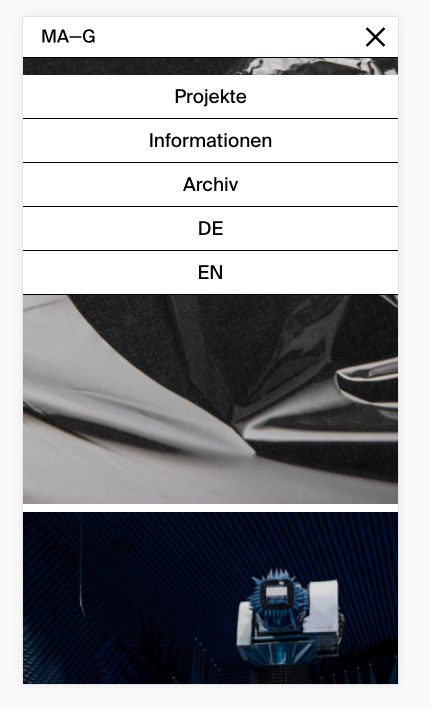
Weird space underneath mobile Menu Bar
-
Hi everyone…
There is a mysterious space between the site title bar and the menu. I don’t know how that space got there… there's nothing in the gridder or in the customizer…

Also I was wondering if it’s possible to remove one Menu point for mobile only? I’ve got 1 Menu for: „Projekte, Informationen, Archiv“ and 1 for the Language Switch Buttons.
The languages are being displayed as individual Menu points – which I don’t really like in the mobile version, so I would rather turn them off…Can you help? Thx in advance,
Marcus -
Dear @Marvic
can you post a link to your website?
Then we can have a look.It is a built in feature that the menus get collected together. We will see if we can change that in the future.
Best!
Marius
-
I can't post a link unfortunately… it's currently in Dev-Mode. Could send you a login to your Email?
I know about the feature, but isn't it possible to tell Menu 2 to disappear on mobile?
Thx @mariusjopen
-
Sure.
Best is if you write an email to marius@thepeople.world and include your username, password and a link to this conversation.
Marius
-
Dear @Marvic
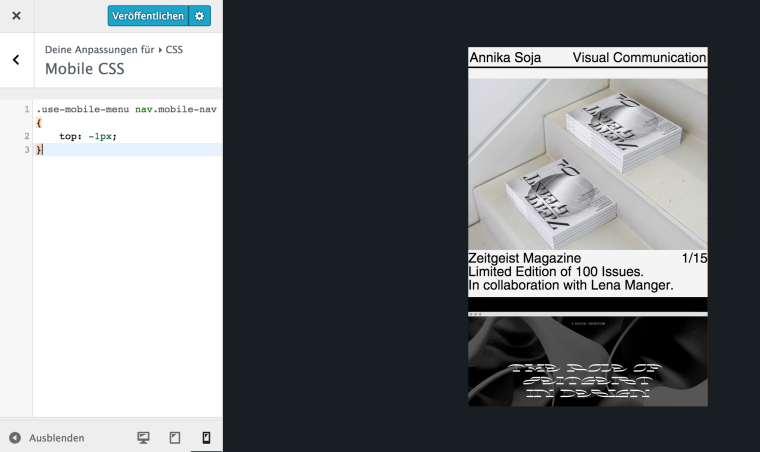
put this into your CUSTOM MOBILE CSS:
.use-mobile-menu nav.mobile-nav {
    top: -1px;
}
Best!
Marius
-
Dear @Marvic
can you post a link to your website?
Then we can have a look.Thank you :-)
Marius
I also code custom websites or custom Lay features.
💿 Email me here: 💿
info@laytheme.com
Before you post:
- When using a WordPress Cache plugin, disable it or clear your cache.
- Update Lay Theme and all Lay Theme Addons
- Disable all Plugins
- Go to Lay Options → Custom CSS & HTML, click "Turn Off All Custom Code", click "Save Changes"
This often solves issues you might run into
When you post:
- Post a link to where the problem is
- Does the problem happen on Chrome, Firefox, Safari or iPhone or Android?
- If the problem is difficult to explain, post screenshots / link to a video to explain it
