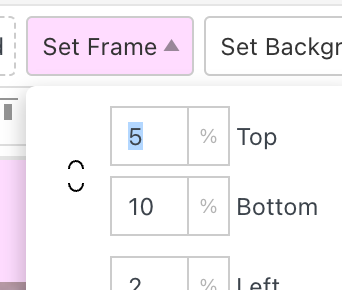
Text on cover not aligned to bottom.
-
Hi,
I want to have the text on my cover being aligned in the bottom left corner of the screen. However, it always crops away the second paragraph of the text, if I use the align bottom feature in the gridder. I also tried separating the text paragraphs and using two text blocks in a stack environment but the problem persists. Does anybody have an idea how to fix this?
Website in question is: https://odeelab.com/labor-copy/
This is how the full text looks, when I center align: https://odeelab.com/Thanks a lot!
-
hey u need to set frame top to 0

cause it gets added to the cover height, which is browser height
I also code custom websites or custom Lay features.
💿 Email me here: 💿
info@laytheme.com
Before you post:
- When using a WordPress Cache plugin, disable it or clear your cache.
- Update Lay Theme and all Lay Theme Addons
- Disable all Plugins
- Go to Lay Options → Custom CSS & HTML, click "Turn Off All Custom Code", click "Save Changes"
This often solves issues you might run into
When you post:
- Post a link to where the problem is
- Does the problem happen on Chrome, Firefox, Safari or iPhone or Android?
- If the problem is difficult to explain, post screenshots / link to a video to explain it
Online Users
Forgot your key, lost your files, need a previous Lay Theme or Addon version?
Go to www.laykeymanager.com